Compare commits
14 Commits
| Author | SHA1 | Date | |
|---|---|---|---|
 Tola Leng Tola Leng
|
f88cc32cf9 | ||
|
Tola Leng
|
9f4e759b01 | ||
|
Tola Leng
|
9ed4d4c7ac | ||
|
Tola Leng
|
9a001f6aec | ||
|
Tola Leng
|
cfdedb9636 | ||
|
Tola Leng
|
9d5fa805c9 | ||
|
Tola Leng
|
68a4ad5478 | ||
|
Tola Leng
|
9b1918e25a | ||
|
Tola Leng
|
1dc25cc461 | ||
|
Tola Leng
|
4dc005c7e4 | ||
|
Tola Leng
|
4ec0c7a8fa | ||
|
Tola Leng
|
dd758b9334 | ||
|
Tola Leng
|
aec7118496 | ||
|
Tola Leng
|
759c3249e1 |
@@ -1,10 +0,0 @@
|
||||
.git
|
||||
server/
|
||||
**/node_modules
|
||||
**/dist
|
||||
**/.next
|
||||
**/.turbo
|
||||
**/.cache
|
||||
**/coverage
|
||||
**/*.log
|
||||
|
||||
@@ -1,2 +0,0 @@
|
||||
# These owners will be the default owners for everything in
|
||||
* @tolaleng
|
||||
@@ -1,15 +0,0 @@
|
||||
# These are supported funding model platforms
|
||||
|
||||
github: #[tolaleng]
|
||||
patreon: # Replace with a single Patreon username
|
||||
open_collective: #checkcle
|
||||
ko_fi: # Replace with a single Ko-fi username
|
||||
tidelift: # Replace with a single Tidelift platform-name/package-name e.g., npm/babel
|
||||
community_bridge: # Replace with a single Community Bridge project-name e.g., cloud-foundry
|
||||
liberapay: # Replace with a single Liberapay username
|
||||
issuehunt: # Replace with a single IssueHunt username
|
||||
lfx_crowdfunding: # Replace with a single LFX Crowdfunding project-name e.g., cloud-foundry
|
||||
polar: # Replace with a single Polar username
|
||||
buy_me_a_coffee: # Replace with a single Buy Me a Coffee username
|
||||
thanks_dev: # Replace with a single thanks.dev username
|
||||
custom: # Replace with up to 4 custom sponsorship URLs e.g., ['link1', 'link2']
|
||||
@@ -1,94 +0,0 @@
|
||||
name: 🐛 Bug Report
|
||||
description: Report a reproducible bug to help us improve.
|
||||
title: "[Bug]: "
|
||||
labels: [bug]
|
||||
assignees: []
|
||||
|
||||
body:
|
||||
- type: markdown
|
||||
attributes:
|
||||
value: |
|
||||
**Thank you for taking the time to report a bug!**
|
||||
Please complete the form below to help us reproduce and fix the issue more effectively.
|
||||
|
||||
- type: input
|
||||
id: environment
|
||||
attributes:
|
||||
label: Environment
|
||||
description: |
|
||||
Describe the environment where the issue occurred.
|
||||
(e.g., OS, browser, Node.js version, Docker version, etc.)
|
||||
placeholder: "Example: Ubuntu 22.04, Chrome 125, Node.js 20.3.0"
|
||||
validations:
|
||||
required: true
|
||||
|
||||
- type: textarea
|
||||
id: description
|
||||
attributes:
|
||||
label: Bug Description
|
||||
description: |
|
||||
A clear and concise description of the issue you encountered.
|
||||
placeholder: "When I do X, Y happens instead of Z..."
|
||||
validations:
|
||||
required: true
|
||||
|
||||
- type: textarea
|
||||
id: steps
|
||||
attributes:
|
||||
label: Steps to Reproduce
|
||||
description: |
|
||||
Provide step-by-step instructions to reproduce the issue.
|
||||
placeholder: |
|
||||
1. Go to '...'
|
||||
2. Click on '...'
|
||||
3. Scroll down to '...'
|
||||
4. See the error
|
||||
validations:
|
||||
required: true
|
||||
|
||||
- type: textarea
|
||||
id: expected
|
||||
attributes:
|
||||
label: Expected Behavior
|
||||
description: What did you expect to happen?
|
||||
placeholder: "The app should..."
|
||||
validations:
|
||||
required: true
|
||||
|
||||
- type: textarea
|
||||
id: screenshots
|
||||
attributes:
|
||||
label: Screenshots or Videos
|
||||
description: |
|
||||
If applicable, add screenshots or screen recordings to help illustrate the issue.
|
||||
placeholder: "Drag and drop or paste screenshots here."
|
||||
validations:
|
||||
required: false
|
||||
|
||||
- type: textarea
|
||||
id: logs
|
||||
attributes:
|
||||
label: Logs
|
||||
description: |
|
||||
If applicable, paste any relevant logs or error messages.
|
||||
Please remove sensitive information before submitting.
|
||||
render: shell
|
||||
placeholder: |
|
||||
```
|
||||
Error: Something went wrong
|
||||
at index.js:123:45
|
||||
```
|
||||
validations:
|
||||
required: false
|
||||
|
||||
- type: checkboxes
|
||||
id: terms
|
||||
attributes:
|
||||
label: Checklist
|
||||
description: |
|
||||
Please confirm the following before submitting:
|
||||
options:
|
||||
- label: I have searched existing issues to avoid creating duplicates.
|
||||
required: true
|
||||
- label: I have provided sufficient information to reproduce the issue.
|
||||
required: true
|
||||
@@ -1 +0,0 @@
|
||||
blank_issues_enabled: true
|
||||
@@ -1,49 +0,0 @@
|
||||
name: 📝 Documentation Improvement
|
||||
description: Suggest improvements or report issues in documentation.
|
||||
title: "[Docs]: "
|
||||
labels: [documentation]
|
||||
assignees: []
|
||||
|
||||
body:
|
||||
- type: markdown
|
||||
attributes:
|
||||
value: |
|
||||
Thank you for helping improve our documentation!
|
||||
|
||||
- type: textarea
|
||||
id: description
|
||||
attributes:
|
||||
label: What part of the documentation needs improvement?
|
||||
description: |
|
||||
Describe the issue clearly.
|
||||
placeholder: "The installation guide is missing steps for..."
|
||||
validations:
|
||||
required: true
|
||||
|
||||
- type: textarea
|
||||
id: location
|
||||
attributes:
|
||||
label: Location
|
||||
description: |
|
||||
Provide a link or path to the affected documentation.
|
||||
placeholder: "https://github.com/operacle/checkcle/docs/INSTALL.md"
|
||||
validations:
|
||||
required: true
|
||||
|
||||
- type: textarea
|
||||
id: suggestion
|
||||
attributes:
|
||||
label: Suggested Change
|
||||
description: |
|
||||
How would you improve it?
|
||||
placeholder: "I suggest adding a section about..."
|
||||
validations:
|
||||
required: false
|
||||
|
||||
- type: checkboxes
|
||||
id: confirmation
|
||||
attributes:
|
||||
label: Checklist
|
||||
options:
|
||||
- label: I have searched existing issues for similar documentation problems.
|
||||
required: true
|
||||
@@ -1,60 +0,0 @@
|
||||
name: 🚀 Feature Request
|
||||
description: Suggest an idea to improve this project.
|
||||
title: "[Feature]: "
|
||||
labels: [enhancement]
|
||||
assignees: []
|
||||
|
||||
body:
|
||||
- type: markdown
|
||||
attributes:
|
||||
value: |
|
||||
**Thank you for suggesting a feature!**
|
||||
Please fill out this form so we can better understand your idea.
|
||||
|
||||
- type: textarea
|
||||
id: description
|
||||
attributes:
|
||||
label: Feature Description
|
||||
description: A clear and concise description of the feature you’d like to see.
|
||||
placeholder: "I would like to have..."
|
||||
validations:
|
||||
required: true
|
||||
|
||||
- type: textarea
|
||||
id: motivation
|
||||
attributes:
|
||||
label: Motivation
|
||||
description: Please explain why this feature would be useful.
|
||||
placeholder: "This feature would help because..."
|
||||
validations:
|
||||
required: true
|
||||
|
||||
- type: textarea
|
||||
id: alternatives
|
||||
attributes:
|
||||
label: Alternatives Considered
|
||||
description: Have you considered any alternative solutions or workarounds?
|
||||
placeholder: "I have tried..."
|
||||
validations:
|
||||
required: false
|
||||
|
||||
- type: textarea
|
||||
id: additional
|
||||
attributes:
|
||||
label: Additional Context
|
||||
description: Add any other context or screenshots about the feature request here.
|
||||
placeholder: "Links to related issues or references..."
|
||||
validations:
|
||||
required: false
|
||||
|
||||
- type: checkboxes
|
||||
id: checklist
|
||||
attributes:
|
||||
label: Checklist
|
||||
description: |
|
||||
Before submitting, please confirm:
|
||||
options:
|
||||
- label: I have searched existing issues to make sure this feature hasn’t been requested yet.
|
||||
required: true
|
||||
- label: I have described the feature clearly and provided supporting details.
|
||||
required: true
|
||||
@@ -1,54 +0,0 @@
|
||||
name: ❓ Ask for Help
|
||||
description: Ask a question or request guidance related to this project.
|
||||
title: "[Question]: "
|
||||
labels: [question]
|
||||
assignees: []
|
||||
|
||||
body:
|
||||
- type: markdown
|
||||
attributes:
|
||||
value: |
|
||||
**Thanks for reaching out!**
|
||||
Please provide as much detail as possible so we can better assist you.
|
||||
|
||||
- type: textarea
|
||||
id: question
|
||||
attributes:
|
||||
label: What do you need help with?
|
||||
description: Clearly describe your question or what you're trying to achieve.
|
||||
placeholder: |
|
||||
I am trying to do X, but I'm not sure how to...
|
||||
validations:
|
||||
required: true
|
||||
|
||||
- type: textarea
|
||||
id: context
|
||||
attributes:
|
||||
label: Additional Context
|
||||
description: |
|
||||
Provide any relevant context, related issues, pull requests, or documentation links that could help us understand your question better.
|
||||
placeholder: "Mention related issues, links to docs, or previous discussions..."
|
||||
validations:
|
||||
required: false
|
||||
|
||||
- type: textarea
|
||||
id: environment
|
||||
attributes:
|
||||
label: Environment Details
|
||||
description: |
|
||||
If relevant, provide details about your environment (e.g., OS, browser, Node.js version).
|
||||
placeholder: "Example: Windows 11, Node.js v20.3.0, Firefox 125"
|
||||
validations:
|
||||
required: false
|
||||
|
||||
- type: checkboxes
|
||||
id: checklist
|
||||
attributes:
|
||||
label: Checklist
|
||||
description: |
|
||||
Before submitting, please confirm the following:
|
||||
options:
|
||||
- label: I have searched existing issues and discussions for a solution.
|
||||
required: true
|
||||
- label: I have read the relevant documentation.
|
||||
required: true
|
||||
@@ -1,51 +0,0 @@
|
||||
name: 🛡️ Security Issue
|
||||
description: Report a potential security vulnerability.
|
||||
title: "[Security]: "
|
||||
labels: [security]
|
||||
assignees: []
|
||||
|
||||
body:
|
||||
- type: markdown
|
||||
attributes:
|
||||
value: |
|
||||
⚠️ **IMPORTANT: Please do NOT disclose sensitive security details in this public issue.**
|
||||
|
||||
If you believe you have found a security vulnerability, **please report it privately** to help keep users safe.
|
||||
|
||||
📧 **Disclosure Process:**
|
||||
- Email: [security@checkcle.io](mailto:security@checkcle.io)
|
||||
- Or follow our [SECURITY.md](../../blob/main/SECURITY.md) policy.
|
||||
|
||||
You can use this issue only to let maintainers know that you have sent or will send a report.
|
||||
|
||||
- type: textarea
|
||||
id: summary
|
||||
attributes:
|
||||
label: Summary
|
||||
description: |
|
||||
Briefly describe the type of vulnerability you believe you have found (without including sensitive details).
|
||||
placeholder: "Example: Possible SQL injection in the user login endpoint."
|
||||
validations:
|
||||
required: true
|
||||
|
||||
- type: textarea
|
||||
id: contact
|
||||
attributes:
|
||||
label: Contact Information
|
||||
description: |
|
||||
Provide an email or other way for maintainers to contact you if we need clarification.
|
||||
placeholder: "your.email@example.com"
|
||||
validations:
|
||||
required: true
|
||||
|
||||
- type: checkboxes
|
||||
id: confirmation
|
||||
attributes:
|
||||
label: Confirmation
|
||||
description: |
|
||||
Please confirm:
|
||||
options:
|
||||
- label: I will not share sensitive exploit details in this issue.
|
||||
required: true
|
||||
- label: I have sent or will send a full report to the private disclosure contact.
|
||||
required: true
|
||||
@@ -1,38 +0,0 @@
|
||||
name: 🌎 Translation Request
|
||||
description: Request a translation or report translation issues.
|
||||
title: "[Translation]: "
|
||||
labels: [translation]
|
||||
assignees: []
|
||||
|
||||
body:
|
||||
- type: markdown
|
||||
attributes:
|
||||
value: |
|
||||
Help us make this project accessible in more languages!
|
||||
|
||||
- type: input
|
||||
id: language
|
||||
attributes:
|
||||
label: Language
|
||||
description: What language is this about?
|
||||
placeholder: "Example: Spanish"
|
||||
validations:
|
||||
required: true
|
||||
|
||||
- type: textarea
|
||||
id: description
|
||||
attributes:
|
||||
label: Details
|
||||
description: |
|
||||
Describe what you’d like to have translated or what issue you found.
|
||||
placeholder: "Please translate the Getting Started guide..."
|
||||
validations:
|
||||
required: true
|
||||
|
||||
- type: checkboxes
|
||||
id: confirmation
|
||||
attributes:
|
||||
label: Checklist
|
||||
options:
|
||||
- label: I have searched existing issues for similar requests.
|
||||
required: true
|
||||
@@ -1,59 +0,0 @@
|
||||
name: Build and Publish Frontend Image
|
||||
|
||||
on:
|
||||
push:
|
||||
branches: [ "develop", "feature/**" ]
|
||||
paths:
|
||||
- 'application/**'
|
||||
- '.github/workflows/build-frontend-image.yml'
|
||||
workflow_dispatch:
|
||||
|
||||
jobs:
|
||||
build:
|
||||
runs-on: ubuntu-latest
|
||||
permissions:
|
||||
contents: read
|
||||
packages: write
|
||||
|
||||
env:
|
||||
IMAGE_NAME: ghcr.io/${{ github.repository_owner }}/checkcle-frontend
|
||||
|
||||
steps:
|
||||
- name: Checkout
|
||||
uses: actions/checkout@v4
|
||||
|
||||
- name: Set up QEMU
|
||||
uses: docker/setup-qemu-action@v3
|
||||
|
||||
- name: Set up Docker Buildx
|
||||
uses: docker/setup-buildx-action@v3
|
||||
|
||||
- name: Log in to GHCR
|
||||
uses: docker/login-action@v3
|
||||
with:
|
||||
registry: ghcr.io
|
||||
username: ${{ github.actor }}
|
||||
password: ${{ secrets.GITHUB_TOKEN }}
|
||||
|
||||
- name: Extract metadata (tags, labels)
|
||||
id: meta
|
||||
uses: docker/metadata-action@v5
|
||||
with:
|
||||
images: ${{ env.IMAGE_NAME }}
|
||||
tags: |
|
||||
type=ref,event=branch
|
||||
type=sha
|
||||
|
||||
- name: Build and push
|
||||
uses: docker/build-push-action@v6
|
||||
with:
|
||||
context: application
|
||||
file: application/Dockerfile
|
||||
push: true
|
||||
platforms: linux/amd64,linux/arm64
|
||||
tags: ${{ steps.meta.outputs.tags }}
|
||||
labels: ${{ steps.meta.outputs.labels }}
|
||||
cache-from: type=gha
|
||||
cache-to: type=gha,mode=max
|
||||
provenance: false
|
||||
|
||||
@@ -22,8 +22,5 @@ dist-ssr
|
||||
*.njsproj
|
||||
*.sln
|
||||
*.sw?
|
||||
pocketbase.exe
|
||||
application/src/lib/pocketbase.ts
|
||||
server/pb_data/
|
||||
Dockerfile
|
||||
application/src/lib/pocketbase-prod.ts
|
||||
|
||||
@@ -1,4 +0,0 @@
|
||||
fileignoreconfig:
|
||||
- filename: application/package-lock.json
|
||||
checksum: 3253a06ef27a634ec2b8a8fe9c156288b9fcf57024623c7ddc3d321f2568e498
|
||||
version: "1.0"
|
||||
@@ -1,81 +0,0 @@
|
||||
# Contributor Covenant Code of Conduct
|
||||
|
||||
## Our Pledge
|
||||
|
||||
We as members, contributors, and leaders of the **CheckCle** project pledge to make participation in our community a harassment-free experience for everyone, regardless of age, body size, visible or invisible disability, ethnicity, sex characteristics, gender identity and expression, level of experience, education, socio-economic status, nationality, personal appearance, race, religion, or sexual identity and orientation.
|
||||
|
||||
We pledge to act and interact in ways that contribute to an open, welcoming, diverse, inclusive, and healthy community.
|
||||
|
||||
## Our Standards
|
||||
|
||||
Examples of behavior that contributes to a positive environment for our community include:
|
||||
|
||||
- Demonstrating empathy and kindness toward other people
|
||||
- Being respectful of differing opinions, viewpoints, and experiences
|
||||
- Giving and gracefully accepting constructive feedback
|
||||
- Accepting responsibility and apologizing to those affected by our mistakes, and learning from the experience
|
||||
- Focusing on what is best not just for us as individuals, but for the overall community
|
||||
|
||||
Examples of unacceptable behavior include:
|
||||
|
||||
- The use of sexualized language or imagery, and sexual attention or advances of any kind
|
||||
- Trolling, insulting or derogatory comments, and personal or political attacks
|
||||
- Public or private harassment
|
||||
- Publishing others’ private information, such as a physical or email address, without their explicit permission
|
||||
- Other conduct which could reasonably be considered inappropriate in a professional setting
|
||||
|
||||
## Enforcement Responsibilities
|
||||
|
||||
Project maintainers are responsible for clarifying and enforcing our standards of acceptable behavior and will take appropriate and fair corrective action in response to any behavior that they deem inappropriate, threatening, offensive, or harmful.
|
||||
|
||||
Project maintainers have the right and responsibility to remove, edit, or reject comments, commits, code, wiki edits, issues, and other contributions that are not aligned to this Code of Conduct, and will communicate reasons for moderation decisions when appropriate.
|
||||
|
||||
## Scope
|
||||
|
||||
This Code of Conduct applies within all project spaces, and also applies when an individual is officially representing the project in public spaces. Examples include using an official project email address, posting via an official social media account, or acting as an appointed representative at an online or offline event.
|
||||
|
||||
## Enforcement
|
||||
|
||||
Instances of abusive, harassing, or otherwise unacceptable behavior may be reported to the project team at:
|
||||
|
||||
📧 **Email:** [hello@checkcle.io](mailto:hello@checkcle.io)
|
||||
|
||||
All complaints will be reviewed and investigated promptly and fairly.
|
||||
|
||||
All project maintainers are obligated to respect the privacy and security of the reporter of any incident.
|
||||
|
||||
## Enforcement Guidelines
|
||||
|
||||
Project maintainers will follow these Community Impact Guidelines in determining the consequences for any action they deem in violation of this Code of Conduct:
|
||||
|
||||
**1. Correction**
|
||||
|
||||
- *Community Impact:* Use of inappropriate language or other behavior deemed unprofessional or unwelcome in the community.
|
||||
- *Consequence:* A private, written warning from project maintainers, providing clarity around the nature of the violation and an explanation of why the behavior was inappropriate. A public apology may be requested.
|
||||
|
||||
**2. Warning**
|
||||
|
||||
- *Community Impact:* A violation through a single incident or series of actions.
|
||||
- *Consequence:* A warning with consequences for continued behavior. No interaction with the people involved, including unsolicited interaction with those enforcing the Code of Conduct, for a specified period of time. This includes avoiding interactions in community spaces as well as external channels like social media. Violating these terms may lead to a temporary or permanent ban.
|
||||
|
||||
**3. Temporary Ban**
|
||||
|
||||
- *Community Impact:* A serious violation of community standards, including sustained inappropriate behavior.
|
||||
- *Consequence:* A temporary ban from any sort of interaction or public communication with the community for a specified period of time. No public or private interaction with the people involved, including unsolicited interaction with those enforcing the Code of Conduct, is allowed during this period. Violating these terms may lead to a permanent ban.
|
||||
|
||||
**4. Permanent Ban**
|
||||
|
||||
- *Community Impact:* Demonstrating a pattern of violation of community standards, including sustained harassment, or showing no remorse after being warned.
|
||||
- *Consequence:* A permanent ban from any sort of public interaction within the community.
|
||||
|
||||
## Attribution
|
||||
|
||||
This Code of Conduct is adapted from the [Contributor Covenant][homepage], version 2.1, available at:
|
||||
|
||||
https://www.contributor-covenant.org/version/2/1/code_of_conduct.html
|
||||
|
||||
For answers to common questions about this code of conduct, see:
|
||||
|
||||
https://www.contributor-covenant.org/faq
|
||||
|
||||
[homepage]: https://www.contributor-covenant.org
|
||||
@@ -1,36 +1,3 @@
|
||||
## 🌐 Select Language
|
||||
|
||||
<table align="center">
|
||||
<tr>
|
||||
<td align="center">
|
||||
<a href="CONTRIBUTING.md">
|
||||
<img src="https://flagcdn.com/24x18/gb.png" alt="English" />
|
||||
<br/><strong>English</strong>
|
||||
</a>
|
||||
</td>
|
||||
<td align="center">
|
||||
<a href="docs/CONTRIBUTING_km.md">
|
||||
<img src="https://flagcdn.com/24x18/kh.png" alt="Khmer" />
|
||||
<br/><strong>ខ្មែរ</strong>
|
||||
</a>
|
||||
</td>
|
||||
<td align="center">
|
||||
<a href="docs/CONTRIBUTING_ja.md">
|
||||
<img src="https://flagcdn.com/24x18/jp.png" alt="Japanese" />
|
||||
<br/><strong>Japanese</strong>
|
||||
</a>
|
||||
</td>
|
||||
</tr>
|
||||
</table>
|
||||
|
||||
|
||||
<p align="center">
|
||||
Thank you to all our contributors, users, and supporters for making this project thrive.
|
||||
</p>
|
||||
|
||||
<p align="center">
|
||||
🚀 <strong>Stay tuned for more updates, features, and improvements.</strong>
|
||||
</p>
|
||||
|
||||
# 🛠️ Contributing to CheckCle
|
||||
|
||||
@@ -79,7 +46,7 @@ Click "Fork" on [GitHub](https://github.com/operacle/checkcle) to create your ow
|
||||
|
||||
### 2. Clone Your Fork
|
||||
```bash
|
||||
git clone https://github.com/yourusername/checkcle.git
|
||||
git clone --branch develop https://github.com/operacle/checkcle.git
|
||||
cd checkcle
|
||||
```
|
||||
|
||||
@@ -95,44 +62,15 @@ npm install && npm run dev
|
||||
#Server Backend
|
||||
cd server
|
||||
./pocketbase serve --dir pb_data
|
||||
|
||||
If you're not using localhost, please run with this (./pocketbase serve --http=0.0.0.0:8090 --dir pb_data)
|
||||
```
|
||||
|
||||
### 4. Start Service Check Operation
|
||||
|
||||
```bash
|
||||
#Server Backend
|
||||
Start Service Operation (Check Service for PING, HTTP, TCP, DNS)
|
||||
|
||||
cd server/service-operation
|
||||
|
||||
go run main.go (you do not need to change the .env while it's the localhost connection)
|
||||
```
|
||||
|
||||
### 5. Start Distributed Regional Agent
|
||||
```bash
|
||||
#### 1. Fork the Repository
|
||||
Click "Fork" on [GitHub](https://github.com/operacle/Distributed-Regional-Monitoring) to create your own copy.
|
||||
|
||||
#### 2. Clone Your Fork
|
||||
git clone https://github.com/yourusername/Distributed-Regional-Monitoring.git
|
||||
cd Distributed-Regional-Monitoring
|
||||
|
||||
#### 3. Install Go Service (make sure you have installed the Go Service)
|
||||
|
||||
Copy .env.example -> .env
|
||||
Change regional agent configuration in .env file
|
||||
and Run: go run main.go
|
||||
|
||||
```
|
||||
---
|
||||
|
||||
## ✅ Pull Request Process
|
||||
|
||||
1. Ensure your code follows the existing style and naming conventions.
|
||||
2. Write clear, concise commit messages.
|
||||
3. Push your branch and open a Pull Request (PR) on the `develop` branch.
|
||||
3. Push your branch and open a Pull Request (PR) on the `main` branch.
|
||||
4. Provide a meaningful PR description (what/why/how).
|
||||
5. Link related issues if applicable (e.g. `Closes #12`).
|
||||
6. Make sure all checks pass (e.g., linting, tests).
|
||||
|
||||
@@ -1,43 +1,4 @@
|
||||
## 🌐 Select Language
|
||||
|
||||
<table align="center">
|
||||
<tr>
|
||||
<td align="center">
|
||||
<a href="README.md">
|
||||
<img src="https://flagcdn.com/24x18/gb.png" alt="English" />
|
||||
<br/><strong>English</strong>
|
||||
</a>
|
||||
</td>
|
||||
<td align="center">
|
||||
<a href="docs/README_km.md">
|
||||
<img src="https://flagcdn.com/24x18/kh.png" alt="Khmer" />
|
||||
<br/><strong>ខ្មែរ</strong>
|
||||
</a>
|
||||
</td>
|
||||
<td align="center">
|
||||
<a href="docs/README_ja.md">
|
||||
<img src="https://flagcdn.com/24x18/jp.png" alt="Japanese" />
|
||||
<br/><strong>Japanese</strong>
|
||||
</a>
|
||||
</td>
|
||||
<td align="center">
|
||||
<a href="docs/README_zhcn.md">
|
||||
<img src="https://flagcdn.com/24x18/cn.png" alt="Chinese" />
|
||||
<br/><strong>Chinese</strong>
|
||||
</a>
|
||||
</td>
|
||||
</tr>
|
||||
</table>
|
||||
|
||||
<p align="center">
|
||||
Thank you to all our contributors, users, and supporters for making this project thrive.
|
||||
</p>
|
||||
|
||||
<p align="center">
|
||||
🚀 <strong>Stay tuned for more updates, features, and improvements.</strong>
|
||||
</p>
|
||||
|
||||
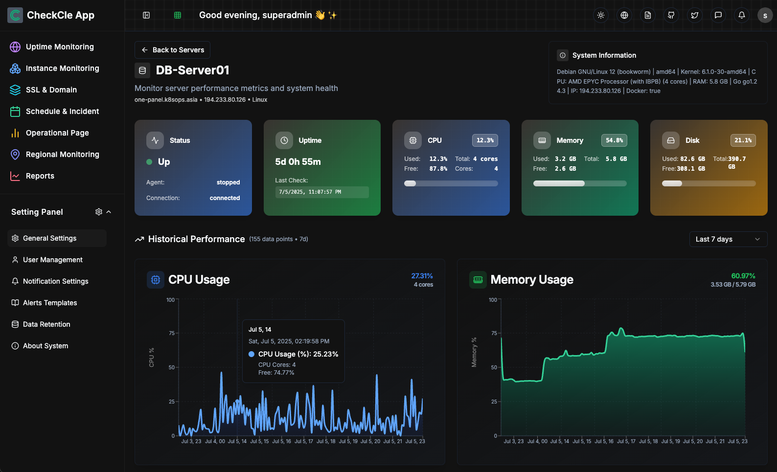
|
||||
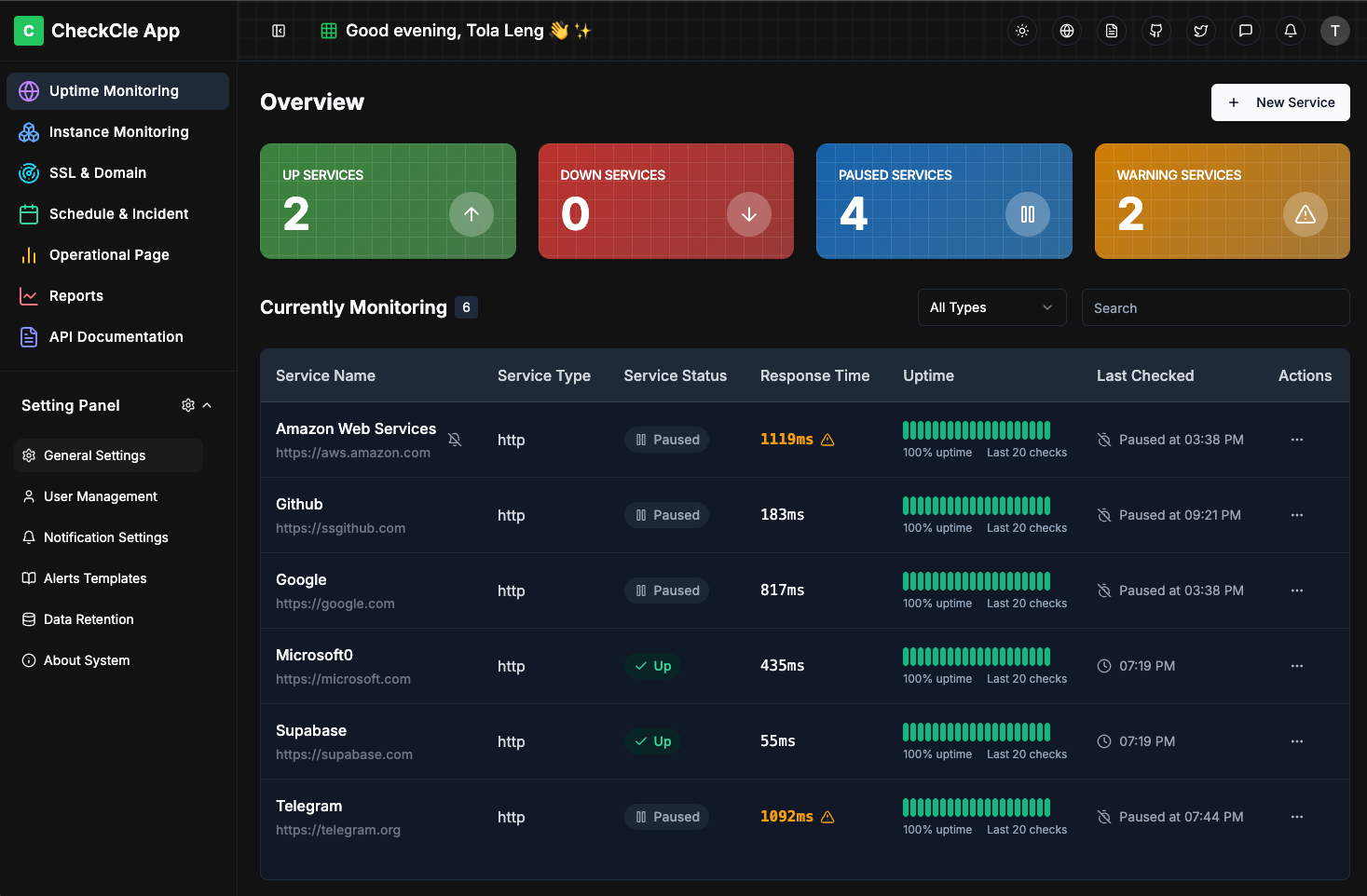
|
||||
|
||||
# 🚀 What is CheckCle?
|
||||
|
||||
@@ -45,22 +6,19 @@ CheckCle is an Open Source solution for seamless, real-time monitoring of full-s
|
||||
|
||||
## 🎯 Live Demo
|
||||
👉 **Try it now:** [CheckCle Live Demo](https://demo.checkcle.io)
|
||||
User: admin@example.com | Passwd: Admin123456
|
||||
|
||||
## 🌟 Core Features
|
||||
### 📝 Roadmap : [DEVELOPMENT_ROADMAP](docs/DEVELOPMENT_ROADMAP.md)
|
||||
|
||||
### Uptime Services & Infrastructure Server Monitoring
|
||||
- Monitor HTTP, DNS, and Ping protocols
|
||||
- Monitor TCP-based, API services (e.g., FTP, SMTP, HTTP)
|
||||
- Track detail uptime, response times, and performance issues
|
||||
- Distributed Regional Monitoring
|
||||
- Incident History (UP/DOWN/WARNING/PAUSE)
|
||||
- SSL & Domain Monitoring (Domain, Issuer, Expiration Date, Days Left, Status, Last Notified)
|
||||
- Infrastructure Server Monitoring, Supports Linux (🐧 Debian, Ubuntu, CentOS, Red Hat, etc.) and Windows (Beta). And Servers metrics like CPU, RAM, disk usage, and network activity) with an one-line installation angent script.
|
||||
- Schedule Maintenance & Incident Management
|
||||
- Operational Status / Public Status Pages
|
||||
- Notifications via email, Telegram, Discord, Slack, Matrix, and more
|
||||
- Notifications via email, Telegram, Discord, and Slack
|
||||
- Reports & Analytics
|
||||
- Settings Panel (User Management, Data Retention, Multi-language, Themes (Dark & Light Mode), Notification and channels and alert templates).
|
||||
|
||||
@@ -70,9 +28,26 @@ CheckCle is an Open Source solution for seamless, real-time monitoring of full-s
|
||||
* ✅ x86_64 PCs, laptops, servers (amd64)
|
||||
* ✅ Modern Raspberry Pi 3/4/5 with (64-bit OS), Apple Silicon Macs (arm64)
|
||||
|
||||
### Install CheckCle using one of the following methods:
|
||||
### Install CheckCle using one of the options below.
|
||||
|
||||
1. Install with Docker Compose Configuration (Recommended)
|
||||
|
||||
1. CheckCle One-Click Installation - Just copy and run on terminal
|
||||
```bash
|
||||
curl -fsSL https://checkcle.io/install.sh | bash
|
||||
|
||||
```
|
||||
2. Install with docker run. Just copy ready docker run command below
|
||||
```bash
|
||||
docker run -d \
|
||||
--name checkcle \
|
||||
--restart unless-stopped \
|
||||
-p 8090:8090 \
|
||||
-v /opt/pb_data:/mnt/pb_data \
|
||||
--ulimit nofile=4096:8192 \
|
||||
operacle/checkcle:latest
|
||||
|
||||
```
|
||||
3. Install with Docker compose Configuration.
|
||||
```bash
|
||||
|
||||
version: '3.9'
|
||||
@@ -92,18 +67,6 @@ services:
|
||||
hard: 8192
|
||||
|
||||
```
|
||||
2. Install with docker run. Just copy ready docker run command below
|
||||
```bash
|
||||
docker run -d \
|
||||
--name checkcle \
|
||||
--restart unless-stopped \
|
||||
-p 8090:8090 \
|
||||
-v /opt/pb_data:/mnt/pb_data \
|
||||
--ulimit nofile=4096:8192 \
|
||||
operacle/checkcle:latest
|
||||
|
||||
```
|
||||
|
||||
3. Admin Web Management
|
||||
|
||||
Default URL: http://0.0.0.0:8090
|
||||
@@ -113,12 +76,31 @@ docker run -d \
|
||||
4. Follow the Quick Start Guide at https://docs.checkcle.io
|
||||
|
||||
###
|
||||
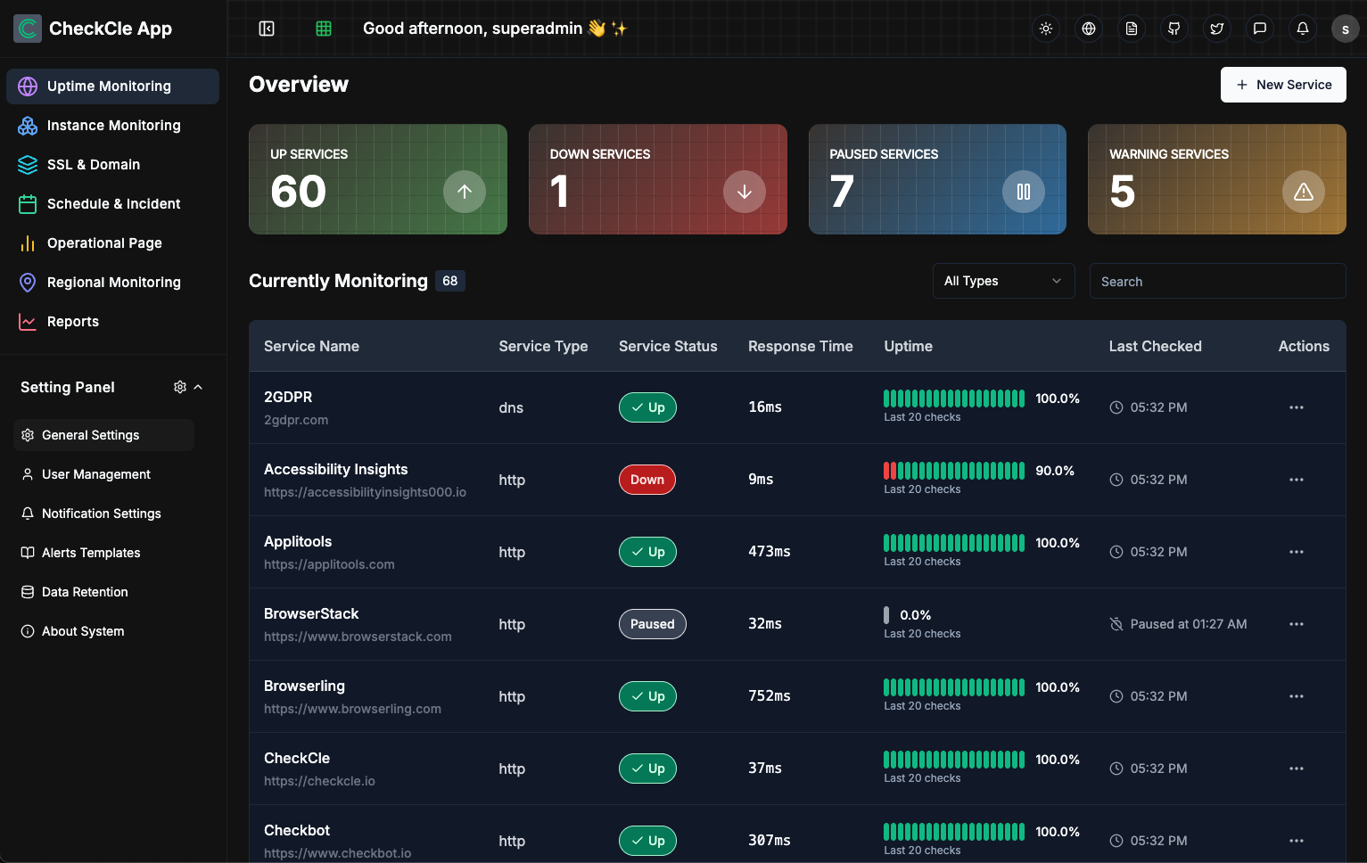
|
||||
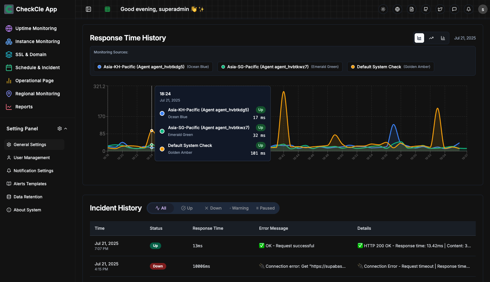
|
||||
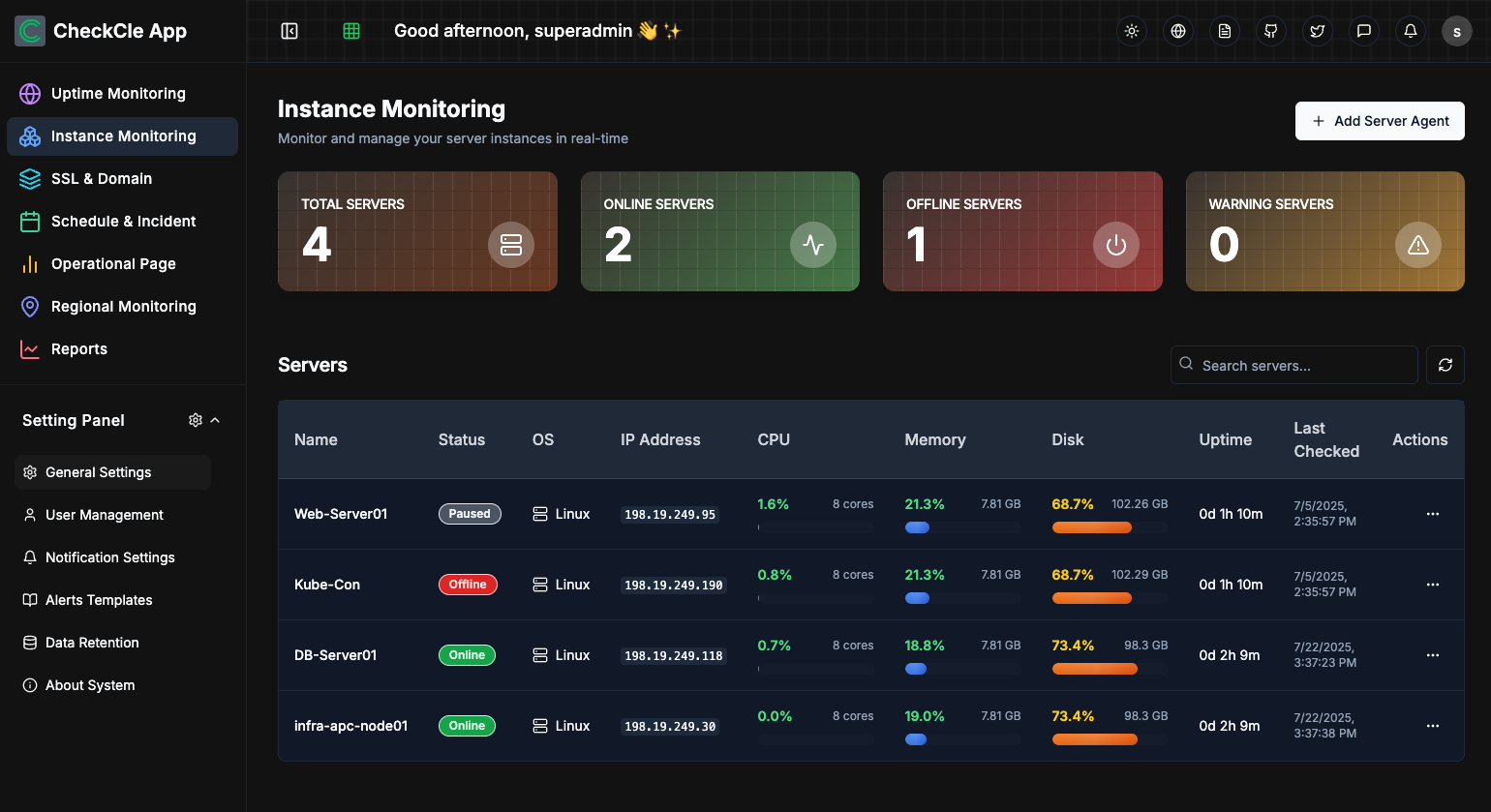
|
||||
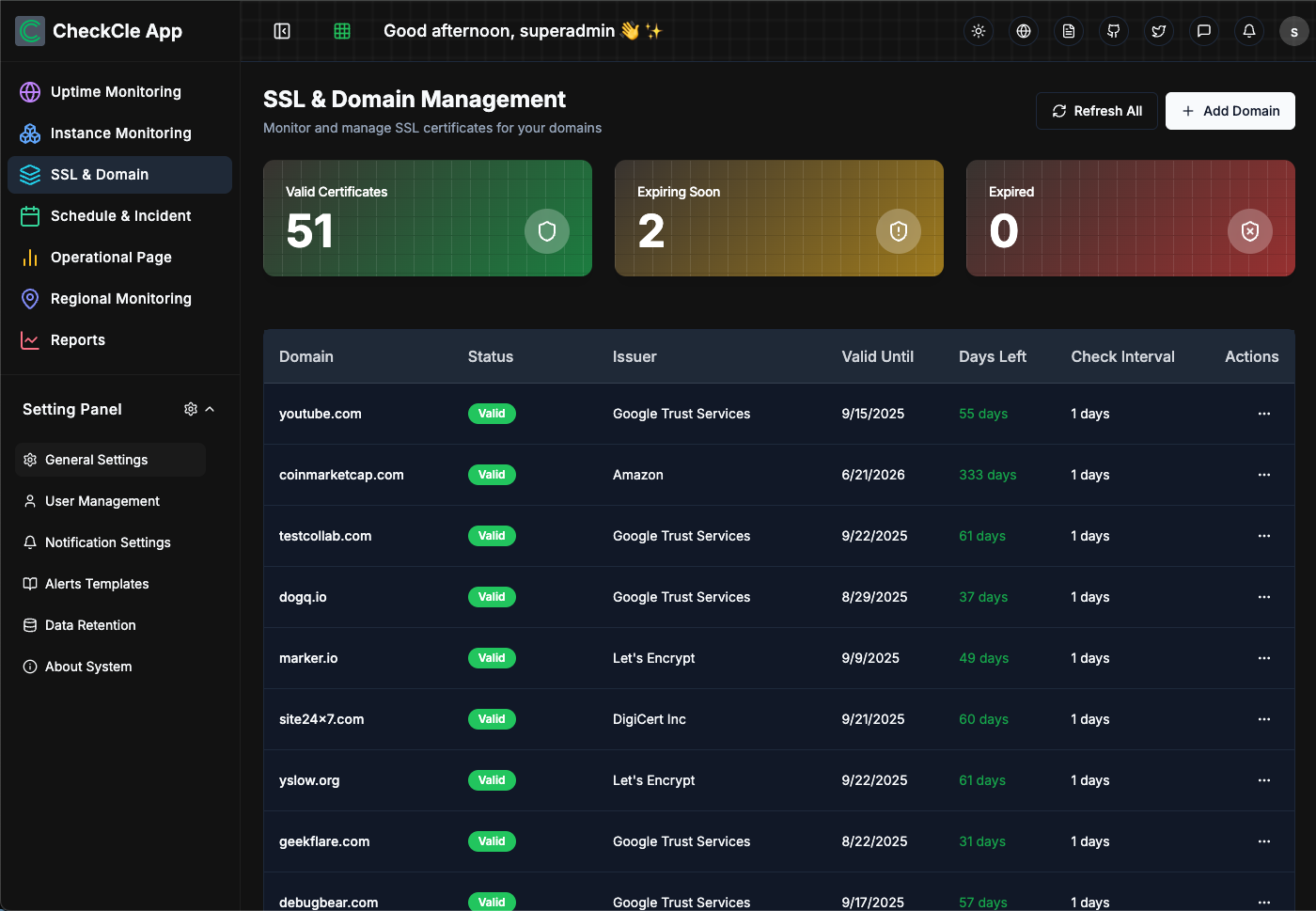
|
||||
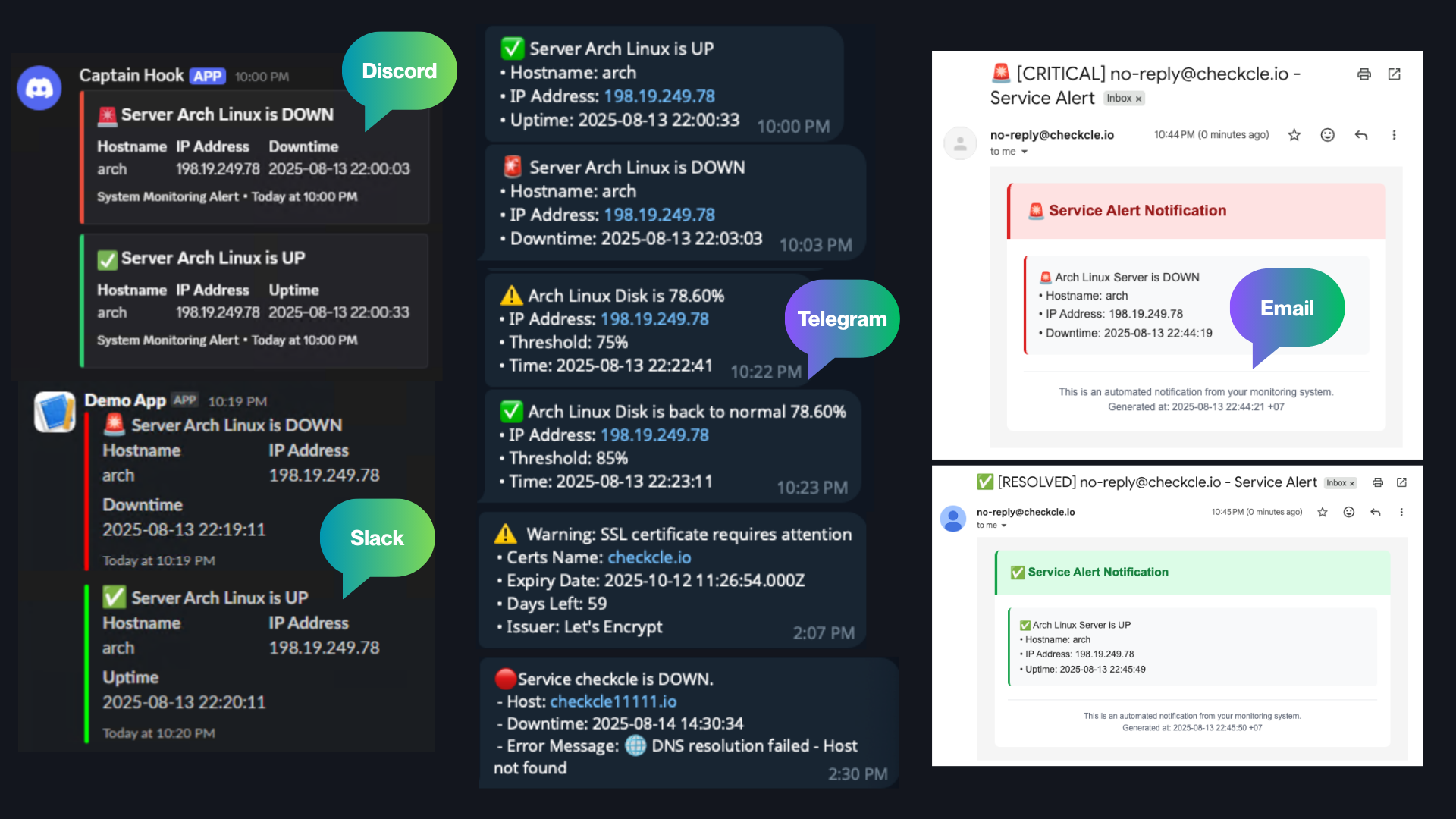
|
||||

|
||||
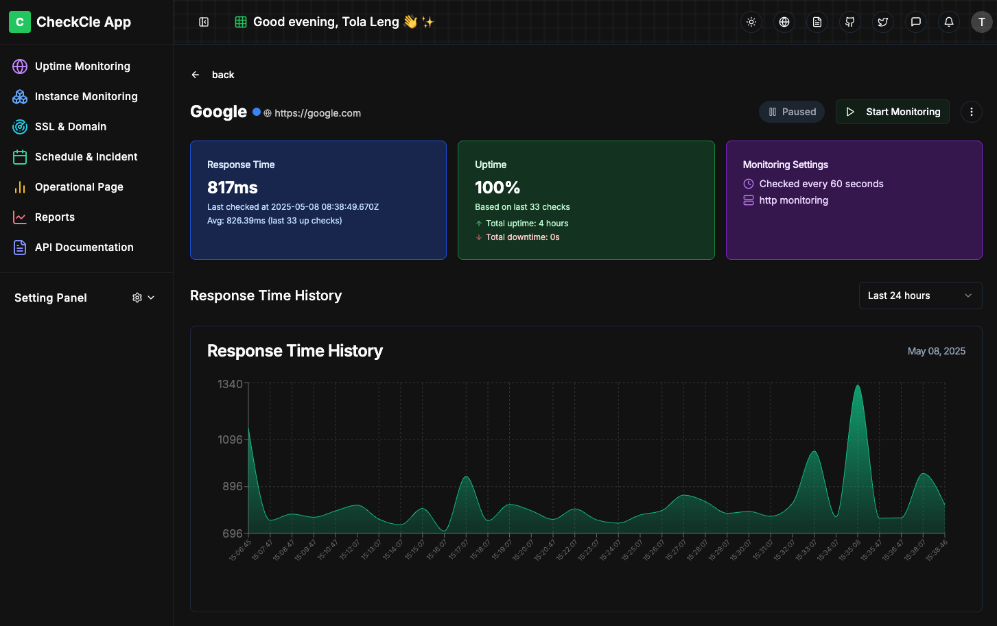
|
||||
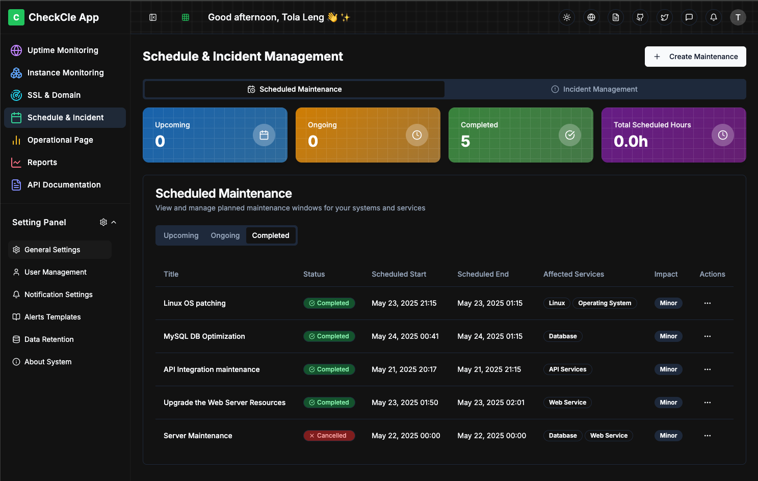
|
||||
|
||||
## 📝 Development Roadmap
|
||||
|
||||
- ✅ Health check & uptime monitoring (HTTP)
|
||||
- ✅ Dashboard UI with live stats
|
||||
- ✅ Auth with Multi-users system (admin)
|
||||
- ✅ Notifications (Telegram)
|
||||
- ✅ Docker containerization
|
||||
- ✅ CheckCle Website
|
||||
- ✅ CheckCle Demo Server
|
||||
- ✅ SSL & Domain Monitoring
|
||||
- ✅ Schedule Maintenance
|
||||
- ✅ Incident Management
|
||||
- [ ] Uptime monitoring (PING - Inprogress)
|
||||
- [ ] Infrastructure Server Monitoring
|
||||
- ✅ Operational Status / Public Status Pages
|
||||
- [ ] Uptime monitoring (TCP, PING, DNS)
|
||||
- ✅ System Setting Panel and Mail Settings
|
||||
- ✅ User Permission Roles
|
||||
- [ ] Notifications (Email/Slack/Discord/Signal)
|
||||
- ✅ Data Retention & Automate Strink (Muti Options to Shrink Data & Database )
|
||||
- ✅ Open-source release with full documentation
|
||||
|
||||
## 🌟 CheckCle for Communities?
|
||||
- **Built with Passion**: Created by an open-source enthusiast for the community
|
||||
@@ -127,48 +109,6 @@ docker run -d \
|
||||
|
||||
---
|
||||
|
||||
## Sponsors
|
||||
Sponsorships will no longer be accepted. From now on, support will only be accepted in the form of ecosystem and community partnerships that provide infrastructure such as cloud servers, domains, or hosting credits.
|
||||
|
||||
If you’re a tech company interested in supporting CheckCle, please contact the author directly at tolaleng@checkcle.io
|
||||
|
||||
### 🤝 Ecosystem & Community Partner
|
||||
<div style="display: flex; align-items: center; gap: 10px;">
|
||||
<a href="https://github.com/gitbookio">
|
||||
<img src="https://avatars.githubusercontent.com/u/7111340?s=200&v=4"
|
||||
width="75" height="75"
|
||||
style="border-radius: 50%;"
|
||||
alt="GitBook Logo" />
|
||||
</a>
|
||||
|
||||
<a href="https://www.cloudflare.com">
|
||||
<img src="https://cdn.checkcle.io/images/sponsor/cloudflare-checkcle_logo.png"
|
||||
height="60"
|
||||
alt="Cloudflare Logo" />
|
||||
</a>
|
||||
<a href="https://m.do.co/c/0c27ef82475f">
|
||||
<img src="https://cdn.checkcle.io/images/sponsor/digitalocean_checkcle.png"
|
||||
height="50"
|
||||
alt="DigitalOcean Logo" />
|
||||
</a>
|
||||
</a>
|
||||
<a href="https://www.jetbrains.com/">
|
||||
<img src="https://cdn.checkcle.io/images/sponsor/jetbrains.png"
|
||||
height="50"
|
||||
alt="Jetbrains Logo" />
|
||||
</a>
|
||||
</div>
|
||||
|
||||
---
|
||||
|
||||
|
||||
## 👥 Contributors
|
||||
Thank you for contributing and continuously making CheckCle better, you're awesome 🫶
|
||||
|
||||
[](https://github.com/operacle/checkcle/graphs/contributors)
|
||||
|
||||
---
|
||||
|
||||
## 🤝 Ways to Contribute
|
||||
|
||||
Here are some ways you can help improve CheckCle:
|
||||
@@ -177,18 +117,26 @@ Here are some ways you can help improve CheckCle:
|
||||
- 🌟 **Suggest Features** – Have an idea? Start a [Discussion](https://github.com/operacle/checkcle/discussions) or open a Feature Request issue.
|
||||
- 🛠 **Submit Pull Requests** – Improve the code, fix bugs, add features, or enhance the docs.
|
||||
- 📝 **Improve Documentation** – Even a typo fix helps!
|
||||
- 🌍 **Spread the Word** – Star ⭐ the [CheckCle](https://github.com/operacle/checkcle.git) repo, share it on socials, and invite others to contribute!
|
||||
- 🌍 **Spread the Word** – Star ⭐ the repo, share it on socials, and invite others to contribute!
|
||||
|
||||
---
|
||||
|
||||
## 🌍 Stay Connected
|
||||
- Website: [checkcle.io](https://checkcle.io)
|
||||
- Documentation: [docs.checkcle.io](https://docs.checkcle.io) | Big thanks to [GitBook](https://github.com/gitbookio) for sponsoring the OSS site plan for CheckCle!
|
||||
- Chat on Discord: Join our community [@discord](https://discord.gg/xs9gbubGwX)
|
||||
- Follow us on X: [@asqrm_io](https://x.com/asqrm_io)
|
||||
- Documentation: [docs.checkcle.io](https://docs.checkcle.io)
|
||||
- GitHub Repository: ⭐ [CheckCle](https://github.com/operacle/checkcle.git)
|
||||
- Community Channels: Engage via discussions and issues!
|
||||
- Discord: Join our community [@discord](https://discord.gg/xs9gbubGwX)
|
||||
- X: [@tlengoss](https://x.com/tlengoss)
|
||||
|
||||
## 📜 License
|
||||
|
||||
CheckCle is released under the MIT License.
|
||||
|
||||
---
|
||||
|
||||
## Star History
|
||||
|
||||
[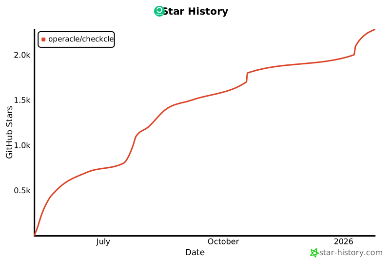](https://www.star-history.com/#operacle/checkcle&Date)
|
||||
|
||||
Stay informed, stay online, with CheckCle! 🌐
|
||||
|
||||
@@ -2,7 +2,7 @@
|
||||
|
||||
## 📦 Project: [checkcle](https://github.com/operacle/checkcle)
|
||||
|
||||
**checkcle** is a self-hosted uptime and server monitoring tool built with TypeScript and Go.
|
||||
**checkcle** is a lightweight, TypeScript-based built for uptime and server monitoring tools.
|
||||
|
||||
We care about the security and privacy of users running this project in production environments.
|
||||
|
||||
@@ -39,7 +39,6 @@ We support the latest stable release of `checkcle`. Security patches may also be
|
||||
|
||||
| Version | Supported |
|
||||
|---------|-----------|
|
||||
| `develop` (latest) | ✅ Yes |
|
||||
| `main` (latest) | ✅ Yes |
|
||||
| Older versions | ⚠️ Best-effort |
|
||||
| Pre-release or forks | ❌ No |
|
||||
@@ -48,21 +47,22 @@ We support the latest stable release of `checkcle`. Security patches may also be
|
||||
|
||||
## 🔍 Security Practices
|
||||
|
||||
CheckCle follows these practices to improve overall security:
|
||||
This project adheres to the following practices to enhance security:
|
||||
|
||||
- 🔎 Regular vulnerability scanning (npm audit for JavaScript dependencies, govulncheck for Go modules)
|
||||
- ⛓️ Dependency pinning (package-lock.json and Go modules)
|
||||
- ✅ Type-safe code in TypeScript and memory-safe design in Go
|
||||
- 🧪 Continuous testing and CI pipelines
|
||||
- 🔎 Regular vulnerability checks using `npm audit`
|
||||
- ⛓️ Dependency pinning via `package-lock.json`
|
||||
- ✅ Type-safe code using `TypeScript`
|
||||
- 🧪 Continuous testing and CI
|
||||
- 🔐 No data is stored or transmitted unless explicitly configured by the user
|
||||
- 🧑💻 All code contributions are reviewed before merging
|
||||
- 🧑💻 All contributions are reviewed before being merged
|
||||
|
||||
---
|
||||
|
||||
## ⚠️ Known Security Limitations
|
||||
|
||||
- Outbound HTTPS requests: CheckCle agents perform outbound HTTPS connections to send metric data to the backend server. Avoid deploying in untrusted or high-risk environments without appropriate network policies and monitoring.
|
||||
- The data may be lost upon system restarts or crashes. Always ensure that backup (pb_data) and recovery mechanisms are in place in production environments.
|
||||
- `checkcle` makes outbound HTTPS requests to check certificate details — avoid running in untrusted or high-risk environments without proper network policies.
|
||||
- Output may contain certificate metadata (e.g., CN, SANs, expiry dates) — avoid exposing this to public logs unless sanitized.
|
||||
- The data may be lost upon system restarts or crashes. Always ensure that backup and recovery mechanisms are in place in production environments.
|
||||
|
||||
---
|
||||
|
||||
|
||||
@@ -1,6 +0,0 @@
|
||||
.git
|
||||
node_modules
|
||||
dist
|
||||
.cache
|
||||
*.log
|
||||
|
||||
@@ -1,18 +0,0 @@
|
||||
# syntax=docker/dockerfile:1.7
|
||||
FROM node:20-bullseye-slim AS build
|
||||
WORKDIR /app
|
||||
ENV npm_config_fund=false \
|
||||
npm_config_audit=false \
|
||||
npm_config_progress=false
|
||||
COPY package.json package-lock.json ./
|
||||
RUN --mount=type=cache,target=/root/.npm npm ci --no-audit --fund=false
|
||||
COPY . .
|
||||
RUN --mount=type=cache,target=/root/.npm npm run build
|
||||
|
||||
FROM nginx:1.27-alpine
|
||||
RUN rm -rf /usr/share/nginx/html/*
|
||||
COPY --from=build /app/dist /usr/share/nginx/html
|
||||
# SPA fallback + asset caching
|
||||
RUN printf 'server {\n listen 80;\n server_name _;\n root /usr/share/nginx/html;\n index index.html;\n location / { try_files $uri $uri/ /index.html; }\n location ~* \\.(?:js|css|png|jpg|jpeg|gif|svg|ico|woff2?)$ { expires 7d; add_header Cache-Control "public, max-age=604800, immutable"; try_files $uri =404; }\n}\n' > /etc/nginx/conf.d/default.conf
|
||||
EXPOSE 80
|
||||
CMD ["nginx","-g","daemon off;"]
|
||||
@@ -4,7 +4,7 @@
|
||||
<head>
|
||||
<meta charset="UTF-8" />
|
||||
<meta name="viewport" content="width=device-width, initial-scale=1.0" />
|
||||
<title>CheckCle</title>
|
||||
<title>CheckCle is an open-source monitoring stack</title>
|
||||
<meta name="description" content="An open-source monitoring platform offering real-time insights into server and service health, incident management, and operational transparency." />
|
||||
<meta name="author" content="Tola Leng" />
|
||||
|
||||
@@ -14,12 +14,13 @@
|
||||
<meta property="og:image" content="https://pub-4a4062303020445f8f289a2fee84f9e8.r2.dev/images/checkcle-black.png" />
|
||||
|
||||
<meta name="twitter:card" content="summary_large_image" />
|
||||
<meta name="twitter:site" content="@checkcle_oss" />
|
||||
<meta name="twitter:site" content="@tlengoss" />
|
||||
<meta name="twitter:image" content="https://pub-4a4062303020445f8f289a2fee84f9e8.r2.dev/images/checkcle-black.png" />
|
||||
</head>
|
||||
|
||||
<body>
|
||||
<div id="root"></div>
|
||||
<!-- IMPORTANT: DO NOT REMOVE THIS SCRIPT TAG OR THIS VERY COMMENT! -->
|
||||
<script type="module" src="/src/main.tsx"></script>
|
||||
</body>
|
||||
</html>
|
||||
|
||||
@@ -50,7 +50,7 @@
|
||||
"jspdf-autotable": "^5.0.2",
|
||||
"lucide-react": "^0.462.0",
|
||||
"next-themes": "^0.3.0",
|
||||
"pocketbase": "^0.26.8",
|
||||
"pocketbase": "^0.19.0",
|
||||
"react": "^18.3.1",
|
||||
"react-day-picker": "^8.10.1",
|
||||
"react-dom": "^18.3.1",
|
||||
|
||||
|
Before Width: | Height: | Size: 57 KiB After Width: | Height: | Size: 45 KiB |
|
Before Width: | Height: | Size: 49 KiB |

|
Before Width: | Height: | Size: 35 KiB |

|
Before Width: | Height: | Size: 20 KiB |

|
Before Width: | Height: | Size: 34 KiB |

|
Before Width: | Height: | Size: 80 KiB |

|
Before Width: | Height: | Size: 250 B |

|
Before Width: | Height: | Size: 83 KiB |

|
Before Width: | Height: | Size: 33 KiB |

|
Before Width: | Height: | Size: 27 KiB |

|
Before Width: | Height: | Size: 42 KiB |

|
Before Width: | Height: | Size: 25 KiB |

|
Before Width: | Height: | Size: 24 KiB |

|
Before Width: | Height: | Size: 24 KiB |

|
Before Width: | Height: | Size: 2.3 KiB |

|
Before Width: | Height: | Size: 58 KiB |

|
Before Width: | Height: | Size: 42 KiB |

|
Before Width: | Height: | Size: 39 KiB |

|
Before Width: | Height: | Size: 58 KiB |

|
Before Width: | Height: | Size: 13 KiB |

|
Before Width: | Height: | Size: 47 KiB |

|
Before Width: | Height: | Size: 6.0 KiB |
@@ -1,71 +1,63 @@
|
||||
import React, { useState } from 'react';
|
||||
import { BrowserRouter, Routes, Route } from 'react-router-dom';
|
||||
|
||||
import React from 'react';
|
||||
import { BrowserRouter as Router, Routes, Route } from 'react-router-dom';
|
||||
import { QueryClient, QueryClientProvider } from '@tanstack/react-query';
|
||||
import { Toaster } from '@/components/ui/sonner';
|
||||
import { ThemeProvider } from '@/contexts/ThemeContext';
|
||||
import { LanguageProvider } from '@/contexts/LanguageContext';
|
||||
import { SidebarProvider } from '@/contexts/SidebarContext';
|
||||
import { ErrorBoundary } from '@/components/ErrorBoundary';
|
||||
|
||||
import { ThemeProvider } from './contexts/ThemeContext';
|
||||
import { LanguageProvider } from './contexts/LanguageContext';
|
||||
import { SidebarProvider } from './contexts/SidebarContext';
|
||||
// Pages
|
||||
import Index from '@/pages/Index';
|
||||
import Login from '@/pages/Login';
|
||||
import Dashboard from '@/pages/Dashboard';
|
||||
import ServiceDetail from '@/pages/ServiceDetail';
|
||||
import Profile from '@/pages/Profile';
|
||||
import Settings from '@/pages/Settings';
|
||||
import OperationalPage from '@/pages/OperationalPage';
|
||||
import ScheduleIncident from '@/pages/ScheduleIncident';
|
||||
import SslDomain from '@/pages/SslDomain';
|
||||
import PublicStatusPage from '@/pages/PublicStatusPage';
|
||||
import NotFound from '@/pages/NotFound';
|
||||
|
||||
import Index from './pages/Index';
|
||||
import Login from './pages/Login';
|
||||
import Dashboard from './pages/Dashboard';
|
||||
import InstanceMonitoring from './pages/InstanceMonitoring';
|
||||
import ContainerMonitoring from './pages/ContainerMonitoring';
|
||||
import ServiceDetail from './pages/ServiceDetail';
|
||||
import SslDomain from './pages/SslDomain';
|
||||
import ScheduleIncident from './pages/ScheduleIncident';
|
||||
import OperationalPage from './pages/OperationalPage';
|
||||
import RegionalMonitoring from './pages/RegionalMonitoring';
|
||||
import Settings from './pages/Settings';
|
||||
import Profile from './pages/Profile';
|
||||
import NotFound from './pages/NotFound';
|
||||
import PublicStatusPage from './pages/PublicStatusPage';
|
||||
import { ProtectedRoute } from './components/auth/ProtectedRoute';
|
||||
import ServerDetail from './pages/ServerDetail';
|
||||
const queryClient = new QueryClient({
|
||||
defaultOptions: {
|
||||
queries: {
|
||||
retry: 1,
|
||||
refetchOnWindowFocus: false,
|
||||
},
|
||||
},
|
||||
});
|
||||
|
||||
function App() {
|
||||
const [queryClient] = useState(() => new QueryClient({
|
||||
defaultOptions: {
|
||||
queries: {
|
||||
staleTime: 60 * 1000
|
||||
}
|
||||
}
|
||||
}));
|
||||
|
||||
return (
|
||||
<BrowserRouter>
|
||||
<QueryClientProvider client={queryClient}>
|
||||
<ThemeProvider>
|
||||
<LanguageProvider>
|
||||
<SidebarProvider>
|
||||
<QueryClientProvider client={queryClient}>
|
||||
<ErrorBoundary>
|
||||
<Router>
|
||||
<Routes>
|
||||
<Route path="/" element={<Index />} />
|
||||
<Route path="/login" element={<Login />} />
|
||||
<Route path="/dashboard" element={<Dashboard />} />
|
||||
<Route path="/service/:id" element={<ServiceDetail />} />
|
||||
<Route path="/profile" element={<Profile />} />
|
||||
<Route path="/settings" element={<Settings />} />
|
||||
<Route path="/operational-page" element={<OperationalPage />} />
|
||||
<Route path="/schedule-incident" element={<ScheduleIncident />} />
|
||||
<Route path="/ssl-domain" element={<SslDomain />} />
|
||||
<Route path="/status/:slug" element={<PublicStatusPage />} />
|
||||
<Route path="*" element={<NotFound />} />
|
||||
</Routes>
|
||||
</Router>
|
||||
<Toaster />
|
||||
<Routes>
|
||||
{/* Public routes */}
|
||||
<Route path="/public/:slug" element={<PublicStatusPage />} />
|
||||
|
||||
{/* Protected routes */}
|
||||
<Route path="/login" element={<Login />} />
|
||||
<Route path="/" element={<ProtectedRoute><Index /></ProtectedRoute>} />
|
||||
<Route path="/dashboard" element={<ProtectedRoute><Dashboard /></ProtectedRoute>} />
|
||||
<Route path="/instance-monitoring" element={<ProtectedRoute><InstanceMonitoring /></ProtectedRoute>} />
|
||||
<Route path="/server-detail/:serverId" element={<ProtectedRoute><ServerDetail /></ProtectedRoute>} />
|
||||
<Route path="/container-monitoring" element={<ProtectedRoute><ContainerMonitoring /></ProtectedRoute>} />
|
||||
<Route path="/container-monitoring/:serverId" element={<ProtectedRoute><ContainerMonitoring /></ProtectedRoute>} />
|
||||
<Route path="/service/:id" element={<ProtectedRoute><ServiceDetail /></ProtectedRoute>} />
|
||||
<Route path="/ssl-domain" element={<ProtectedRoute><SslDomain /></ProtectedRoute>} />
|
||||
<Route path="/schedule-incident" element={<ProtectedRoute><ScheduleIncident /></ProtectedRoute>} />
|
||||
<Route path="/operational-page" element={<ProtectedRoute><OperationalPage /></ProtectedRoute>} />
|
||||
<Route path="/regional-monitoring" element={<ProtectedRoute><RegionalMonitoring /></ProtectedRoute>} />
|
||||
<Route path="/settings" element={<ProtectedRoute><Settings /></ProtectedRoute>} />
|
||||
<Route path="/profile" element={<ProtectedRoute><Profile /></ProtectedRoute>} />
|
||||
<Route path="*" element={<NotFound />} />
|
||||
</Routes>
|
||||
</QueryClientProvider>
|
||||
</ErrorBoundary>
|
||||
</SidebarProvider>
|
||||
</LanguageProvider>
|
||||
</ThemeProvider>
|
||||
</BrowserRouter>
|
||||
</QueryClientProvider>
|
||||
);
|
||||
}
|
||||
|
||||
|
||||
@@ -11,19 +11,19 @@ const api = {
|
||||
* Handle API requests
|
||||
*/
|
||||
async handleRequest(path, method, body) {
|
||||
// console.log(`API request: ${method} ${path}`, body);
|
||||
console.log(`API request: ${method} ${path}`, body);
|
||||
|
||||
// Route to the appropriate handler
|
||||
if (path === '/api/realtime') {
|
||||
// console.log("Routing to realtime handler");
|
||||
console.log("Routing to realtime handler");
|
||||
return await realtime(body);
|
||||
} else if (path === '/api/settings' || path.startsWith('/api/settings/')) {
|
||||
// console.log("Routing to settings handler");
|
||||
console.log("Routing to settings handler");
|
||||
return await settingsApi(body, path);
|
||||
}
|
||||
|
||||
// Return 404 for unknown routes
|
||||
// console.error(`Endpoint not found: ${path}`);
|
||||
console.error(`Endpoint not found: ${path}`);
|
||||
return {
|
||||
status: 404,
|
||||
json: {
|
||||
@@ -40,7 +40,7 @@ const originalFetch = window.fetch;
|
||||
window.fetch = async (url, options = {}) => {
|
||||
// Check if this is an API request to our mock endpoints
|
||||
if (typeof url === 'string' && url.startsWith('/api/')) {
|
||||
// console.log('Intercepting API request:', url, options);
|
||||
console.log('Intercepting API request:', url, options);
|
||||
|
||||
try {
|
||||
let body = {};
|
||||
|
||||
@@ -2,7 +2,7 @@
|
||||
// This file handles realtime notifications in a client-side environment
|
||||
// In a production app, this would be a server-side endpoint
|
||||
|
||||
//console.log("API Realtime endpoint loaded");
|
||||
console.log("API Realtime endpoint loaded");
|
||||
|
||||
// Simple implementation that simulates sending notifications
|
||||
export default async function handler(req) {
|
||||
|
||||
@@ -3,7 +3,7 @@ import { getAuthHeaders, getBaseUrl, validateEmail } from '../utils';
|
||||
import { SettingsApiResponse } from '../types';
|
||||
|
||||
const createEmailTemplate = (template: string, data: any): { subject: string; htmlBody: string } => {
|
||||
let subject = 'Test Email from CheckCle';
|
||||
let subject = 'Test Email from ReamStack';
|
||||
let htmlBody = `
|
||||
<html>
|
||||
<body style="font-family: Arial, sans-serif; line-height: 1.6; color: #333;">
|
||||
@@ -13,7 +13,7 @@ const createEmailTemplate = (template: string, data: any): { subject: string; ht
|
||||
<p>If you received this email, your SMTP configuration is working correctly.</p>
|
||||
<hr style="border: none; border-top: 1px solid #eee; margin: 20px 0;">
|
||||
<p style="font-size: 12px; color: #666;">
|
||||
Sent from CheckCle Monitoring System<br>
|
||||
Sent from ReamStack Monitoring System<br>
|
||||
Template: ${template}<br>
|
||||
${data.collection ? `Collection: ${data.collection}` : ''}
|
||||
</p>
|
||||
@@ -24,7 +24,7 @@ const createEmailTemplate = (template: string, data: any): { subject: string; ht
|
||||
|
||||
switch (template) {
|
||||
case 'verification':
|
||||
subject = 'Email Verification Test - CheckCle';
|
||||
subject = 'Email Verification Test - ReamStack';
|
||||
htmlBody = `
|
||||
<html>
|
||||
<body style="font-family: Arial, sans-serif; line-height: 1.6; color: #333;">
|
||||
@@ -37,14 +37,14 @@ const createEmailTemplate = (template: string, data: any): { subject: string; ht
|
||||
<p><strong>Collection:</strong> ${data.collection || '_superusers'}</p>
|
||||
</div>
|
||||
<hr style="border: none; border-top: 1px solid #eee; margin: 20px 0;">
|
||||
<p style="font-size: 12px; color: #666;">Sent from CheckCle Monitoring System</p>
|
||||
<p style="font-size: 12px; color: #666;">Sent from ReamStack Monitoring System</p>
|
||||
</div>
|
||||
</body>
|
||||
</html>
|
||||
`;
|
||||
break;
|
||||
case 'password-reset':
|
||||
subject = 'Password Reset Test - CheckCle';
|
||||
subject = 'Password Reset Test - ReamStack';
|
||||
htmlBody = `
|
||||
<html>
|
||||
<body style="font-family: Arial, sans-serif; line-height: 1.6; color: #333;">
|
||||
@@ -57,14 +57,14 @@ const createEmailTemplate = (template: string, data: any): { subject: string; ht
|
||||
<p><strong>Collection:</strong> ${data.collection || '_superusers'}</p>
|
||||
</div>
|
||||
<hr style="border: none; border-top: 1px solid #eee; margin: 20px 0;">
|
||||
<p style="font-size: 12px; color: #666;">Sent from CheckCle Monitoring System</p>
|
||||
<p style="font-size: 12px; color: #666;">Sent from ReamStack Monitoring System</p>
|
||||
</div>
|
||||
</body>
|
||||
</html>
|
||||
`;
|
||||
break;
|
||||
case 'email-change':
|
||||
subject = 'Email Change Confirmation Test - CheckCle';
|
||||
subject = 'Email Change Confirmation Test - ReamStack';
|
||||
htmlBody = `
|
||||
<html>
|
||||
<body style="font-family: Arial, sans-serif; line-height: 1.6; color: #333;">
|
||||
@@ -76,7 +76,7 @@ const createEmailTemplate = (template: string, data: any): { subject: string; ht
|
||||
<p><strong>Template:</strong> Email Change Confirmation</p>
|
||||
</div>
|
||||
<hr style="border: none; border-top: 1px solid #eee; margin: 20px 0;">
|
||||
<p style="font-size: 12px; color: #666;">Sent from CheckCle Monitoring System</p>
|
||||
<p style="font-size: 12px; color: #666;">Sent from ReamStack Monitoring System</p>
|
||||
</div>
|
||||
</body>
|
||||
</html>
|
||||
@@ -178,6 +178,10 @@ export const sendTestEmail = async (data: any): Promise<SettingsApiResponse> =>
|
||||
smtpPort: smtpSettings.port || 587
|
||||
});
|
||||
|
||||
// For now, we'll simulate a successful email send
|
||||
// In a real implementation, you would integrate with your email service here
|
||||
// This could be nodemailer, SendGrid, or your PocketBase email system
|
||||
|
||||
// Simulate processing time
|
||||
console.log('Simulating email send...');
|
||||
await new Promise(resolve => setTimeout(resolve, 1000));
|
||||
|
||||
@@ -2,7 +2,7 @@ import { getAuthHeaders, getBaseUrl, validateEmail } from '../utils';
|
||||
import { SettingsApiResponse } from '../types';
|
||||
|
||||
const createEmailTemplate = (template: string, data: any): { subject: string; htmlBody: string } => {
|
||||
let subject = 'Test Email from CheckCle';
|
||||
let subject = 'Test Email from ReamStack';
|
||||
let htmlBody = `
|
||||
<html>
|
||||
<body style="font-family: Arial, sans-serif; line-height: 1.6; color: #333;">
|
||||
@@ -12,7 +12,7 @@ const createEmailTemplate = (template: string, data: any): { subject: string; ht
|
||||
<p>If you received this email, your SMTP configuration is working correctly.</p>
|
||||
<hr style="border: none; border-top: 1px solid #eee; margin: 20px 0;">
|
||||
<p style="font-size: 12px; color: #666;">
|
||||
Sent from CheckCle Monitoring System<br>
|
||||
Sent from ReamStack Monitoring System<br>
|
||||
Template: ${template}<br>
|
||||
${data.collection ? `Collection: ${data.collection}` : ''}
|
||||
</p>
|
||||
@@ -23,7 +23,7 @@ const createEmailTemplate = (template: string, data: any): { subject: string; ht
|
||||
|
||||
switch (template) {
|
||||
case 'verification':
|
||||
subject = 'Email Verification Test - CheckCle';
|
||||
subject = 'Email Verification Test - ReamStack';
|
||||
htmlBody = `
|
||||
<html>
|
||||
<body style="font-family: Arial, sans-serif; line-height: 1.6; color: #333;">
|
||||
@@ -36,14 +36,14 @@ const createEmailTemplate = (template: string, data: any): { subject: string; ht
|
||||
<p><strong>Collection:</strong> ${data.collection || '_superusers'}</p>
|
||||
</div>
|
||||
<hr style="border: none; border-top: 1px solid #eee; margin: 20px 0;">
|
||||
<p style="font-size: 12px; color: #666;">Sent from CheckCle Monitoring System</p>
|
||||
<p style="font-size: 12px; color: #666;">Sent from ReamStack Monitoring System</p>
|
||||
</div>
|
||||
</body>
|
||||
</html>
|
||||
`;
|
||||
break;
|
||||
case 'password-reset':
|
||||
subject = 'Password Reset Test - CheckCle';
|
||||
subject = 'Password Reset Test - ReamStack';
|
||||
htmlBody = `
|
||||
<html>
|
||||
<body style="font-family: Arial, sans-serif; line-height: 1.6; color: #333;">
|
||||
@@ -56,14 +56,14 @@ const createEmailTemplate = (template: string, data: any): { subject: string; ht
|
||||
<p><strong>Collection:</strong> ${data.collection || '_superusers'}</p>
|
||||
</div>
|
||||
<hr style="border: none; border-top: 1px solid #eee; margin: 20px 0;">
|
||||
<p style="font-size: 12px; color: #666;">Sent from CheckCle Monitoring System</p>
|
||||
<p style="font-size: 12px; color: #666;">Sent from ReamStack Monitoring System</p>
|
||||
</div>
|
||||
</body>
|
||||
</html>
|
||||
`;
|
||||
break;
|
||||
case 'email-change':
|
||||
subject = 'Email Change Confirmation Test - CheckCle';
|
||||
subject = 'Email Change Confirmation Test - ReamStack';
|
||||
htmlBody = `
|
||||
<html>
|
||||
<body style="font-family: Arial, sans-serif; line-height: 1.6; color: #333;">
|
||||
@@ -75,7 +75,7 @@ const createEmailTemplate = (template: string, data: any): { subject: string; ht
|
||||
<p><strong>Template:</strong> Email Change Confirmation</p>
|
||||
</div>
|
||||
<hr style="border: none; border-top: 1px solid #eee; margin: 20px 0;">
|
||||
<p style="font-size: 12px; color: #666;">Sent from CheckCle Monitoring System</p>
|
||||
<p style="font-size: 12px; color: #666;">Sent from ReamStack Monitoring System</p>
|
||||
</div>
|
||||
</body>
|
||||
</html>
|
||||
|
||||
@@ -8,7 +8,7 @@ import { testEmail } from './actions/testEmail';
|
||||
* Settings API handler
|
||||
*/
|
||||
const settingsApi = async (body: any, path?: string) => {
|
||||
// console.log('Settings API called with path:', path, 'body:', body);
|
||||
console.log('Settings API called with path:', path, 'body:', body);
|
||||
|
||||
// Handle test email endpoint specifically
|
||||
if (path === '/api/settings/test/email') {
|
||||
@@ -18,7 +18,7 @@ const settingsApi = async (body: any, path?: string) => {
|
||||
|
||||
// Handle regular settings API with action-based routing
|
||||
const action = body?.action;
|
||||
// console.log('Settings API called with action:', action, 'data:', body?.data);
|
||||
console.log('Settings API called with action:', action, 'data:', body?.data);
|
||||
|
||||
switch (action) {
|
||||
case 'getSettings':
|
||||
|
||||
@@ -1,16 +0,0 @@
|
||||
|
||||
import { ReactNode } from 'react';
|
||||
import { Navigate } from 'react-router-dom';
|
||||
import { authService } from '@/services/authService';
|
||||
|
||||
interface ProtectedRouteProps {
|
||||
children: ReactNode;
|
||||
}
|
||||
|
||||
export const ProtectedRoute = ({ children }: ProtectedRouteProps) => {
|
||||
if (!authService.isAuthenticated()) {
|
||||
return <Navigate to="/login" replace />;
|
||||
}
|
||||
|
||||
return <>{children}</>;
|
||||
};
|
||||
@@ -7,7 +7,6 @@ import { StatusCards } from "./StatusCards";
|
||||
import { ServiceFilters } from "./ServiceFilters";
|
||||
import { ServicesTable } from "./ServicesTable";
|
||||
import { AddServiceDialog } from "@/components/services/AddServiceDialog";
|
||||
import { useLanguage } from "@/contexts/LanguageContext";
|
||||
|
||||
interface DashboardContentProps {
|
||||
services: Service[];
|
||||
@@ -16,7 +15,6 @@ interface DashboardContentProps {
|
||||
}
|
||||
|
||||
export const DashboardContent = ({ services, isLoading, error }: DashboardContentProps) => {
|
||||
const { t } = useLanguage();
|
||||
const [filter, setFilter] = useState<string>("all");
|
||||
const [searchTerm, setSearchTerm] = useState<string>("");
|
||||
const [isAddDialogOpen, setIsAddDialogOpen] = useState<boolean>(false);
|
||||
@@ -33,7 +31,7 @@ export const DashboardContent = ({ services, isLoading, error }: DashboardConten
|
||||
return (
|
||||
<div className="flex flex-col items-center justify-center h-full gap-4 text-foreground">
|
||||
<p>Error loading service data.</p>
|
||||
<Button onClick={() => window.location.reload()}>{t('retry')}</Button>
|
||||
<Button onClick={() => window.location.reload()}>Retry</Button>
|
||||
</div>
|
||||
);
|
||||
}
|
||||
@@ -42,12 +40,12 @@ export const DashboardContent = ({ services, isLoading, error }: DashboardConten
|
||||
<main className="flex-1 flex flex-col overflow-auto bg-background p-6 pb-0">
|
||||
<div className="flex flex-col flex-1">
|
||||
<div className="flex justify-between items-center mb-6">
|
||||
<h2 className="text-2xl font-bold text-foreground">{t('overview')}</h2>
|
||||
<h2 className="text-2xl font-bold text-foreground">Overview</h2>
|
||||
<Button
|
||||
className="text-primary-foreground"
|
||||
onClick={() => setIsAddDialogOpen(true)}
|
||||
>
|
||||
<Plus className="w-4 h-4 mr-2" /> {t('newService')}
|
||||
<Plus className="w-4 h-4 mr-2" /> New Service
|
||||
</Button>
|
||||
</div>
|
||||
|
||||
|
||||
@@ -1,59 +1,78 @@
|
||||
|
||||
import { Button } from "@/components/ui/button";
|
||||
import { AuthUser } from "@/services/authService";
|
||||
import { useTheme } from "@/contexts/ThemeContext";
|
||||
import {
|
||||
Moon, PanelLeft, PanelLeftClose, Sun, Globe, FileText,
|
||||
Github, Twitter, MessageSquare, Bell, User, Settings,
|
||||
LogOut, Menu, X
|
||||
} from "lucide-react";
|
||||
import { Moon, PanelLeft, PanelLeftClose, Sun, Globe, FileText, Github, Twitter, MessageSquare, Bell, User, Settings, LogOut, Grid3x3 } from "lucide-react";
|
||||
import { useLanguage } from "@/contexts/LanguageContext";
|
||||
import {
|
||||
DropdownMenu, DropdownMenuContent, DropdownMenuItem,
|
||||
DropdownMenuTrigger, DropdownMenuSeparator
|
||||
} from "@/components/ui/dropdown-menu";
|
||||
import { DropdownMenu, DropdownMenuContent, DropdownMenuItem, DropdownMenuTrigger, DropdownMenuSeparator } from "@/components/ui/dropdown-menu";
|
||||
import { useEffect, useState } from "react";
|
||||
import { Avatar, AvatarFallback, AvatarImage } from "@/components/ui/avatar";
|
||||
import { useNavigate } from "react-router-dom";
|
||||
import { useSystemSettings } from "@/hooks/useSystemSettings";
|
||||
import { useSidebar } from "@/contexts/SidebarContext";
|
||||
import { cn } from "@/lib/utils";
|
||||
import QuickActionsDialog from "./QuickActionsDialog";
|
||||
|
||||
interface HeaderProps {
|
||||
currentUser: AuthUser | null;
|
||||
onLogout: () => void;
|
||||
sidebarCollapsed: boolean;
|
||||
toggleSidebar: () => void;
|
||||
}
|
||||
|
||||
export const Header = ({
|
||||
currentUser,
|
||||
onLogout,
|
||||
sidebarCollapsed,
|
||||
toggleSidebar
|
||||
}: HeaderProps) => {
|
||||
const { theme, toggleTheme } = useTheme();
|
||||
const { language, setLanguage, t } = useLanguage();
|
||||
const { sidebarCollapsed, toggleSidebar, isMobileOpen, toggleMobileMenu } = useSidebar();
|
||||
const [greeting, setGreeting] = useState<string>("");
|
||||
const { systemName } = useSystemSettings();
|
||||
const navigate = useNavigate();
|
||||
const [quickActionsOpen, setQuickActionsOpen] = useState(false);
|
||||
|
||||
// Set greeting based on time of day
|
||||
useEffect(() => {
|
||||
const updateGreeting = () => {
|
||||
const hour = new Date().getHours();
|
||||
if (hour >= 5 && hour < 12) setGreeting(t("goodMorning"));
|
||||
else if (hour >= 12 && hour < 18) setGreeting(t("goodAfternoon"));
|
||||
else setGreeting(t("goodEvening"));
|
||||
if (hour >= 5 && hour < 12) {
|
||||
setGreeting(t("goodMorning"));
|
||||
} else if (hour >= 12 && hour < 18) {
|
||||
setGreeting(t("goodAfternoon"));
|
||||
} else {
|
||||
setGreeting(t("goodEvening"));
|
||||
}
|
||||
};
|
||||
updateGreeting();
|
||||
// Update greeting if language changes
|
||||
|
||||
// You could add a timer to update the greeting throughout the day
|
||||
// but that's typically unnecessary since most sessions aren't active across time periods
|
||||
}, [language, t]);
|
||||
|
||||
const avatarUrl = currentUser?.avatar || '';
|
||||
// Log avatar data for debugging
|
||||
useEffect(() => {
|
||||
if (currentUser) {
|
||||
console.log("Avatar URL in Header:", currentUser.avatar);
|
||||
}
|
||||
}, [currentUser]);
|
||||
|
||||
const openExternalLink = (url: string) => {
|
||||
window.open(url, '_blank');
|
||||
};
|
||||
// Prepare avatar URL - ensure it displays correctly if it's a local profile image
|
||||
let avatarUrl = '';
|
||||
if (currentUser?.avatar) {
|
||||
// If it's a relative path from the public folder, make sure it's resolved properly
|
||||
if (currentUser.avatar.startsWith('/upload/profile/')) {
|
||||
avatarUrl = currentUser.avatar;
|
||||
} else {
|
||||
avatarUrl = currentUser.avatar;
|
||||
}
|
||||
console.log("Final avatar URL:", avatarUrl);
|
||||
}
|
||||
|
||||
return (
|
||||
<header className="relative bg-background border-b border-border px-4 lg:px-6 flex justify-between items-center h-16 shrink-0 z-30 overflow-hidden">
|
||||
{/* Grid Pattern Overlay */}
|
||||
<div className="absolute inset-0 z-0 pointer-events-none opacity-20">
|
||||
<header className="relative bg-background border-b border-border px-6 flex justify-between items-center py-[12px] overflow-hidden">
|
||||
{/* Grid Pattern Overlay - Similar to StatusCards */}
|
||||
<div className="absolute inset-0 z-0">
|
||||
<div
|
||||
className="w-full h-full"
|
||||
style={{
|
||||
@@ -66,74 +85,29 @@ export const Header = ({
|
||||
</div>
|
||||
</div>
|
||||
|
||||
<div className="flex items-center gap-2 lg:gap-4 z-10">
|
||||
{/* Mobile Toggle */}
|
||||
<Button variant="ghost" size="icon" onClick={toggleMobileMenu} className="lg:hidden h-9 w-9">
|
||||
{isMobileOpen ? <X className="h-5 w-5" /> : <Menu className="h-5 w-5" />}
|
||||
</Button>
|
||||
|
||||
{/* Desktop Toggle */}
|
||||
<Button variant="ghost" size="icon" onClick={toggleSidebar} className="hidden lg:flex h-9 w-9">
|
||||
{/* Header Content */}
|
||||
<div className="flex items-center gap-4 z-10">
|
||||
<Button variant="ghost" size="icon" onClick={toggleSidebar} className="mr-2">
|
||||
{sidebarCollapsed ? <PanelLeft className="h-5 w-5" /> : <PanelLeftClose className="h-5 w-5" />}
|
||||
</Button>
|
||||
|
||||
<div className="flex items-center">
|
||||
<h1 className="text-sm lg:text-lg font-medium truncate max-w-[150px] lg:max-w-none">
|
||||
{greeting}, {currentUser?.name || currentUser?.email?.split('@')[0] || 'User'} 👋 ✨
|
||||
</h1>
|
||||
{/* Quick Actions Button */}
|
||||
<Button
|
||||
variant="ghost"
|
||||
size="icon"
|
||||
onClick={() => setQuickActionsOpen(true)}
|
||||
className="mr-2"
|
||||
>
|
||||
<Grid3x3 className="h-5 w-5 text-green-500" />
|
||||
</Button>
|
||||
|
||||
<div className="flex items-center space-x-2">
|
||||
<h1 className="text-lg font-medium">{greeting}, {currentUser?.name || currentUser?.email?.split('@')[0] || 'User'} 👋 ✨</h1>
|
||||
</div>
|
||||
</div>
|
||||
|
||||
<div className="flex items-center space-x-1 lg:space-x-3 z-10">
|
||||
{/* External Links - Hidden on small screens */}
|
||||
<div className="hidden md:flex items-center space-x-1 mr-2">
|
||||
<Button
|
||||
variant="outline"
|
||||
size="icon"
|
||||
className="rounded-full w-8 h-8 border-border"
|
||||
onClick={() => openExternalLink('https://docs.checkcle.io')}
|
||||
title={t("documentation")}
|
||||
>
|
||||
<FileText className="h-4 w-4" />
|
||||
</Button>
|
||||
<Button
|
||||
variant="outline"
|
||||
size="icon"
|
||||
className="rounded-full w-8 h-8 border-border"
|
||||
onClick={() => openExternalLink('https://github.com/operacle/checkcle')}
|
||||
title="GitHub"
|
||||
>
|
||||
<Github className="h-4 w-4" />
|
||||
</Button>
|
||||
<Button
|
||||
variant="outline"
|
||||
size="icon"
|
||||
className="rounded-full w-8 h-8 border-border"
|
||||
onClick={() => openExternalLink('https://x.com/checkcle_oss')}
|
||||
title="X (Twitter)"
|
||||
>
|
||||
<Twitter className="h-4 w-4" />
|
||||
</Button>
|
||||
<Button
|
||||
variant="outline"
|
||||
size="icon"
|
||||
className="rounded-full w-8 h-8 border-border"
|
||||
onClick={() => openExternalLink('https://discord.gg/xs9gbubGwX')}
|
||||
title="Discord"
|
||||
>
|
||||
<MessageSquare className="h-4 w-4" />
|
||||
</Button>
|
||||
<Button
|
||||
variant="outline"
|
||||
size="icon"
|
||||
className="rounded-full w-8 h-8 border-border"
|
||||
title={t("notifications")}
|
||||
>
|
||||
<Bell className="w-4 h-4" />
|
||||
</Button>
|
||||
</div>
|
||||
|
||||
<Button variant="outline" size="icon" className="rounded-full w-8 h-8 border-border hidden sm:flex" onClick={toggleTheme}>
|
||||
<div className="flex items-center space-x-4 z-10">
|
||||
<Button variant="outline" size="icon" className="rounded-full w-8 h-8 border-border" onClick={toggleTheme}>
|
||||
<span className="sr-only">Toggle theme</span>
|
||||
{theme === 'dark' ? <Sun className="w-4 h-4" /> : <Moon className="w-4 h-4" />}
|
||||
</Button>
|
||||
@@ -145,7 +119,7 @@ export const Header = ({
|
||||
<Globe className="w-4 h-4" />
|
||||
</Button>
|
||||
</DropdownMenuTrigger>
|
||||
<DropdownMenuContent align="end" className="w-40">
|
||||
<DropdownMenuContent align="end">
|
||||
<DropdownMenuItem onClick={() => setLanguage("en")} className={language === "en" ? "bg-accent" : ""}>
|
||||
{t("english")}
|
||||
</DropdownMenuItem>
|
||||
@@ -153,35 +127,79 @@ export const Header = ({
|
||||
{t("khmer")}
|
||||
</DropdownMenuItem>
|
||||
<DropdownMenuItem onClick={() => setLanguage("de")} className={language === "de" ? "bg-accent" : ""}>
|
||||
{t("german")}
|
||||
</DropdownMenuItem>
|
||||
<DropdownMenuItem onClick={() => setLanguage("ko")} className={language === "ko" ? "bg-accent" : ""}>
|
||||
{t("korean")}
|
||||
</DropdownMenuItem>
|
||||
<DropdownMenuItem onClick={() => setLanguage("ja")} className={language === "ja" ? "bg-accent" : ""}>
|
||||
{t("japanese")}
|
||||
</DropdownMenuItem>
|
||||
<DropdownMenuItem onClick={() => setLanguage("zhcn")} className={language === "zhcn" ? "bg-accent" : ""}>
|
||||
{t("simplifiedChinese")}
|
||||
{t("Deutsch")}
|
||||
</DropdownMenuItem>
|
||||
</DropdownMenuContent>
|
||||
</DropdownMenu>
|
||||
|
||||
<div className="h-8 w-px bg-border mx-1 hidden sm:block" />
|
||||
{/* Documentation */}
|
||||
<Button
|
||||
variant="outline"
|
||||
size="icon"
|
||||
className="rounded-full w-8 h-8 border-border"
|
||||
onClick={() => window.open("https://docs.checkcle.io", "_blank")}
|
||||
>
|
||||
<span className="sr-only">{t("documentation")}</span>
|
||||
<FileText className="w-4 h-4" />
|
||||
</Button>
|
||||
|
||||
{/* GitHub */}
|
||||
<Button
|
||||
variant="outline"
|
||||
size="icon"
|
||||
className="rounded-full w-8 h-8 border-border"
|
||||
onClick={() => window.open("https://github.com/operacle/checkcle", "_blank")}
|
||||
>
|
||||
<span className="sr-only">GitHub</span>
|
||||
<Github className="w-4 h-4" />
|
||||
</Button>
|
||||
|
||||
{/* X (Twitter) */}
|
||||
<Button
|
||||
variant="outline"
|
||||
size="icon"
|
||||
className="rounded-full w-8 h-8 border-border"
|
||||
onClick={() => window.open("https://x.com/tlengoss", "_blank")}
|
||||
>
|
||||
<span className="sr-only">X (Twitter)</span>
|
||||
<Twitter className="w-4 h-4" />
|
||||
</Button>
|
||||
|
||||
{/* Discord */}
|
||||
<Button
|
||||
variant="outline"
|
||||
size="icon"
|
||||
className="rounded-full w-8 h-8 border-border"
|
||||
onClick={() => window.open("https://discord.gg/xs9gbubGwX", "_blank")}
|
||||
>
|
||||
<span className="sr-only">Discord</span>
|
||||
<MessageSquare className="w-4 h-4" />
|
||||
</Button>
|
||||
|
||||
{/* Notifications */}
|
||||
<Button variant="outline" size="icon" className="rounded-full w-8 h-8 border-border">
|
||||
<span className="sr-only">{t("notifications")}</span>
|
||||
<Bell className="w-4 h-4" />
|
||||
</Button>
|
||||
|
||||
{/* User Profile Dropdown */}
|
||||
<DropdownMenu>
|
||||
<DropdownMenuTrigger asChild>
|
||||
<Avatar className="h-8 w-8 cursor-pointer border hover:ring-2 hover:ring-primary/20 transition-all">
|
||||
{avatarUrl ? <AvatarImage src={avatarUrl} alt="User" /> : <AvatarFallback className="bg-primary/20 text-primary">{currentUser?.name?.[0] || 'U'}</AvatarFallback>}
|
||||
<Avatar className="h-8 w-8 cursor-pointer ring-offset-background transition-colors hover:bg-accent hover:text-accent-foreground">
|
||||
{avatarUrl ? <AvatarImage src={avatarUrl} alt={currentUser?.name || currentUser?.email?.split('@')[0] || 'User'} /> : <AvatarFallback className="bg-primary/20 text-primary">
|
||||
{currentUser?.name?.[0] || currentUser?.email?.[0] || 'U'}
|
||||
</AvatarFallback>}
|
||||
</Avatar>
|
||||
</DropdownMenuTrigger>
|
||||
<DropdownMenuContent align="end" className="w-56">
|
||||
<div className="flex items-center gap-3 p-2">
|
||||
<Avatar className="h-10 w-10">
|
||||
{avatarUrl ? <AvatarImage src={avatarUrl} alt="User" /> : <AvatarFallback className="bg-primary/20 text-primary">{currentUser?.name?.[0] || 'U'}</AvatarFallback>}
|
||||
{avatarUrl ? <AvatarImage src={avatarUrl} alt={currentUser?.name || currentUser?.email?.split('@')[0] || 'User'} /> : <AvatarFallback className="bg-primary/20 text-primary">
|
||||
{currentUser?.name?.[0] || currentUser?.email?.[0] || 'U'}
|
||||
</AvatarFallback>}
|
||||
</Avatar>
|
||||
<div className="flex flex-col space-y-0.5">
|
||||
<span className="text-sm font-medium truncate">{currentUser?.name || 'User'}</span>
|
||||
<div className="flex flex-col space-y-1">
|
||||
<span className="font-medium">{currentUser?.name || 'User'}</span>
|
||||
<span className="text-xs text-muted-foreground truncate">{currentUser?.email}</span>
|
||||
</div>
|
||||
</div>
|
||||
@@ -202,6 +220,9 @@ export const Header = ({
|
||||
</DropdownMenuContent>
|
||||
</DropdownMenu>
|
||||
</div>
|
||||
|
||||
{/* Quick Actions Dialog */}
|
||||
<QuickActionsDialog isOpen={quickActionsOpen} setIsOpen={setQuickActionsOpen} />
|
||||
</header>
|
||||
);
|
||||
};
|
||||
@@ -0,0 +1,145 @@
|
||||
|
||||
import React from 'react';
|
||||
import {
|
||||
Dialog,
|
||||
DialogContent,
|
||||
DialogDescription,
|
||||
DialogHeader,
|
||||
DialogTitle,
|
||||
DialogClose
|
||||
} from "@/components/ui/dialog";
|
||||
import { Button } from "@/components/ui/button";
|
||||
import { X } from "lucide-react";
|
||||
import { useLanguage } from "@/contexts/LanguageContext";
|
||||
|
||||
interface QuickActionsDialogProps {
|
||||
isOpen: boolean;
|
||||
setIsOpen: (open: boolean) => void;
|
||||
}
|
||||
|
||||
export const QuickActionsDialog: React.FC<QuickActionsDialogProps> = ({ isOpen, setIsOpen }) => {
|
||||
const { t } = useLanguage();
|
||||
|
||||
return (
|
||||
<Dialog open={isOpen} onOpenChange={setIsOpen}>
|
||||
<DialogContent className="sm:max-w-[800px] bg-background max-h-[90vh] overflow-y-auto">
|
||||
<DialogClose className="absolute right-4 top-4">
|
||||
<X className="h-4 w-4" />
|
||||
<span className="sr-only">Close</span>
|
||||
</DialogClose>
|
||||
<DialogHeader>
|
||||
<DialogTitle className="text-xl font-bold">{t('quickActions')}</DialogTitle>
|
||||
<DialogDescription>
|
||||
{t('quickActionsDescription')}
|
||||
</DialogDescription>
|
||||
</DialogHeader>
|
||||
|
||||
<div className="grid grid-cols-1 md:grid-cols-3 gap-4 mt-4">
|
||||
{/* Website Monitoring Card */}
|
||||
<div className="border rounded-lg p-4 bg-card hover:shadow-md transition-shadow">
|
||||
<h3 className="font-semibold text-lg mb-2">{t('monitorWebsite')}</h3>
|
||||
<p className="text-sm text-muted-foreground mb-4">
|
||||
{t('monitorWebsiteDesc')}
|
||||
</p>
|
||||
<div className="space-y-2">
|
||||
<p className="text-sm font-medium">{t('quickTips')}:</p>
|
||||
<ul className="list-disc pl-5 text-sm space-y-1">
|
||||
<li>{t('monitorMultipleEndpoints')}</li>
|
||||
<li>{t('trackResponseTimes')}</li>
|
||||
<li>{t('setCustomAlerts')}</li>
|
||||
</ul>
|
||||
</div>
|
||||
</div>
|
||||
|
||||
{/* Server Monitoring Card */}
|
||||
<div className="border rounded-lg p-4 bg-card hover:shadow-md transition-shadow">
|
||||
<h3 className="font-semibold text-lg mb-2">{t('monitorServer')}</h3>
|
||||
<p className="text-sm text-muted-foreground mb-4">
|
||||
{t('monitorServerDesc')}
|
||||
</p>
|
||||
<div className="space-y-2">
|
||||
<p className="text-sm font-medium">{t('quickTips')}:</p>
|
||||
<ul className="list-disc pl-5 text-sm space-y-1">
|
||||
<li>{t('monitorCPURam')}</li>
|
||||
<li>{t('trackNetworkMetrics')}</li>
|
||||
<li>{t('viewProcesses')}</li>
|
||||
</ul>
|
||||
</div>
|
||||
</div>
|
||||
|
||||
{/* SSL Certificate Card */}
|
||||
<div className="border rounded-lg p-4 bg-card hover:shadow-md transition-shadow">
|
||||
<h3 className="font-semibold text-lg mb-2">{t('sslCertificate')}</h3>
|
||||
<p className="text-sm text-muted-foreground mb-4">
|
||||
{t('sslCertificateDesc')}
|
||||
</p>
|
||||
<div className="space-y-2">
|
||||
<p className="text-sm font-medium">{t('quickTips')}:</p>
|
||||
<ul className="list-disc pl-5 text-sm space-y-1">
|
||||
<li>{t('trackSSLExpiration')}</li>
|
||||
<li>{t('getEarlyRenewal')}</li>
|
||||
<li>{t('monitorMultipleDomains')}</li>
|
||||
</ul>
|
||||
</div>
|
||||
</div>
|
||||
|
||||
{/* Incidents Management Card */}
|
||||
<div className="border rounded-lg p-4 bg-card hover:shadow-md transition-shadow">
|
||||
<h3 className="font-semibold text-lg mb-2">{t('incidentsManagement')}</h3>
|
||||
<p className="text-sm text-muted-foreground mb-4">
|
||||
{t('incidentsManagementDesc')}
|
||||
</p>
|
||||
<div className="space-y-2">
|
||||
<p className="text-sm font-medium">{t('quickTips')}:</p>
|
||||
<ul className="list-disc pl-5 text-sm space-y-1">
|
||||
<li>{t('createTrackIncidents')}</li>
|
||||
<li>{t('assignIncidents')}</li>
|
||||
<li>{t('monitorResolution')}</li>
|
||||
</ul>
|
||||
</div>
|
||||
</div>
|
||||
|
||||
{/* Operational Status Card */}
|
||||
<div className="border rounded-lg p-4 bg-card hover:shadow-md transition-shadow">
|
||||
<h3 className="font-semibold text-lg mb-2">{t('operationalStatus')}</h3>
|
||||
<p className="text-sm text-muted-foreground mb-4">
|
||||
{t('operationalStatusDesc')}
|
||||
</p>
|
||||
<div className="space-y-2">
|
||||
<p className="text-sm font-medium">{t('quickTips')}:</p>
|
||||
<ul className="list-disc pl-5 text-sm space-y-1">
|
||||
<li>{t('createCustomStatus')}</li>
|
||||
<li>{t('displayRealTime')}</li>
|
||||
<li>{t('shareIncidentUpdates')}</li>
|
||||
</ul>
|
||||
</div>
|
||||
</div>
|
||||
|
||||
{/* Reports & Analytics Card */}
|
||||
<div className="border rounded-lg p-4 bg-card hover:shadow-md transition-shadow">
|
||||
<h3 className="font-semibold text-lg mb-2">{t('reportsAnalytics')}</h3>
|
||||
<p className="text-sm text-muted-foreground mb-4">
|
||||
{t('reportsAnalyticsDesc')}
|
||||
</p>
|
||||
<div className="space-y-2">
|
||||
<p className="text-sm font-medium">{t('quickTips')}:</p>
|
||||
<ul className="list-disc pl-5 text-sm space-y-1">
|
||||
<li>{t('generateUptimeReports')}</li>
|
||||
<li>{t('analyzePerformance')}</li>
|
||||
<li>{t('exportMonitoringData')}</li>
|
||||
</ul>
|
||||
</div>
|
||||
</div>
|
||||
</div>
|
||||
|
||||
<div className="flex justify-end mt-6">
|
||||
<Button variant="outline" onClick={() => setIsOpen(false)}>
|
||||
{t('close')}
|
||||
</Button>
|
||||
</div>
|
||||
</DialogContent>
|
||||
</Dialog>
|
||||
);
|
||||
};
|
||||
|
||||
export default QuickActionsDialog;
|
||||
@@ -3,7 +3,6 @@ import { Button } from "@/components/ui/button";
|
||||
import { Input } from "@/components/ui/input";
|
||||
import { Select, SelectTrigger, SelectValue, SelectContent, SelectItem } from "@/components/ui/select";
|
||||
import { Plus } from "lucide-react";
|
||||
import { useLanguage } from "@/contexts/LanguageContext";
|
||||
|
||||
interface ServiceFiltersProps {
|
||||
filter: string;
|
||||
@@ -20,11 +19,10 @@ export const ServiceFilters = ({
|
||||
setSearchTerm,
|
||||
servicesCount
|
||||
}: ServiceFiltersProps) => {
|
||||
const { t } = useLanguage();
|
||||
return (
|
||||
<div className="mb-6 flex justify-between items-center">
|
||||
<div className="flex items-center">
|
||||
<h3 className="text-xl font-semibold mr-2 text-foreground">{t('currentlyMonitoring')}</h3>
|
||||
<h3 className="text-xl font-semibold mr-2 text-foreground">Currently Monitoring</h3>
|
||||
<span className="bg-secondary text-secondary-foreground px-2 py-0.5 rounded text-sm">
|
||||
{servicesCount}
|
||||
</span>
|
||||
@@ -32,10 +30,10 @@ export const ServiceFilters = ({
|
||||
<div className="flex space-x-4">
|
||||
<Select value={filter} onValueChange={setFilter}>
|
||||
<SelectTrigger className="w-40 bg-card border-border">
|
||||
<SelectValue placeholder={t('allTypes')} />
|
||||
<SelectValue placeholder="All Types" />
|
||||
</SelectTrigger>
|
||||
<SelectContent>
|
||||
<SelectItem value="all">{t('allTypes')}</SelectItem>
|
||||
<SelectItem value="all">All Types</SelectItem>
|
||||
<SelectItem value="HTTP">HTTP</SelectItem>
|
||||
<SelectItem value="PING">PING</SelectItem>
|
||||
<SelectItem value="TCP">TCP</SelectItem>
|
||||
@@ -45,7 +43,7 @@ export const ServiceFilters = ({
|
||||
<div className="relative">
|
||||
<Input
|
||||
className="w-72 bg-card border-border"
|
||||
placeholder={t('search')}
|
||||
placeholder="Search"
|
||||
value={searchTerm}
|
||||
onChange={(e) => setSearchTerm(e.target.value)}
|
||||
/>
|
||||
|
||||
@@ -1,44 +1,22 @@
|
||||
|
||||
import React from "react";
|
||||
import { useTheme } from "@/contexts/ThemeContext";
|
||||
import { SidebarHeader } from "./sidebar/SidebarHeader";
|
||||
import { MainNavigation } from "./sidebar/MainNavigation";
|
||||
import { SettingsPanel } from "./sidebar/SettingsPanel";
|
||||
import { useSidebar } from "@/contexts/SidebarContext";
|
||||
import { cn } from "@/lib/utils";
|
||||
|
||||
export const Sidebar = () => {
|
||||
interface SidebarProps {
|
||||
collapsed: boolean;
|
||||
}
|
||||
|
||||
export const Sidebar = ({ collapsed }: SidebarProps) => {
|
||||
const { theme } = useTheme();
|
||||
const { sidebarCollapsed, isMobileOpen, toggleMobileMenu } = useSidebar();
|
||||
|
||||
return (
|
||||
<>
|
||||
{/* Mobile Overlay */}
|
||||
{isMobileOpen && (
|
||||
<div
|
||||
className="fixed inset-0 bg-black/60 z-40 lg:hidden backdrop-blur-sm transition-opacity animate-in fade-in"
|
||||
onClick={toggleMobileMenu}
|
||||
/>
|
||||
)}
|
||||
|
||||
{/* Sidebar Container */}
|
||||
<aside
|
||||
className={cn(
|
||||
"fixed inset-y-0 left-0 z-50 lg:static lg:block transition-all duration-300 ease-in-out border-r flex flex-col h-full",
|
||||
theme === 'dark' ? 'bg-[#121212] border-[#1e1e1e]' : 'bg-sidebar border-sidebar-border',
|
||||
// Mobile state
|
||||
isMobileOpen ? "translate-x-0 w-64" : "-translate-x-full lg:translate-x-0",
|
||||
// Desktop state (collapsed/expanded)
|
||||
!isMobileOpen && sidebarCollapsed ? "lg:w-16" : "lg:w-64"
|
||||
)}
|
||||
>
|
||||
<SidebarHeader collapsed={!isMobileOpen && sidebarCollapsed} />
|
||||
|
||||
<div className="flex-1 overflow-y-auto overflow-x-hidden custom-scrollbar">
|
||||
<MainNavigation collapsed={!isMobileOpen && sidebarCollapsed} />
|
||||
</div>
|
||||
|
||||
<SettingsPanel collapsed={!isMobileOpen && sidebarCollapsed} />
|
||||
</aside>
|
||||
</>
|
||||
<div className={`${collapsed ? 'w-16' : 'w-64'} ${theme === 'dark' ? 'bg-[#121212] border-[#1e1e1e]' : 'bg-sidebar border-sidebar-border'} border-r flex flex-col transition-all duration-300 h-full`}>
|
||||
<SidebarHeader collapsed={collapsed} />
|
||||
<MainNavigation collapsed={collapsed} />
|
||||
<SettingsPanel collapsed={collapsed} />
|
||||
</div>
|
||||
);
|
||||
};
|
||||
@@ -3,15 +3,12 @@ import { Card, CardContent, CardHeader, CardTitle } from "@/components/ui/card";
|
||||
import { ArrowUp, ArrowDown, Pause, AlertTriangle } from "lucide-react";
|
||||
import { Service } from "@/services/serviceService";
|
||||
import { useTheme } from "@/contexts/ThemeContext";
|
||||
import {useLanguage} from "@/contexts/LanguageContext.tsx";
|
||||
|
||||
interface StatusCardsProps {
|
||||
services: Service[];
|
||||
}
|
||||
|
||||
export const StatusCards = ({ services }: StatusCardsProps) => {
|
||||
const { t } = useLanguage();
|
||||
|
||||
// Count services by status
|
||||
const upServices = services.filter(s => s.status === "up").length;
|
||||
const downServices = services.filter(s => s.status === "down").length;
|
||||
@@ -30,22 +27,22 @@ export const StatusCards = ({ services }: StatusCardsProps) => {
|
||||
} relative z-10`}
|
||||
style={{
|
||||
background: theme === 'dark'
|
||||
? "linear-gradient(135deg, rgba(65, 59, 55, 0.8) 0%, rgba(102, 187, 106, 0.6) 100%)"
|
||||
: "linear-gradient(135deg, rgba(65, 59, 55, 0.8) 0%, #66bb6a 100%)"
|
||||
? "linear-gradient(135deg, rgba(67, 160, 71, 0.8) 0%, rgba(102, 187, 106, 0.6) 100%)"
|
||||
: "linear-gradient(135deg, #43a047 0%, #66bb6a 100%)"
|
||||
}}
|
||||
>
|
||||
{/* Grid Pattern Overlay */}
|
||||
<div className="absolute inset-0 z-0 opacity-10">
|
||||
<div className="w-full h-full"
|
||||
style={{
|
||||
backgroundImage: `linear-gradient(#000 1px, transparent 1px),
|
||||
backgroundImage: `linear-gradient(#fff 1px, transparent 1px),
|
||||
linear-gradient(90deg, #fff 1px, transparent 1px)`,
|
||||
backgroundSize: '20px 20px'
|
||||
}}
|
||||
></div>
|
||||
</div>
|
||||
<CardHeader className="pb-2 relative z-10">
|
||||
<CardTitle className="text-sm font-medium text-white">{t("upServices")}</CardTitle>
|
||||
<CardTitle className="text-sm font-medium text-white">UP SERVICES</CardTitle>
|
||||
</CardHeader>
|
||||
<CardContent className="flex items-center justify-between relative z-10">
|
||||
<span className="text-5xl font-bold text-white">{upServices}</span>
|
||||
@@ -62,22 +59,22 @@ export const StatusCards = ({ services }: StatusCardsProps) => {
|
||||
} relative z-10`}
|
||||
style={{
|
||||
background: theme === 'dark'
|
||||
? "linear-gradient(135deg, rgba(65, 59, 55, 0.8) 0%, rgba(239, 83, 80, 0.6) 100%)"
|
||||
: "linear-gradient(135deg, rgba(65, 59, 55, 0.8) 0%, #ef5350 100%)"
|
||||
? "linear-gradient(135deg, rgba(229, 57, 53, 0.8) 0%, rgba(239, 83, 80, 0.6) 100%)"
|
||||
: "linear-gradient(135deg, #e53935 0%, #ef5350 100%)"
|
||||
}}
|
||||
>
|
||||
{/* Grid Pattern Overlay */}
|
||||
<div className="absolute inset-0 z-0 opacity-10">
|
||||
<div className="w-full h-full"
|
||||
style={{
|
||||
backgroundImage: `linear-gradient(#000 1px, transparent 1px),
|
||||
backgroundImage: `linear-gradient(#fff 1px, transparent 1px),
|
||||
linear-gradient(90deg, #fff 1px, transparent 1px)`,
|
||||
backgroundSize: '20px 20px'
|
||||
}}
|
||||
></div>
|
||||
</div>
|
||||
<CardHeader className="pb-2 relative z-10">
|
||||
<CardTitle className="text-sm font-medium text-white">{t("downServices")}</CardTitle>
|
||||
<CardTitle className="text-sm font-medium text-white">DOWN SERVICES</CardTitle>
|
||||
</CardHeader>
|
||||
<CardContent className="flex items-center justify-between relative z-10">
|
||||
<span className="text-5xl font-bold text-white">{downServices}</span>
|
||||
@@ -94,22 +91,22 @@ export const StatusCards = ({ services }: StatusCardsProps) => {
|
||||
} relative z-10`}
|
||||
style={{
|
||||
background: theme === 'dark'
|
||||
? "linear-gradient(135deg, rgba(65, 59, 55, 0.8) 0%, rgba(66, 165, 245, 0.6) 100%)"
|
||||
: "linear-gradient(135deg, rgba(65, 59, 55, 0.8) 0%, #42a5f5 100%)"
|
||||
? "linear-gradient(135deg, rgba(25, 118, 210, 0.8) 0%, rgba(66, 165, 245, 0.6) 100%)"
|
||||
: "linear-gradient(135deg, #1976d2 0%, #42a5f5 100%)"
|
||||
}}
|
||||
>
|
||||
{/* Grid Pattern Overlay */}
|
||||
<div className="absolute inset-0 z-0 opacity-10">
|
||||
<div className="w-full h-full"
|
||||
style={{
|
||||
backgroundImage: `linear-gradient(#000 1px, transparent 1px),
|
||||
backgroundImage: `linear-gradient(#fff 1px, transparent 1px),
|
||||
linear-gradient(90deg, #fff 1px, transparent 1px)`,
|
||||
backgroundSize: '20px 20px'
|
||||
}}
|
||||
></div>
|
||||
</div>
|
||||
<CardHeader className="pb-2 relative z-10">
|
||||
<CardTitle className="text-sm font-medium text-white">{t("pausedServices")}</CardTitle>
|
||||
<CardTitle className="text-sm font-medium text-white">PAUSED SERVICES</CardTitle>
|
||||
</CardHeader>
|
||||
<CardContent className="flex items-center justify-between relative z-10">
|
||||
<span className="text-5xl font-bold text-white">{pausedServices}</span>
|
||||
@@ -126,22 +123,22 @@ export const StatusCards = ({ services }: StatusCardsProps) => {
|
||||
} relative z-10`}
|
||||
style={{
|
||||
background: theme === 'dark'
|
||||
? "linear-gradient(135deg, rgba(65, 59, 55, 0.8) 0%, rgba(255, 183, 77, 0.6) 100%)"
|
||||
: "linear-gradient(135deg, rgba(65, 59, 55, 0.8) 0%, #ffb74d 100%)"
|
||||
? "linear-gradient(135deg, rgba(255, 152, 0, 0.8) 0%, rgba(255, 183, 77, 0.6) 100%)"
|
||||
: "linear-gradient(135deg, #ff9800 0%, #ffb74d 100%)"
|
||||
}}
|
||||
>
|
||||
{/* Grid Pattern Overlay */}
|
||||
<div className="absolute inset-0 z-0 opacity-10">
|
||||
<div className="w-full h-full"
|
||||
style={{
|
||||
backgroundImage: `linear-gradient(#000 1px, transparent 1px),
|
||||
backgroundImage: `linear-gradient(#fff 1px, transparent 1px),
|
||||
linear-gradient(90deg, #fff 1px, transparent 1px)`,
|
||||
backgroundSize: '20px 20px'
|
||||
}}
|
||||
></div>
|
||||
</div>
|
||||
<CardHeader className="pb-2 relative z-10">
|
||||
<CardTitle className="text-sm font-medium text-white">{t("warningServices")}</CardTitle>
|
||||
<CardTitle className="text-sm font-medium text-white">WARNING SERVICES</CardTitle>
|
||||
</CardHeader>
|
||||
<CardContent className="flex items-center justify-between relative z-10">
|
||||
<span className="text-5xl font-bold text-white">{warningServices}</span>
|
||||
|
||||
@@ -1,9 +1,9 @@
|
||||
|
||||
import React from "react";
|
||||
import { useLocation, useNavigate } from "react-router-dom";
|
||||
import { useTheme } from "@/contexts/ThemeContext";
|
||||
import { useLanguage } from "@/contexts/LanguageContext";
|
||||
import { LucideIcon } from "lucide-react";
|
||||
import { cn } from "@/lib/utils";
|
||||
|
||||
interface MenuItemProps {
|
||||
id: string;
|
||||
@@ -16,6 +16,7 @@ interface MenuItemProps {
|
||||
}
|
||||
|
||||
export const MenuItem: React.FC<MenuItemProps> = ({
|
||||
id,
|
||||
path,
|
||||
icon: Icon,
|
||||
translationKey,
|
||||
@@ -28,39 +29,26 @@ export const MenuItem: React.FC<MenuItemProps> = ({
|
||||
const location = useLocation();
|
||||
const navigate = useNavigate();
|
||||
|
||||
const isActive = path && location.pathname === path;
|
||||
|
||||
const handleClick = (e: React.MouseEvent) => {
|
||||
e.preventDefault();
|
||||
e.stopPropagation();
|
||||
|
||||
if (hasNavigation && path) {
|
||||
navigate(path);
|
||||
// Use navigate instead of window.location to prevent full page reload
|
||||
navigate(path, { replace: false });
|
||||
}
|
||||
};
|
||||
|
||||
const isActive = path && location.pathname === path;
|
||||
const mainIconSize = "h-6 w-6";
|
||||
|
||||
return (
|
||||
<div
|
||||
className={cn(
|
||||
"group relative flex items-center mb-1 rounded-lg cursor-pointer transition-all duration-200",
|
||||
collapsed ? "p-3 justify-center" : "p-2.5 px-4",
|
||||
isActive
|
||||
? (theme === 'dark' ? 'bg-zinc-800 text-white' : 'bg-primary/10 text-primary')
|
||||
: (theme === 'dark' ? 'text-zinc-400 hover:bg-zinc-800/50 hover:text-white' : 'text-zinc-600 hover:bg-zinc-100')
|
||||
)}
|
||||
className={`${collapsed ? 'p-3' : 'p-2 pl-3'} mb-1 rounded-lg ${isActive ? theme === 'dark' ? 'bg-gray-800' : 'bg-sidebar-accent' : `hover:${theme === 'dark' ? 'bg-gray-800' : 'bg-sidebar-accent'}`} flex items-center ${collapsed ? 'justify-center' : ''} transition-colors duration-200 cursor-pointer`}
|
||||
onClick={handleClick}
|
||||
title={collapsed ? t(translationKey) : ""}
|
||||
>
|
||||
<Icon className={cn("h-5 w-5 shrink-0 transition-colors", color, isActive ? "opacity-100" : "opacity-80 group-hover:opacity-100")} />
|
||||
|
||||
{!collapsed && (
|
||||
<span className="ml-3 font-medium tracking-wide text-sm truncate">
|
||||
{t(translationKey)}
|
||||
</span>
|
||||
)}
|
||||
|
||||
{/* Small Indicator for active state */}
|
||||
{isActive && !collapsed && (
|
||||
<div className="absolute left-0 w-1 h-6 bg-primary rounded-r-full" />
|
||||
)}
|
||||
<Icon className={`${mainIconSize} ${color}`} />
|
||||
{!collapsed && <span className="ml-2.5 font-medium text-foreground tracking-wide text-[15px]">{t(translationKey)}</span>}
|
||||
</div>
|
||||
);
|
||||
};
|
||||
@@ -11,12 +11,8 @@ export const SidebarHeader: React.FC<SidebarHeaderProps> = ({ collapsed }) => {
|
||||
|
||||
return (
|
||||
<div className={`p-4 ${theme === 'dark' ? 'border-[#1e1e1e]' : 'border-sidebar-border'} border-b flex items-center ${collapsed ? 'justify-center' : ''}`}>
|
||||
<div className="h-8 w-8 bg-gray-600 rounded flex items-center justify-center mr-2">
|
||||
<img
|
||||
src="/favicon_sidebar.ico"
|
||||
alt="CheckCle"
|
||||
className="h-6 w-6"
|
||||
/>
|
||||
<div className="h-8 w-8 bg-green-500 rounded flex items-center justify-center mr-2">
|
||||
<span className="text-white font-bold">C</span>
|
||||
</div>
|
||||
{!collapsed && <h1 className="text-xl font-semibold">CheckCle App</h1>}
|
||||
</div>
|
||||
|
||||
@@ -1,5 +1,5 @@
|
||||
|
||||
import { Globe, Boxes, Layers, Calendar, BarChart2, LineChart, MapPin, Settings, User, Bell, Database, Info, BookOpen } from "lucide-react";
|
||||
import { Globe, Boxes, Radar, Calendar, BarChart2, LineChart, FileText, Settings, User, Bell, Database, Info, BookOpen } from "lucide-react";
|
||||
|
||||
export const mainMenuItems = [
|
||||
{
|
||||
@@ -12,16 +12,16 @@ export const mainMenuItems = [
|
||||
},
|
||||
{
|
||||
id: 'instance-monitoring',
|
||||
path: '/instance-monitoring',
|
||||
path: null,
|
||||
icon: Boxes,
|
||||
translationKey: 'instanceMonitoring',
|
||||
color: 'text-blue-400',
|
||||
hasNavigation: true
|
||||
hasNavigation: false
|
||||
},
|
||||
{
|
||||
id: 'ssl-domain',
|
||||
path: '/ssl-domain',
|
||||
icon: Layers,
|
||||
icon: Radar,
|
||||
translationKey: 'sslDomain',
|
||||
color: 'text-cyan-400',
|
||||
hasNavigation: true
|
||||
@@ -42,14 +42,6 @@ export const mainMenuItems = [
|
||||
color: 'text-amber-400',
|
||||
hasNavigation: true
|
||||
},
|
||||
{
|
||||
id: 'regional-monitoring',
|
||||
path: '/regional-monitoring',
|
||||
icon: MapPin,
|
||||
translationKey: 'regionalMonitoring',
|
||||
color: 'text-indigo-400',
|
||||
hasNavigation: true
|
||||
},
|
||||
{
|
||||
id: 'reports',
|
||||
path: null,
|
||||
@@ -57,6 +49,14 @@ export const mainMenuItems = [
|
||||
translationKey: 'reports',
|
||||
color: 'text-rose-400',
|
||||
hasNavigation: false
|
||||
},
|
||||
{
|
||||
id: 'api-documentation',
|
||||
path: null,
|
||||
icon: FileText,
|
||||
translationKey: 'apiDocumentation',
|
||||
color: 'text-indigo-400',
|
||||
hasNavigation: false
|
||||
}
|
||||
];
|
||||
|
||||
|
||||
@@ -1,99 +0,0 @@
|
||||
|
||||
import { useState } from "react";
|
||||
import { Card, CardContent, CardHeader, CardTitle } from "@/components/ui/card";
|
||||
import { Table, TableBody } from "@/components/ui/table";
|
||||
import { DockerContainer } from "@/types/docker.types";
|
||||
import { DockerMetricsDialog } from "./DockerMetricsDialog";
|
||||
import { useLanguage } from "@/contexts/LanguageContext";
|
||||
import {
|
||||
DockerTableSearch,
|
||||
DockerTableHeader,
|
||||
DockerTableRow,
|
||||
DockerEmptyState
|
||||
} from "./table";
|
||||
|
||||
interface DockerContainersTableProps {
|
||||
containers: DockerContainer[];
|
||||
isLoading: boolean;
|
||||
onRefresh: () => void;
|
||||
}
|
||||
|
||||
export const DockerContainersTable = ({ containers, isLoading, onRefresh }: DockerContainersTableProps) => {
|
||||
const { t } = useLanguage();
|
||||
const [searchTerm, setSearchTerm] = useState("");
|
||||
const [selectedContainer, setSelectedContainer] = useState<DockerContainer | null>(null);
|
||||
const [metricsDialogOpen, setMetricsDialogOpen] = useState(false);
|
||||
|
||||
const filteredContainers = containers.filter(container =>
|
||||
container.name.toLowerCase().includes(searchTerm.toLowerCase()) ||
|
||||
container.docker_id.toLowerCase().includes(searchTerm.toLowerCase()) ||
|
||||
container.hostname.toLowerCase().includes(searchTerm.toLowerCase())
|
||||
);
|
||||
|
||||
const handleContainerAction = (action: string, containerId: string, containerName: string) => {
|
||||
console.log(`${action} action for container ${containerName} (${containerId})`);
|
||||
// TODO: Implement container actions
|
||||
};
|
||||
|
||||
const handleRowClick = (container: DockerContainer) => {
|
||||
setSelectedContainer(container);
|
||||
setMetricsDialogOpen(true);
|
||||
};
|
||||
|
||||
const handleViewMetrics = (container: DockerContainer) => {
|
||||
setSelectedContainer(container);
|
||||
setMetricsDialogOpen(true);
|
||||
};
|
||||
|
||||
return (
|
||||
<>
|
||||
<Card className="w-full bg-transparent border-0 shadow-none">
|
||||
<CardHeader className="pb-4 px-0">
|
||||
<div className="flex flex-col gap-4">
|
||||
<div className="flex flex-col sm:flex-row sm:items-center sm:justify-between gap-4">
|
||||
<CardTitle className="text-lg sm:text-xl font-semibold">{t('dockerContainers', 'docker')}</CardTitle>
|
||||
<DockerTableSearch
|
||||
searchTerm={searchTerm}
|
||||
onSearchChange={setSearchTerm}
|
||||
onRefresh={onRefresh}
|
||||
isLoading={isLoading}
|
||||
/>
|
||||
</div>
|
||||
</div>
|
||||
</CardHeader>
|
||||
<CardContent className="p-0">
|
||||
<div className="overflow-x-auto">
|
||||
<div className="min-w-full inline-block align-middle">
|
||||
<div className="overflow-hidden border border-border rounded-lg shadow-sm">
|
||||
<Table>
|
||||
<DockerTableHeader />
|
||||
<TableBody>
|
||||
{filteredContainers.length === 0 ? (
|
||||
<DockerEmptyState searchTerm={searchTerm} />
|
||||
) : (
|
||||
filteredContainers.map((container) => (
|
||||
<DockerTableRow
|
||||
key={container.id}
|
||||
container={container}
|
||||
onRowClick={handleRowClick}
|
||||
onContainerAction={handleContainerAction}
|
||||
onViewMetrics={handleViewMetrics}
|
||||
/>
|
||||
))
|
||||
)}
|
||||
</TableBody>
|
||||
</Table>
|
||||
</div>
|
||||
</div>
|
||||
</div>
|
||||
</CardContent>
|
||||
</Card>
|
||||
|
||||
<DockerMetricsDialog
|
||||
container={selectedContainer}
|
||||
open={metricsDialogOpen}
|
||||
onOpenChange={setMetricsDialogOpen}
|
||||
/>
|
||||
</>
|
||||
);
|
||||
};
|
||||
@@ -1,697 +0,0 @@
|
||||
import { useState, useEffect } from "react";
|
||||
import { useQuery } from "@tanstack/react-query";
|
||||
import { Dialog, DialogContent, DialogHeader, DialogTitle } from "@/components/ui/dialog";
|
||||
import { Card, CardContent, CardHeader, CardTitle } from "@/components/ui/card";
|
||||
import { Tabs, TabsContent, TabsList, TabsTrigger } from "@/components/ui/tabs";
|
||||
import { Select, SelectContent, SelectItem, SelectTrigger, SelectValue } from "@/components/ui/select";
|
||||
import { ChartContainer, ChartTooltip, ChartTooltipContent } from "@/components/ui/chart";
|
||||
import { LineChart, Line, XAxis, YAxis, CartesianGrid, ResponsiveContainer, AreaChart, Area } from "recharts";
|
||||
import { DockerContainer, DockerMetrics } from "@/types/docker.types";
|
||||
import { dockerService } from "@/services/dockerService";
|
||||
import { Loader2, Cpu, HardDrive, Network, MemoryStick } from "lucide-react";
|
||||
import { useTheme } from "@/contexts/ThemeContext";
|
||||
import { useLanguage } from "@/contexts/LanguageContext";
|
||||
|
||||
interface DockerMetricsDialogProps {
|
||||
container: DockerContainer | null;
|
||||
open: boolean;
|
||||
onOpenChange: (open: boolean) => void;
|
||||
}
|
||||
|
||||
type TimeRange = '60m' | '1d' | '7d' | '1m' | '3m';
|
||||
|
||||
const timeRangeOptions = [
|
||||
{ value: '60m' as TimeRange, label: 'minutes60', hours: 1 },
|
||||
{ value: '1d' as TimeRange, label: 'day1', hours: 24 },
|
||||
{ value: '7d' as TimeRange, label: 'days7', hours: 24 * 7 },
|
||||
{ value: '1m' as TimeRange, label: 'month1', hours: 24 * 30 },
|
||||
{ value: '3m' as TimeRange, label: 'months3', hours: 24 * 90 },
|
||||
];
|
||||
|
||||
export const DockerMetricsDialog = ({ container, open, onOpenChange }: DockerMetricsDialogProps) => {
|
||||
const [timeRange, setTimeRange] = useState<TimeRange>("1d");
|
||||
const { theme } = useTheme();
|
||||
const { t } = useLanguage();
|
||||
|
||||
const {
|
||||
data: metrics = [],
|
||||
isLoading,
|
||||
error
|
||||
} = useQuery({
|
||||
queryKey: ['docker-metrics', container?.docker_id, timeRange],
|
||||
queryFn: () => container ? dockerService.getContainerMetrics(container.docker_id) : Promise.resolve([]),
|
||||
enabled: !!container && open,
|
||||
refetchInterval: 30000
|
||||
});
|
||||
|
||||
const formatBytes = (bytes: number, decimals = 2) => {
|
||||
if (bytes === 0) return '0 B';
|
||||
const k = 1024;
|
||||
const dm = decimals < 0 ? 0 : decimals;
|
||||
const sizes = ['B', 'KB', 'MB', 'GB', 'TB'];
|
||||
const i = Math.floor(Math.log(bytes) / Math.log(k));
|
||||
return parseFloat((bytes / Math.pow(k, i)).toFixed(dm)) + ' ' + sizes[i];
|
||||
};
|
||||
|
||||
const parseValueWithUnit = (value: string | number): { numeric: number; unit: string; original: string } => {
|
||||
if (typeof value === 'number') {
|
||||
return { numeric: value, unit: 'B', original: value.toString() };
|
||||
}
|
||||
|
||||
const str = value.toString();
|
||||
const match = str.match(/^([\d.]+)\s*([A-Za-z%]*)/);
|
||||
if (match) {
|
||||
const numeric = parseFloat(match[1]);
|
||||
const unit = match[2] || '';
|
||||
return { numeric, unit, original: str };
|
||||
}
|
||||
return { numeric: 0, unit: '', original: str };
|
||||
};
|
||||
|
||||
const convertToBytes = (value: string | number): number => {
|
||||
if (typeof value === 'number') return value;
|
||||
|
||||
const parsed = parseValueWithUnit(value);
|
||||
const multipliers: { [key: string]: number } = {
|
||||
'B': 1,
|
||||
'KB': 1024,
|
||||
'MB': 1024 * 1024,
|
||||
'GB': 1024 * 1024 * 1024,
|
||||
'TB': 1024 * 1024 * 1024 * 1024
|
||||
};
|
||||
|
||||
const multiplier = multipliers[parsed.unit.toUpperCase()] || 1;
|
||||
return parsed.numeric * multiplier;
|
||||
};
|
||||
|
||||
const filterMetricsByTimeRange = (metrics: DockerMetrics[], timeRange: TimeRange): DockerMetrics[] => {
|
||||
const now = new Date();
|
||||
const selectedRange = timeRangeOptions.find(opt => opt.value === timeRange);
|
||||
if (!selectedRange) return metrics;
|
||||
|
||||
const cutoffTime = new Date(now.getTime() - (selectedRange.hours * 60 * 60 * 1000));
|
||||
|
||||
return metrics.filter(metric => {
|
||||
const metricTime = new Date(metric.timestamp);
|
||||
return metricTime >= cutoffTime;
|
||||
});
|
||||
};
|
||||
|
||||
const formatChartData = (metrics: DockerMetrics[]) => {
|
||||
const filteredMetrics = filterMetricsByTimeRange(metrics, timeRange);
|
||||
|
||||
return filteredMetrics.slice(0, 100).reverse().map((metric, index) => {
|
||||
// Parse CPU usage
|
||||
const cpuUsage = typeof metric.cpu_usage === 'string' ?
|
||||
parseFloat(metric.cpu_usage.replace('%', '')) :
|
||||
parseFloat(metric.cpu_usage) || 0;
|
||||
|
||||
// Parse memory values
|
||||
const ramUsedBytes = convertToBytes(metric.ram_used);
|
||||
const ramTotalBytes = convertToBytes(metric.ram_total);
|
||||
const ramFreeBytes = convertToBytes(metric.ram_free);
|
||||
const ramUsagePercent = ramTotalBytes > 0 ? (ramUsedBytes / ramTotalBytes) * 100 : 0;
|
||||
|
||||
// Parse disk values
|
||||
const diskUsedBytes = convertToBytes(metric.disk_used);
|
||||
const diskTotalBytes = convertToBytes(metric.disk_total);
|
||||
const diskFreeBytes = convertToBytes(metric.disk_free);
|
||||
const diskUsagePercent = diskTotalBytes > 0 ? (diskUsedBytes / diskTotalBytes) * 100 : 0;
|
||||
|
||||
// Network values
|
||||
const networkRxBytes = metric.network_rx_bytes || 0;
|
||||
const networkTxBytes = metric.network_tx_bytes || 0;
|
||||
const networkRxSpeed = metric.network_rx_speed || 0;
|
||||
const networkTxSpeed = metric.network_tx_speed || 0;
|
||||
|
||||
return {
|
||||
timestamp: new Date(metric.timestamp).toLocaleTimeString('en-US', {
|
||||
hour: '2-digit',
|
||||
minute: '2-digit'
|
||||
}),
|
||||
// CPU
|
||||
cpuUsage: Math.round(cpuUsage * 100) / 100,
|
||||
cpuCores: parseInt(metric.cpu_cores) || 0,
|
||||
cpuFree: 100 - cpuUsage,
|
||||
|
||||
// Memory
|
||||
ramUsedBytes,
|
||||
ramTotalBytes,
|
||||
ramFreeBytes,
|
||||
ramUsed: formatBytes(ramUsedBytes),
|
||||
ramTotal: formatBytes(ramTotalBytes),
|
||||
ramFree: formatBytes(ramFreeBytes),
|
||||
ramUsagePercent: Math.round(ramUsagePercent * 100) / 100,
|
||||
|
||||
// Disk
|
||||
diskUsedBytes,
|
||||
diskTotalBytes,
|
||||
diskFreeBytes,
|
||||
diskUsed: formatBytes(diskUsedBytes),
|
||||
diskTotal: formatBytes(diskTotalBytes),
|
||||
diskFree: formatBytes(diskFreeBytes),
|
||||
diskUsagePercent: Math.round(diskUsagePercent * 100) / 100,
|
||||
|
||||
// Network
|
||||
networkRxBytes,
|
||||
networkTxBytes,
|
||||
networkRx: formatBytes(networkRxBytes),
|
||||
networkTx: formatBytes(networkTxBytes),
|
||||
networkRxSpeed: Math.round(networkRxSpeed * 100) / 100,
|
||||
networkTxSpeed: Math.round(networkTxSpeed * 100) / 100,
|
||||
};
|
||||
});
|
||||
};
|
||||
|
||||
const chartData = formatChartData(metrics);
|
||||
const latestMetric = chartData[chartData.length - 1];
|
||||
|
||||
const chartConfig = {
|
||||
cpuUsage: {
|
||||
label: "CPU Usage (%)",
|
||||
color: theme === 'dark' ? "#3b82f6" : "#2563eb",
|
||||
},
|
||||
ramUsagePercent: {
|
||||
label: "RAM Usage (%)",
|
||||
color: theme === 'dark' ? "#10b981" : "#059669",
|
||||
},
|
||||
diskUsagePercent: {
|
||||
label: "Disk Usage (%)",
|
||||
color: theme === 'dark' ? "#f59e0b" : "#d97706",
|
||||
},
|
||||
networkRx: {
|
||||
label: "Network RX",
|
||||
color: theme === 'dark' ? "#8b5cf6" : "#7c3aed",
|
||||
},
|
||||
networkTx: {
|
||||
label: "Network TX",
|
||||
color: theme === 'dark' ? "#ef4444" : "#dc2626",
|
||||
},
|
||||
};
|
||||
|
||||
const getGridColor = () => theme === 'dark' ? '#374151' : '#e5e7eb';
|
||||
const getAxisColor = () => theme === 'dark' ? '#9ca3af' : '#6b7280';
|
||||
|
||||
const MetricCard = ({ title, used, total, free, percentage, icon: Icon, color }: {
|
||||
title: string;
|
||||
used: string;
|
||||
total: string;
|
||||
free: string;
|
||||
percentage: number;
|
||||
icon: any;
|
||||
color: string;
|
||||
}) => (
|
||||
<div className="bg-muted/30 rounded-lg p-4 space-y-2">
|
||||
<div className="flex items-center gap-2">
|
||||
<Icon className="h-4 w-4" style={{ color }} />
|
||||
<span className="text-sm font-medium">{title}</span>
|
||||
</div>
|
||||
<div className="space-y-1 text-xs">
|
||||
<div className="flex justify-between">
|
||||
<span className="text-muted-foreground">Used:</span>
|
||||
<span className="font-mono">{used}</span>
|
||||
</div>
|
||||
<div className="flex justify-between">
|
||||
<span className="text-muted-foreground">Free:</span>
|
||||
<span className="font-mono">{free}</span>
|
||||
</div>
|
||||
<div className="flex justify-between">
|
||||
<span className="text-muted-foreground">Total:</span>
|
||||
<span className="font-mono">{total}</span>
|
||||
</div>
|
||||
<div className="flex justify-between">
|
||||
<span className="text-muted-foreground">Usage:</span>
|
||||
<span className="font-mono">{percentage.toFixed(1)}%</span>
|
||||
</div>
|
||||
</div>
|
||||
</div>
|
||||
);
|
||||
|
||||
if (!container) return null;
|
||||
|
||||
return (
|
||||
<Dialog open={open} onOpenChange={onOpenChange}>
|
||||
<DialogContent className="max-w-7xl max-h-[95vh] overflow-y-auto bg-background text-foreground">
|
||||
<DialogHeader>
|
||||
<DialogTitle className="flex items-center justify-between">
|
||||
<div className="flex items-center gap-2">
|
||||
<div className="h-8 w-8 rounded bg-primary/10 flex items-center justify-center">
|
||||
<Cpu className="h-4 w-4 text-primary" />
|
||||
</div>
|
||||
{t('containerMetricsTitle', 'docker', { name: container.name })}
|
||||
</div>
|
||||
<div className="flex items-center gap-2">
|
||||
<Select value={timeRange} onValueChange={(value: TimeRange) => setTimeRange(value)}>
|
||||
<SelectTrigger className="w-[140px] h-8">
|
||||
<SelectValue />
|
||||
</SelectTrigger>
|
||||
<SelectContent>
|
||||
{timeRangeOptions.map((option) => (
|
||||
<SelectItem key={option.value} value={option.value}>
|
||||
{t(option.label, 'docker')}
|
||||
</SelectItem>
|
||||
))}
|
||||
</SelectContent>
|
||||
</Select>
|
||||
</div>
|
||||
</DialogTitle>
|
||||
<p className="text-sm text-muted-foreground">
|
||||
{t('dockerId', 'docker')}: {container.docker_id} • {container.hostname}
|
||||
</p>
|
||||
</DialogHeader>
|
||||
|
||||
{isLoading ? (
|
||||
<div className="flex items-center justify-center h-96">
|
||||
<Loader2 className="h-8 w-8 animate-spin" />
|
||||
<span className="ml-2">{t('loadingMetrics', 'docker')}</span>
|
||||
</div>
|
||||
) : error ? (
|
||||
<div className="flex items-center justify-center h-96 text-muted-foreground">
|
||||
<p>{t('errorLoadingMetrics', 'docker')}: {String((error as any)?.message ?? '')}</p>
|
||||
</div>
|
||||
) : chartData.length === 0 ? (
|
||||
<div className="flex items-center justify-center h-96 text-muted-foreground">
|
||||
<p>{t('noMetricsAvailable', 'docker')}</p>
|
||||
</div>
|
||||
) : (
|
||||
<>
|
||||
{/* Current Metrics Summary */}
|
||||
{latestMetric && (
|
||||
<div className="grid grid-cols-1 md:grid-cols-2 lg:grid-cols-4 gap-4 mb-6">
|
||||
<MetricCard
|
||||
title={t('cpu', 'docker')}
|
||||
used={`${latestMetric.cpuUsage}%`}
|
||||
total={`${latestMetric.cpuCores} cores`}
|
||||
free={`${(100 - latestMetric.cpuUsage).toFixed(1)}%`}
|
||||
percentage={latestMetric.cpuUsage}
|
||||
icon={Cpu}
|
||||
color={chartConfig.cpuUsage.color}
|
||||
/>
|
||||
<MetricCard
|
||||
title={t('memoryTitle', 'docker')}
|
||||
used={latestMetric.ramUsed}
|
||||
total={latestMetric.ramTotal}
|
||||
free={latestMetric.ramFree}
|
||||
percentage={latestMetric.ramUsagePercent}
|
||||
icon={MemoryStick}
|
||||
color={chartConfig.ramUsagePercent.color}
|
||||
/>
|
||||
<MetricCard
|
||||
title={t('diskTitle', 'docker')}
|
||||
used={latestMetric.diskUsed}
|
||||
total={latestMetric.diskTotal}
|
||||
free={latestMetric.diskFree}
|
||||
percentage={latestMetric.diskUsagePercent}
|
||||
icon={HardDrive}
|
||||
color={chartConfig.diskUsagePercent.color}
|
||||
/>
|
||||
<MetricCard
|
||||
title={t('network', 'docker')}
|
||||
used={`RX: ${latestMetric.networkRx}`}
|
||||
total={`TX: ${latestMetric.networkTx}`}
|
||||
free={`${t('networkSpeedKbs', 'docker').replace('(KB/s)', '')}: ${latestMetric.networkRxSpeed} KB/s`}
|
||||
percentage={0}
|
||||
icon={Network}
|
||||
color={chartConfig.networkRx.color}
|
||||
/>
|
||||
</div>
|
||||
)}
|
||||
|
||||
<Tabs defaultValue="cpu" className="w-full">
|
||||
<TabsList className="grid w-full grid-cols-4 bg-muted">
|
||||
<TabsTrigger value="cpu" className="flex items-center gap-2 data-[state=active]:bg-background">
|
||||
<Cpu className="h-4 w-4" />
|
||||
{t('cpu', 'docker')}
|
||||
</TabsTrigger>
|
||||
<TabsTrigger value="memory" className="flex items-center gap-2 data-[state=active]:bg-background">
|
||||
<MemoryStick className="h-4 w-4" />
|
||||
{t('memoryTitle', 'docker')}
|
||||
</TabsTrigger>
|
||||
<TabsTrigger value="disk" className="flex items-center gap-2 data-[state=active]:bg-background">
|
||||
<HardDrive className="h-4 w-4" />
|
||||
{t('diskTitle', 'docker')}
|
||||
</TabsTrigger>
|
||||
<TabsTrigger value="network" className="flex items-center gap-2 data-[state=active]:bg-background">
|
||||
<Network className="h-4 w-4" />
|
||||
{t('network', 'docker')}
|
||||
</TabsTrigger>
|
||||
</TabsList>
|
||||
|
||||
<TabsContent value="cpu" className="space-y-4 mt-6">
|
||||
<div className="grid grid-cols-1 md:grid-cols-2 gap-4">
|
||||
<Card className="bg-card border-border">
|
||||
<CardHeader>
|
||||
<CardTitle className="text-foreground">{t('cpuUsagePct', 'docker')}</CardTitle>
|
||||
</CardHeader>
|
||||
<CardContent>
|
||||
<ChartContainer config={chartConfig} className="h-80">
|
||||
<LineChart data={chartData}>
|
||||
<CartesianGrid strokeDasharray="3 3" stroke={getGridColor()} />
|
||||
<XAxis
|
||||
dataKey="timestamp"
|
||||
tick={{ fontSize: 12, fill: getAxisColor() }}
|
||||
axisLine={{ stroke: getGridColor() }}
|
||||
/>
|
||||
<YAxis
|
||||
domain={[0, 100]}
|
||||
tick={{ fontSize: 12, fill: getAxisColor() }}
|
||||
axisLine={{ stroke: getGridColor() }}
|
||||
/>
|
||||
<ChartTooltip
|
||||
content={<ChartTooltipContent className="bg-popover border-border" />}
|
||||
cursor={{ stroke: getGridColor() }}
|
||||
/>
|
||||
<Line
|
||||
type="monotone"
|
||||
dataKey="cpuUsage"
|
||||
stroke={chartConfig.cpuUsage.color}
|
||||
strokeWidth={2}
|
||||
dot={{ r: 3, fill: chartConfig.cpuUsage.color }}
|
||||
name={t('cpuUsagePct', 'docker')}
|
||||
/>
|
||||
</LineChart>
|
||||
</ChartContainer>
|
||||
</CardContent>
|
||||
</Card>
|
||||
|
||||
<Card className="bg-card border-border">
|
||||
<CardHeader>
|
||||
<CardTitle className="text-foreground">{t('cpuUsageVsAvailable', 'docker')}</CardTitle>
|
||||
</CardHeader>
|
||||
<CardContent>
|
||||
<ChartContainer config={chartConfig} className="h-80">
|
||||
<AreaChart data={chartData}>
|
||||
<CartesianGrid strokeDasharray="3 3" stroke={getGridColor()} />
|
||||
<XAxis
|
||||
dataKey="timestamp"
|
||||
tick={{ fontSize: 12, fill: getAxisColor() }}
|
||||
axisLine={{ stroke: getGridColor() }}
|
||||
/>
|
||||
<YAxis
|
||||
domain={[0, 100]}
|
||||
tick={{ fontSize: 12, fill: getAxisColor() }}
|
||||
axisLine={{ stroke: getGridColor() }}
|
||||
/>
|
||||
<ChartTooltip
|
||||
content={<ChartTooltipContent className="bg-popover border-border" />}
|
||||
cursor={{ stroke: getGridColor() }}
|
||||
/>
|
||||
<Area
|
||||
type="monotone"
|
||||
dataKey="cpuFree"
|
||||
stackId="1"
|
||||
stroke={theme === 'dark' ? "#6b7280" : "#9ca3af"}
|
||||
fill={theme === 'dark' ? "#6b7280" : "#9ca3af"}
|
||||
fillOpacity={0.3}
|
||||
name={t('cpuAvailablePct', 'docker')}
|
||||
/>
|
||||
<Area
|
||||
type="monotone"
|
||||
dataKey="cpuUsage"
|
||||
stackId="1"
|
||||
stroke={chartConfig.cpuUsage.color}
|
||||
fill={chartConfig.cpuUsage.color}
|
||||
fillOpacity={0.6}
|
||||
name={t('cpuUsagePct', 'docker')}
|
||||
/>
|
||||
</AreaChart>
|
||||
</ChartContainer>
|
||||
</CardContent>
|
||||
</Card>
|
||||
</div>
|
||||
</TabsContent>
|
||||
|
||||
<TabsContent value="memory" className="space-y-4 mt-6">
|
||||
<div className="grid grid-cols-1 md:grid-cols-2 gap-4">
|
||||
<Card className="bg-card border-border">
|
||||
<CardHeader>
|
||||
<CardTitle className="text-foreground">{t('ramUsagePct', 'docker')}</CardTitle>
|
||||
</CardHeader>
|
||||
<CardContent>
|
||||
<ChartContainer config={chartConfig} className="h-80">
|
||||
<AreaChart data={chartData}>
|
||||
<CartesianGrid strokeDasharray="3 3" stroke={getGridColor()} />
|
||||
<XAxis
|
||||
dataKey="timestamp"
|
||||
tick={{ fontSize: 12, fill: getAxisColor() }}
|
||||
axisLine={{ stroke: getGridColor() }}
|
||||
/>
|
||||
<YAxis
|
||||
domain={[0, 100]}
|
||||
tick={{ fontSize: 12, fill: getAxisColor() }}
|
||||
axisLine={{ stroke: getGridColor() }}
|
||||
/>
|
||||
<ChartTooltip
|
||||
content={<ChartTooltipContent className="bg-popover border-border" />}
|
||||
cursor={{ stroke: getGridColor() }}
|
||||
/>
|
||||
<Area
|
||||
type="monotone"
|
||||
dataKey="ramUsagePercent"
|
||||
stackId="1"
|
||||
stroke={chartConfig.ramUsagePercent.color}
|
||||
fill={chartConfig.ramUsagePercent.color}
|
||||
fillOpacity={0.6}
|
||||
name="RAM Usage (%)"
|
||||
/>
|
||||
</AreaChart>
|
||||
</ChartContainer>
|
||||
</CardContent>
|
||||
</Card>
|
||||
|
||||
<Card className="bg-card border-border">
|
||||
<CardHeader>
|
||||
<CardTitle className="text-foreground">{t('memoryUsageBytes', 'docker')}</CardTitle>
|
||||
</CardHeader>
|
||||
<CardContent>
|
||||
<ChartContainer config={chartConfig} className="h-80">
|
||||
<AreaChart data={chartData}>
|
||||
<CartesianGrid strokeDasharray="3 3" stroke={getGridColor()} />
|
||||
<XAxis
|
||||
dataKey="timestamp"
|
||||
tick={{ fontSize: 12, fill: getAxisColor() }}
|
||||
axisLine={{ stroke: getGridColor() }}
|
||||
/>
|
||||
<YAxis
|
||||
tick={{ fontSize: 12, fill: getAxisColor() }}
|
||||
axisLine={{ stroke: getGridColor() }}
|
||||
tickFormatter={(value) => formatBytes(value)}
|
||||
/>
|
||||
<ChartTooltip
|
||||
content={<ChartTooltipContent className="bg-popover border-border" />}
|
||||
cursor={{ stroke: getGridColor() }}
|
||||
formatter={(value, name) => [
|
||||
name === t('usedMemory', 'docker') ? formatBytes(Number(value)) :
|
||||
name === t('totalMemory', 'docker') ? formatBytes(Number(value)) : value,
|
||||
name
|
||||
]}
|
||||
/>
|
||||
<Area
|
||||
type="monotone"
|
||||
dataKey="ramTotalBytes"
|
||||
stackId="1"
|
||||
stroke={theme === 'dark' ? "#6b7280" : "#9ca3af"}
|
||||
fill={theme === 'dark' ? "#6b7280" : "#9ca3af"}
|
||||
fillOpacity={0.3}
|
||||
name={t('totalMemory', 'docker')}
|
||||
/>
|
||||
<Area
|
||||
type="monotone"
|
||||
dataKey="ramUsedBytes"
|
||||
stackId="1"
|
||||
stroke={chartConfig.ramUsagePercent.color}
|
||||
fill={chartConfig.ramUsagePercent.color}
|
||||
fillOpacity={0.6}
|
||||
name={t('usedMemory', 'docker')}
|
||||
/>
|
||||
</AreaChart>
|
||||
</ChartContainer>
|
||||
</CardContent>
|
||||
</Card>
|
||||
</div>
|
||||
</TabsContent>
|
||||
|
||||
<TabsContent value="disk" className="space-y-4 mt-6">
|
||||
<div className="grid grid-cols-1 md:grid-cols-2 gap-4">
|
||||
<Card className="bg-card border-border">
|
||||
<CardHeader>
|
||||
<CardTitle className="text-foreground">{t('diskUsagePct', 'docker')}</CardTitle>
|
||||
</CardHeader>
|
||||
<CardContent>
|
||||
<ChartContainer config={chartConfig} className="h-80">
|
||||
<AreaChart data={chartData}>
|
||||
<CartesianGrid strokeDasharray="3 3" stroke={getGridColor()} />
|
||||
<XAxis
|
||||
dataKey="timestamp"
|
||||
tick={{ fontSize: 12, fill: getAxisColor() }}
|
||||
axisLine={{ stroke: getGridColor() }}
|
||||
/>
|
||||
<YAxis
|
||||
domain={[0, 100]}
|
||||
tick={{ fontSize: 12, fill: getAxisColor() }}
|
||||
axisLine={{ stroke: getGridColor() }}
|
||||
/>
|
||||
<ChartTooltip
|
||||
content={<ChartTooltipContent className="bg-popover border-border" />}
|
||||
cursor={{ stroke: getGridColor() }}
|
||||
/>
|
||||
<Area
|
||||
type="monotone"
|
||||
dataKey="diskUsagePercent"
|
||||
stackId="1"
|
||||
stroke={chartConfig.diskUsagePercent.color}
|
||||
fill={chartConfig.diskUsagePercent.color}
|
||||
fillOpacity={0.6}
|
||||
name={t('diskUsagePct', 'docker')}
|
||||
/>
|
||||
</AreaChart>
|
||||
</ChartContainer>
|
||||
</CardContent>
|
||||
</Card>
|
||||
|
||||
<Card className="bg-card border-border">
|
||||
<CardHeader>
|
||||
<CardTitle className="text-foreground">{t('diskUsageBytes', 'docker')}</CardTitle>
|
||||
</CardHeader>
|
||||
<CardContent>
|
||||
<ChartContainer config={chartConfig} className="h-80">
|
||||
<AreaChart data={chartData}>
|
||||
<CartesianGrid strokeDasharray="3 3" stroke={getGridColor()} />
|
||||
<XAxis
|
||||
dataKey="timestamp"
|
||||
tick={{ fontSize: 12, fill: getAxisColor() }}
|
||||
axisLine={{ stroke: getGridColor() }}
|
||||
/>
|
||||
<YAxis
|
||||
tick={{ fontSize: 12, fill: getAxisColor() }}
|
||||
axisLine={{ stroke: getGridColor() }}
|
||||
tickFormatter={(value) => formatBytes(value)}
|
||||
/>
|
||||
<ChartTooltip
|
||||
content={<ChartTooltipContent className="bg-popover border-border" />}
|
||||
cursor={{ stroke: getGridColor() }}
|
||||
formatter={(value, name) => [
|
||||
name === t('usedDisk', 'docker') ? formatBytes(Number(value)) :
|
||||
name === t('totalDisk', 'docker') ? formatBytes(Number(value)) : value,
|
||||
name
|
||||
]}
|
||||
/>
|
||||
<Area
|
||||
type="monotone"
|
||||
dataKey="diskTotalBytes"
|
||||
stackId="1"
|
||||
stroke={theme === 'dark' ? "#6b7280" : "#9ca3af"}
|
||||
fill={theme === 'dark' ? "#6b7280" : "#9ca3af"}
|
||||
fillOpacity={0.3}
|
||||
name={t('totalDisk', 'docker')}
|
||||
/>
|
||||
<Area
|
||||
type="monotone"
|
||||
dataKey="diskUsedBytes"
|
||||
stackId="1"
|
||||
stroke={chartConfig.diskUsagePercent.color}
|
||||
fill={chartConfig.diskUsagePercent.color}
|
||||
fillOpacity={0.6}
|
||||
name={t('usedDisk', 'docker')}
|
||||
/>
|
||||
</AreaChart>
|
||||
</ChartContainer>
|
||||
</CardContent>
|
||||
</Card>
|
||||
</div>
|
||||
</TabsContent>
|
||||
|
||||
<TabsContent value="network" className="space-y-4 mt-6">
|
||||
<div className="grid grid-cols-1 md:grid-cols-2 gap-4">
|
||||
<Card className="bg-card border-border">
|
||||
<CardHeader>
|
||||
<CardTitle className="text-foreground">{t('networkTraffic', 'docker')}</CardTitle>
|
||||
</CardHeader>
|
||||
<CardContent>
|
||||
<ChartContainer config={chartConfig} className="h-64">
|
||||
<LineChart data={chartData}>
|
||||
<CartesianGrid strokeDasharray="3 3" stroke={getGridColor()} />
|
||||
<XAxis
|
||||
dataKey="timestamp"
|
||||
tick={{ fontSize: 12, fill: getAxisColor() }}
|
||||
axisLine={{ stroke: getGridColor() }}
|
||||
/>
|
||||
<YAxis
|
||||
tick={{ fontSize: 12, fill: getAxisColor() }}
|
||||
axisLine={{ stroke: getGridColor() }}
|
||||
/>
|
||||
<ChartTooltip
|
||||
content={<ChartTooltipContent className="bg-popover border-border" />}
|
||||
cursor={{ stroke: getGridColor() }}
|
||||
/>
|
||||
<Line
|
||||
type="monotone"
|
||||
dataKey="networkRxBytes"
|
||||
stroke={chartConfig.networkRx.color}
|
||||
strokeWidth={2}
|
||||
name={t('rxBytes', 'docker')}
|
||||
dot={{ r: 2 }}
|
||||
/>
|
||||
<Line
|
||||
type="monotone"
|
||||
dataKey="networkTxBytes"
|
||||
stroke={chartConfig.networkTx.color}
|
||||
strokeWidth={2}
|
||||
name={t('txBytes', 'docker')}
|
||||
dot={{ r: 2 }}
|
||||
/>
|
||||
</LineChart>
|
||||
</ChartContainer>
|
||||
</CardContent>
|
||||
</Card>
|
||||
|
||||
<Card className="bg-card border-border">
|
||||
<CardHeader>
|
||||
<CardTitle className="text-foreground">{t('networkSpeedKbs', 'docker')}</CardTitle>
|
||||
</CardHeader>
|
||||
<CardContent>
|
||||
<ChartContainer config={chartConfig} className="h-64">
|
||||
<LineChart data={chartData}>
|
||||
<CartesianGrid strokeDasharray="3 3" stroke={getGridColor()} />
|
||||
<XAxis
|
||||
dataKey="timestamp"
|
||||
tick={{ fontSize: 12, fill: getAxisColor() }}
|
||||
axisLine={{ stroke: getGridColor() }}
|
||||
/>
|
||||
<YAxis
|
||||
tick={{ fontSize: 12, fill: getAxisColor() }}
|
||||
axisLine={{ stroke: getGridColor() }}
|
||||
/>
|
||||
<ChartTooltip
|
||||
content={<ChartTooltipContent className="bg-popover border-border" />}
|
||||
cursor={{ stroke: getGridColor() }}
|
||||
/>
|
||||
<Line
|
||||
type="monotone"
|
||||
dataKey="networkRxSpeed"
|
||||
stroke={chartConfig.networkRx.color}
|
||||
strokeWidth={2}
|
||||
name={t('rxSpeedKbs', 'docker')}
|
||||
dot={{ r: 2 }}
|
||||
/>
|
||||
<Line
|
||||
type="monotone"
|
||||
dataKey="networkTxSpeed"
|
||||
stroke={chartConfig.networkTx.color}
|
||||
strokeWidth={2}
|
||||
name={t('txSpeedKbs', 'docker')}
|
||||
dot={{ r: 2 }}
|
||||
/>
|
||||
</LineChart>
|
||||
</ChartContainer>
|
||||
</CardContent>
|
||||
</Card>
|
||||
</div>
|
||||
</TabsContent>
|
||||
</Tabs>
|
||||
</>
|
||||
)}
|
||||
</DialogContent>
|
||||
</Dialog>
|
||||
);
|
||||
};
|
||||
@@ -1,104 +0,0 @@
|
||||
|
||||
import { Card, CardContent, CardHeader, CardTitle } from "@/components/ui/card";
|
||||
import { Badge } from "@/components/ui/badge";
|
||||
import { Container, Play, Square, AlertTriangle } from "lucide-react";
|
||||
import { DockerStats } from "@/types/docker.types";
|
||||
import { useTheme } from "@/contexts/ThemeContext";
|
||||
import { useLanguage } from "@/contexts/LanguageContext";
|
||||
|
||||
interface DockerStatsCardsProps {
|
||||
stats: DockerStats;
|
||||
}
|
||||
|
||||
export const DockerStatsCards = ({ stats }: DockerStatsCardsProps) => {
|
||||
const { theme } = useTheme();
|
||||
const { t } = useLanguage();
|
||||
|
||||
const cards = [
|
||||
{
|
||||
title: t('totalContainers', 'docker'),
|
||||
value: stats.total,
|
||||
icon: Container,
|
||||
color: "text-blue-600",
|
||||
gradient: theme === 'dark'
|
||||
? "linear-gradient(135deg, rgba(65, 59, 55, 0.8) 0%, rgba(59, 130, 246, 0.6) 100%)"
|
||||
: "linear-gradient(135deg, rgba(65, 59, 55, 0.8) 0%, #3b82f6 100%)"
|
||||
},
|
||||
{
|
||||
title: t('running', 'docker'),
|
||||
value: stats.running,
|
||||
icon: Play,
|
||||
color: "text-green-600",
|
||||
gradient: theme === 'dark'
|
||||
? "linear-gradient(135deg, rgba(65, 59, 55, 0.8) 0%, rgba(16, 185, 129, 0.6) 100%)"
|
||||
: "linear-gradient(135deg, rgba(65, 59, 55, 0.8) 0%, #10b981 100%)"
|
||||
},
|
||||
{
|
||||
title: t('stopped', 'docker'),
|
||||
value: stats.stopped,
|
||||
icon: Square,
|
||||
color: "text-gray-600",
|
||||
gradient: theme === 'dark'
|
||||
? "linear-gradient(135deg, rgba(65, 59, 55, 0.8) 0%, rgba(107, 114, 128, 0.6) 100%)"
|
||||
: "linear-gradient(135deg, rgba(65, 59, 55, 0.8) 0%, #6b7280 100%)"
|
||||
},
|
||||
{
|
||||
title: t('warning', 'docker'),
|
||||
value: stats.warning,
|
||||
icon: AlertTriangle,
|
||||
color: "text-amber-600",
|
||||
gradient: theme === 'dark'
|
||||
? "linear-gradient(135deg, rgba(65, 59, 55, 0.8) 0%, rgba(245, 158, 11, 0.6) 100%)"
|
||||
: "linear-gradient(135deg, rgba(65, 59, 55, 0.8) 0%, #f59e0b 100%)"
|
||||
},
|
||||
];
|
||||
|
||||
return (
|
||||
<div className="grid grid-cols-1 sm:grid-cols-2 lg:grid-cols-4 gap-4 lg:gap-6">
|
||||
{cards.map((card) => {
|
||||
const IconComponent = card.icon;
|
||||
return (
|
||||
<Card
|
||||
key={card.title}
|
||||
className="border-none rounded-xl shadow-lg overflow-hidden transition-all duration-300 hover:shadow-xl transform hover:-translate-y-1 relative"
|
||||
style={{ background: card.gradient }}
|
||||
>
|
||||
{/* Grid Pattern Overlay */}
|
||||
<div className="absolute inset-0 z-0 opacity-10">
|
||||
<div
|
||||
className="w-full h-full"
|
||||
style={{
|
||||
backgroundImage: `linear-gradient(rgba(255,255,255,0.1) 1px, transparent 1px),
|
||||
linear-gradient(90deg, rgba(255,255,255,0.1) 1px, transparent 1px)`,
|
||||
backgroundSize: '20px 20px'
|
||||
}}
|
||||
/>
|
||||
</div>
|
||||
|
||||
<CardHeader className="flex flex-row items-center justify-between space-y-0 pb-2 relative z-10">
|
||||
<CardTitle className="text-sm font-medium text-white/70">
|
||||
{card.title}
|
||||
</CardTitle>
|
||||
<div className="p-2.5 rounded-xl bg-white/20 backdrop-blur-sm shadow-sm transition-all duration-300 group-hover:scale-110">
|
||||
<IconComponent className="h-4 w-4 text-white" />
|
||||
</div>
|
||||
</CardHeader>
|
||||
<CardContent className="relative z-10">
|
||||
<div className="flex items-center justify-between">
|
||||
<div className="text-2xl font-bold text-white">
|
||||
{card.value}
|
||||
</div>
|
||||
<Badge
|
||||
variant="outline"
|
||||
className="text-xs font-mono font-bold px-2 py-1 rounded-md bg-white/20 backdrop-blur-sm text-white border border-white/30"
|
||||
>
|
||||
{t('containersLabel', 'docker')}
|
||||
</Badge>
|
||||
</div>
|
||||
</CardContent>
|
||||
</Card>
|
||||
);
|
||||
})}
|
||||
</div>
|
||||
);
|
||||
};
|
||||
@@ -1,50 +0,0 @@
|
||||
|
||||
import { Badge } from "@/components/ui/badge";
|
||||
import { useLanguage } from "@/contexts/LanguageContext";
|
||||
|
||||
interface DockerStatusBadgeProps {
|
||||
status: 'running' | 'stopped' | 'warning';
|
||||
}
|
||||
|
||||
export const DockerStatusBadge = ({ status }: DockerStatusBadgeProps) => {
|
||||
const { t } = useLanguage();
|
||||
const getStatusConfig = (status: string) => {
|
||||
switch (status) {
|
||||
case 'running':
|
||||
return {
|
||||
variant: 'default' as const,
|
||||
className: 'bg-emerald-100 text-emerald-800 border-emerald-200 hover:bg-emerald-200',
|
||||
label: t('running', 'docker')
|
||||
};
|
||||
case 'stopped':
|
||||
return {
|
||||
variant: 'secondary' as const,
|
||||
className: 'bg-gray-100 text-gray-800 border-gray-200 hover:bg-gray-200',
|
||||
label: t('stopped', 'docker')
|
||||
};
|
||||
case 'warning':
|
||||
return {
|
||||
variant: 'destructive' as const,
|
||||
className: 'bg-amber-100 text-amber-800 border-amber-200 hover:bg-amber-200',
|
||||
label: t('warning', 'docker')
|
||||
};
|
||||
default:
|
||||
return {
|
||||
variant: 'outline' as const,
|
||||
className: 'bg-gray-100 text-gray-600 border-gray-200',
|
||||
label: t('unknown', 'docker')
|
||||
};
|
||||
}
|
||||
};
|
||||
|
||||
const config = getStatusConfig(status);
|
||||
|
||||
return (
|
||||
<Badge
|
||||
variant={config.variant}
|
||||
className={`${config.className} font-medium text-xs px-2 py-1`}
|
||||
>
|
||||
{config.label}
|
||||
</Badge>
|
||||
);
|
||||
};
|
||||
@@ -1,25 +0,0 @@
|
||||
|
||||
import { TableCell, TableRow } from "@/components/ui/table";
|
||||
import { useLanguage } from "@/contexts/LanguageContext";
|
||||
|
||||
interface DockerEmptyStateProps {
|
||||
searchTerm: string;
|
||||
}
|
||||
|
||||
export const DockerEmptyState = ({ searchTerm }: DockerEmptyStateProps) => {
|
||||
const { t } = useLanguage();
|
||||
return (
|
||||
<TableRow>
|
||||
<TableCell colSpan={8} className="text-center py-12 text-muted-foreground">
|
||||
<div className="flex flex-col items-center gap-2">
|
||||
<div className="text-lg font-medium">
|
||||
{searchTerm ? t('noContainersFound', 'docker') : t('noContainersRunning', 'docker')}
|
||||
</div>
|
||||
<div className="text-sm">
|
||||
{searchTerm ? t('tryAdjustSearch', 'docker') : t('startSomeContainers', 'docker')}
|
||||
</div>
|
||||
</div>
|
||||
</TableCell>
|
||||
</TableRow>
|
||||
);
|
||||
};
|
||||
@@ -1,43 +0,0 @@
|
||||
|
||||
import { Button } from "@/components/ui/button";
|
||||
import { DropdownMenu, DropdownMenuContent, DropdownMenuItem, DropdownMenuTrigger, DropdownMenuSeparator } from "@/components/ui/dropdown-menu";
|
||||
import { MoreHorizontal, Eye, Play, Pause, Square, Trash2, BarChart3, RefreshCw } from "lucide-react";
|
||||
import { DockerContainer } from "@/types/docker.types";
|
||||
import { useLanguage } from "@/contexts/LanguageContext";
|
||||
|
||||
interface DockerRowActionsProps {
|
||||
container: DockerContainer;
|
||||
containerStatus: 'running' | 'stopped' | 'warning';
|
||||
onContainerAction: (action: string, containerId: string, containerName: string) => void;
|
||||
onViewMetrics: (container: DockerContainer) => void;
|
||||
}
|
||||
|
||||
export const DockerRowActions = ({ container, containerStatus, onContainerAction, onViewMetrics }: DockerRowActionsProps) => {
|
||||
const { t } = useLanguage();
|
||||
return (
|
||||
<DropdownMenu>
|
||||
<DropdownMenuTrigger asChild>
|
||||
<Button variant="ghost" className="h-8 w-8 p-0 hover:bg-muted">
|
||||
<span className="sr-only">{t('openMenu', 'docker')}</span>
|
||||
<MoreHorizontal className="h-4 w-4" />
|
||||
</Button>
|
||||
</DropdownMenuTrigger>
|
||||
<DropdownMenuContent align="end" className="w-48 bg-popover border-border shadow-md">
|
||||
<DropdownMenuItem
|
||||
onClick={() => onViewMetrics(container)}
|
||||
className="cursor-pointer hover:bg-muted"
|
||||
>
|
||||
<BarChart3 className="mr-2 h-4 w-4" />
|
||||
{t('viewMetrics', 'docker')}
|
||||
</DropdownMenuItem>
|
||||
<DropdownMenuItem
|
||||
onClick={() => onContainerAction('view-detail', container.id, container.name)}
|
||||
className="cursor-pointer hover:bg-muted"
|
||||
>
|
||||
<Eye className="mr-2 h-4 w-4" />
|
||||
{t('viewDetails', 'docker')}
|
||||
</DropdownMenuItem>
|
||||
</DropdownMenuContent>
|
||||
</DropdownMenu>
|
||||
);
|
||||
};
|
||||
@@ -1,21 +0,0 @@
|
||||
|
||||
import { TableHead, TableHeader, TableRow } from "@/components/ui/table";
|
||||
import { useLanguage } from "@/contexts/LanguageContext";
|
||||
|
||||
export const DockerTableHeader = () => {
|
||||
const { t } = useLanguage();
|
||||
return (
|
||||
<TableHeader>
|
||||
<TableRow className="border-border bg-muted/30">
|
||||
<TableHead className="min-w-[200px] font-semibold">{t('container', 'docker')}</TableHead>
|
||||
<TableHead className="min-w-[100px] font-semibold">{t('status', 'docker')}</TableHead>
|
||||
<TableHead className="min-w-[140px] font-semibold">{t('cpuUsage', 'docker')}</TableHead>
|
||||
<TableHead className="min-w-[160px] font-semibold">{t('memory', 'docker')}</TableHead>
|
||||
<TableHead className="min-w-[160px] font-semibold">{t('disk', 'docker')}</TableHead>
|
||||
<TableHead className="min-w-[100px] font-semibold">{t('uptime', 'docker')}</TableHead>
|
||||
<TableHead className="min-w-[160px] font-semibold">{t('lastChecked', 'docker')}</TableHead>
|
||||
<TableHead className="min-w-[80px] text-center font-semibold">{t('actions', 'docker')}</TableHead>
|
||||
</TableRow>
|
||||
</TableHeader>
|
||||
);
|
||||
};
|
||||
@@ -1,123 +0,0 @@
|
||||
|
||||
import { TableCell, TableRow } from "@/components/ui/table";
|
||||
import { Progress } from "@/components/ui/progress";
|
||||
import { DockerContainer } from "@/types/docker.types";
|
||||
import { DockerStatusBadge } from "../DockerStatusBadge";
|
||||
import { DockerRowActions } from "./DockerRowActions";
|
||||
import { dockerService } from "@/services/dockerService";
|
||||
|
||||
interface DockerTableRowProps {
|
||||
container: DockerContainer;
|
||||
onRowClick: (container: DockerContainer) => void;
|
||||
onContainerAction: (action: string, containerId: string, containerName: string) => void;
|
||||
onViewMetrics: (container: DockerContainer) => void;
|
||||
}
|
||||
|
||||
export const DockerTableRow = ({ container, onRowClick, onContainerAction, onViewMetrics }: DockerTableRowProps) => {
|
||||
const cpuPercentage = container.cpu_usage;
|
||||
const memoryPercentage = Math.round((container.ram_used / container.ram_total) * 100);
|
||||
const diskPercentage = Math.round((container.disk_used / container.disk_total) * 100);
|
||||
const containerStatus = dockerService.getStatusFromDockerStatus(container.status);
|
||||
|
||||
const formatPercentage = (used: number, total: number) => {
|
||||
if (total === 0) return "0%";
|
||||
return `${Math.round((used / total) * 100)}%`;
|
||||
};
|
||||
|
||||
const getUsageColor = (percentage: number) => {
|
||||
if (percentage >= 90) return "text-red-500";
|
||||
if (percentage >= 70) return "text-amber-500";
|
||||
return "text-emerald-500";
|
||||
};
|
||||
|
||||
const getProgressColor = (percentage: number) => {
|
||||
if (percentage >= 90) return "bg-red-500";
|
||||
if (percentage >= 70) return "bg-amber-500";
|
||||
return "bg-emerald-500";
|
||||
};
|
||||
|
||||
return (
|
||||
<TableRow
|
||||
className="hover:bg-muted/50 transition-colors border-border cursor-pointer"
|
||||
onClick={() => onRowClick(container)}
|
||||
>
|
||||
<TableCell className="font-medium">
|
||||
<div className="space-y-1">
|
||||
<div className="font-semibold text-sm sm:text-base text-foreground">{container.name}</div>
|
||||
<div className="text-xs sm:text-sm text-muted-foreground">
|
||||
<div className="font-mono">{container.docker_id}</div>
|
||||
</div>
|
||||
</div>
|
||||
</TableCell>
|
||||
<TableCell>
|
||||
<DockerStatusBadge status={containerStatus} />
|
||||
</TableCell>
|
||||
<TableCell>
|
||||
<div className="space-y-2">
|
||||
<div className="flex items-center justify-between gap-3">
|
||||
<Progress
|
||||
value={cpuPercentage}
|
||||
className="flex-1 h-2 bg-muted/50"
|
||||
indicatorClassName={getProgressColor(cpuPercentage)}
|
||||
/>
|
||||
<span className={`font-semibold text-sm min-w-[40px] text-right ${getUsageColor(cpuPercentage)}`}>
|
||||
{cpuPercentage}%
|
||||
</span>
|
||||
</div>
|
||||
</div>
|
||||
</TableCell>
|
||||
<TableCell>
|
||||
<div className="space-y-2">
|
||||
<div className="flex items-center justify-between gap-3">
|
||||
<Progress
|
||||
value={memoryPercentage}
|
||||
className="flex-1 h-2 bg-muted/50"
|
||||
indicatorClassName={getProgressColor(memoryPercentage)}
|
||||
/>
|
||||
<span className={`font-semibold text-sm min-w-[40px] text-right ${getUsageColor(memoryPercentage)}`}>
|
||||
{formatPercentage(container.ram_used, container.ram_total)}
|
||||
</span>
|
||||
</div>
|
||||
<div className="text-xs text-muted-foreground font-mono">
|
||||
{dockerService.formatBytes(container.ram_used)} / {dockerService.formatBytes(container.ram_total)}
|
||||
</div>
|
||||
</div>
|
||||
</TableCell>
|
||||
<TableCell>
|
||||
<div className="space-y-2">
|
||||
<div className="flex items-center justify-between gap-3">
|
||||
<Progress
|
||||
value={diskPercentage}
|
||||
className="flex-1 h-2 bg-muted/50"
|
||||
indicatorClassName={getProgressColor(diskPercentage)}
|
||||
/>
|
||||
<span className={`font-semibold text-sm min-w-[40px] text-right ${getUsageColor(diskPercentage)}`}>
|
||||
{formatPercentage(container.disk_used, container.disk_total)}
|
||||
</span>
|
||||
</div>
|
||||
<div className="text-xs text-muted-foreground font-mono">
|
||||
{dockerService.formatBytes(container.disk_used)} / {dockerService.formatBytes(container.disk_total)}
|
||||
</div>
|
||||
</div>
|
||||
</TableCell>
|
||||
<TableCell>
|
||||
<span className="text-xs sm:text-sm font-medium font-mono">
|
||||
{dockerService.formatUptime(container.uptime)}
|
||||
</span>
|
||||
</TableCell>
|
||||
<TableCell>
|
||||
<span className="text-xs sm:text-sm text-muted-foreground">
|
||||
{new Date(container.last_checked).toLocaleString()}
|
||||
</span>
|
||||
</TableCell>
|
||||
<TableCell className="text-center" onClick={(e) => e.stopPropagation()}>
|
||||
<DockerRowActions
|
||||
container={container}
|
||||
containerStatus={containerStatus}
|
||||
onContainerAction={onContainerAction}
|
||||
onViewMetrics={onViewMetrics}
|
||||
/>
|
||||
</TableCell>
|
||||
</TableRow>
|
||||
);
|
||||
};
|
||||
@@ -1,39 +0,0 @@
|
||||
|
||||
import { Input } from "@/components/ui/input";
|
||||
import { Button } from "@/components/ui/button";
|
||||
import { Search, RefreshCw } from "lucide-react";
|
||||
import { useLanguage } from "@/contexts/LanguageContext";
|
||||
|
||||
interface DockerTableSearchProps {
|
||||
searchTerm: string;
|
||||
onSearchChange: (value: string) => void;
|
||||
onRefresh: () => void;
|
||||
isLoading: boolean;
|
||||
}
|
||||
|
||||
export const DockerTableSearch = ({ searchTerm, onSearchChange, onRefresh, isLoading }: DockerTableSearchProps) => {
|
||||
const { t } = useLanguage();
|
||||
return (
|
||||
<div className="flex flex-col sm:flex-row gap-3 w-full sm:w-auto">
|
||||
<div className="relative flex-1 sm:flex-initial">
|
||||
<Search className="absolute left-3 top-1/2 transform -translate-y-1/2 text-muted-foreground h-4 w-4" />
|
||||
<Input
|
||||
placeholder={t('searchContainersPlaceholder', 'docker')}
|
||||
value={searchTerm}
|
||||
onChange={(e) => onSearchChange(e.target.value)}
|
||||
className="pl-10 sm:w-64 bg-background border-border"
|
||||
/>
|
||||
</div>
|
||||
<Button
|
||||
onClick={onRefresh}
|
||||
disabled={isLoading}
|
||||
variant="outline"
|
||||
size="default"
|
||||
className="w-full sm:w-auto bg-background border-border hover:bg-muted"
|
||||
>
|
||||
<RefreshCw className={`h-4 w-4 mr-2 ${isLoading ? 'animate-spin' : ''}`} />
|
||||
<span className="sm:inline">{t('refresh', 'docker')}</span>
|
||||
</Button>
|
||||
</div>
|
||||
);
|
||||
};
|
||||
@@ -1,6 +0,0 @@
|
||||
|
||||
export { DockerTableSearch } from './DockerTableSearch';
|
||||
export { DockerTableHeader } from './DockerTableHeader';
|
||||
export { DockerTableRow } from './DockerTableRow';
|
||||
export { DockerRowActions } from './DockerRowActions';
|
||||
export { DockerEmptyState } from './DockerEmptyState';
|
||||
@@ -1,4 +1,3 @@
|
||||
|
||||
import { useState } from 'react';
|
||||
import { Card, CardContent, CardDescription, CardHeader, CardTitle } from '@/components/ui/card';
|
||||
import { Button } from '@/components/ui/button';
|
||||
@@ -7,11 +6,10 @@ import { Label } from '@/components/ui/label';
|
||||
import { Textarea } from '@/components/ui/textarea';
|
||||
import { Select, SelectContent, SelectItem, SelectTrigger, SelectValue } from '@/components/ui/select';
|
||||
import { Badge } from '@/components/ui/badge';
|
||||
import { Plus, X, Server } from 'lucide-react';
|
||||
import { Plus, X, Server, Shield, AlertTriangle } from 'lucide-react';
|
||||
import { StatusPageComponentRecord } from '@/types/statusPageComponents.types';
|
||||
import { useQuery } from '@tanstack/react-query';
|
||||
import { serviceService } from '@/services/serviceService';
|
||||
import { useLanguage } from "@/contexts/LanguageContext";
|
||||
|
||||
interface ComponentsSelectorProps {
|
||||
selectedComponents: Partial<StatusPageComponentRecord>[];
|
||||
@@ -19,8 +17,13 @@ interface ComponentsSelectorProps {
|
||||
onComponentDelete?: (componentId: string) => void;
|
||||
}
|
||||
|
||||
const componentTypes = [
|
||||
{ value: 'uptime', label: 'Uptime Service', icon: Server },
|
||||
{ value: 'ssl', label: 'SSL Certificate', icon: Shield },
|
||||
{ value: 'incident', label: 'Incident Monitoring', icon: AlertTriangle },
|
||||
];
|
||||
|
||||
export const ComponentsSelector = ({ selectedComponents, onComponentsChange, onComponentDelete }: ComponentsSelectorProps) => {
|
||||
const { t } = useLanguage();
|
||||
const [showAddForm, setShowAddForm] = useState(false);
|
||||
const [newComponent, setNewComponent] = useState({
|
||||
name: '',
|
||||
@@ -73,16 +76,16 @@ export const ComponentsSelector = ({ selectedComponents, onComponentsChange, onC
|
||||
<CardHeader>
|
||||
<CardTitle className="flex items-center gap-2">
|
||||
<Server className="h-5 w-5" />
|
||||
{t('statusPageComponents')}
|
||||
Status Page Components
|
||||
</CardTitle>
|
||||
<CardDescription>
|
||||
{t('addMonitoringComponentsDesc')}
|
||||
Add monitoring components like uptime services, SSL certificates, and incident tracking
|
||||
</CardDescription>
|
||||
</CardHeader>
|
||||
<CardContent className="space-y-4">
|
||||
{selectedComponents.length > 0 && (
|
||||
<div className="space-y-2">
|
||||
<Label>{t('selectedComponents')}</Label>
|
||||
<Label>Selected Components</Label>
|
||||
<div className="space-y-2">
|
||||
{selectedComponents.map((component, index) => (
|
||||
<div key={component.id || index} className="flex items-center justify-between p-3 border rounded-lg">
|
||||
@@ -94,12 +97,12 @@ export const ComponentsSelector = ({ selectedComponents, onComponentsChange, onC
|
||||
<div className="flex gap-2 mt-1">
|
||||
{component.service_id && (
|
||||
<Badge variant="secondary" className="text-xs">
|
||||
{t('service')}: {services.find(s => s.id === component.service_id)?.name || component.service_id}
|
||||
Service: {services.find(s => s.id === component.service_id)?.name || component.service_id}
|
||||
</Badge>
|
||||
)}
|
||||
{component.server_id && (
|
||||
<Badge variant="secondary" className="text-xs">
|
||||
{t('server')}: {component.server_id}
|
||||
Server: {component.server_id}
|
||||
</Badge>
|
||||
)}
|
||||
</div>
|
||||
@@ -124,22 +127,22 @@ export const ComponentsSelector = ({ selectedComponents, onComponentsChange, onC
|
||||
className="w-full"
|
||||
>
|
||||
<Plus className="h-4 w-4 mr-2" />
|
||||
{t('addComponent')}
|
||||
Add Component
|
||||
</Button>
|
||||
) : (
|
||||
<div className="border rounded-lg p-4 space-y-4">
|
||||
<div className="grid grid-cols-2 gap-4">
|
||||
<div>
|
||||
<Label htmlFor="component-name">{t('componentName')}</Label>
|
||||
<Label htmlFor="component-name">Component Name</Label>
|
||||
<Input
|
||||
id="component-name"
|
||||
placeholder={t('componentNamePlaceholder')}
|
||||
placeholder="e.g., Main Website"
|
||||
value={newComponent.name}
|
||||
onChange={(e) => setNewComponent({ ...newComponent, name: e.target.value })}
|
||||
/>
|
||||
</div>
|
||||
<div>
|
||||
<Label htmlFor="display-order">{t('displayOrder')}</Label>
|
||||
<Label htmlFor="display-order">Display Order</Label>
|
||||
<Input
|
||||
id="display-order"
|
||||
type="number"
|
||||
@@ -150,10 +153,10 @@ export const ComponentsSelector = ({ selectedComponents, onComponentsChange, onC
|
||||
</div>
|
||||
|
||||
<div>
|
||||
<Label htmlFor="component-description">{t('descriptionOptional')}</Label>
|
||||
<Label htmlFor="component-description">Description (Optional)</Label>
|
||||
<Textarea
|
||||
id="component-description"
|
||||
placeholder={t('descriptionPlaceholder')}
|
||||
placeholder="Brief description of this component"
|
||||
value={newComponent.description}
|
||||
onChange={(e) => setNewComponent({ ...newComponent, description: e.target.value })}
|
||||
/>
|
||||
@@ -161,12 +164,12 @@ export const ComponentsSelector = ({ selectedComponents, onComponentsChange, onC
|
||||
|
||||
<div className="grid grid-cols-2 gap-4">
|
||||
<div>
|
||||
<Label htmlFor="service-id">{t('uptimeServiceOptional')}</Label>
|
||||
<Label htmlFor="service-id">Uptime Service (Optional)</Label>
|
||||
<Select onValueChange={(value) => setNewComponent({ ...newComponent, service_id: value })}>
|
||||
<SelectTrigger>
|
||||
<SelectValue placeholder={t('selectUptimeService')} />
|
||||
<SelectValue placeholder="Select an uptime service" />
|
||||
</SelectTrigger>
|
||||
<SelectContent>
|
||||
<SelectContent className="z-50 bg-white border shadow-lg">
|
||||
{services.map((service) => (
|
||||
<SelectItem key={service.id} value={service.id}>
|
||||
<div className="flex items-center gap-2">
|
||||
@@ -183,10 +186,10 @@ export const ComponentsSelector = ({ selectedComponents, onComponentsChange, onC
|
||||
</Select>
|
||||
</div>
|
||||
<div>
|
||||
<Label htmlFor="server-id">{t('serverIdOptional')}</Label>
|
||||
<Label htmlFor="server-id">Server ID (Optional)</Label>
|
||||
<Input
|
||||
id="server-id"
|
||||
placeholder={t('serverIdPlaceholder')}
|
||||
placeholder="server_456"
|
||||
value={newComponent.server_id}
|
||||
onChange={(e) => setNewComponent({ ...newComponent, server_id: e.target.value })}
|
||||
/>
|
||||
@@ -195,14 +198,45 @@ export const ComponentsSelector = ({ selectedComponents, onComponentsChange, onC
|
||||
|
||||
<div className="flex gap-2">
|
||||
<Button onClick={addComponent} disabled={!newComponent.name.trim()}>
|
||||
{t('addComponent')}
|
||||
Add Component
|
||||
</Button>
|
||||
<Button variant="outline" onClick={() => setShowAddForm(false)}>
|
||||
{t('cancel')}
|
||||
Cancel
|
||||
</Button>
|
||||
</div>
|
||||
</div>
|
||||
)}
|
||||
|
||||
<div className="mt-4">
|
||||
<Label>Quick Add Templates</Label>
|
||||
<div className="grid grid-cols-1 sm:grid-cols-3 gap-2 mt-2">
|
||||
{componentTypes.map((type) => {
|
||||
const Icon = type.icon;
|
||||
return (
|
||||
<Button
|
||||
key={type.value}
|
||||
variant="outline"
|
||||
size="sm"
|
||||
onClick={() => {
|
||||
const component: Partial<StatusPageComponentRecord> = {
|
||||
name: type.label,
|
||||
description: `Monitor ${type.label.toLowerCase()}`,
|
||||
service_id: '',
|
||||
server_id: '',
|
||||
display_order: selectedComponents.length + 1,
|
||||
operational_status_id: '',
|
||||
};
|
||||
onComponentsChange([...selectedComponents, component]);
|
||||
}}
|
||||
className="justify-start"
|
||||
>
|
||||
<Icon className="h-4 w-4 mr-2" />
|
||||
{type.label}
|
||||
</Button>
|
||||
);
|
||||
})}
|
||||
</div>
|
||||
</div>
|
||||
</CardContent>
|
||||
</Card>
|
||||
);
|
||||
|
||||
@@ -14,7 +14,6 @@ import { useCreateStatusPageComponent } from '@/hooks/useStatusPageComponents';
|
||||
import { ComponentsSelector } from './ComponentsSelector';
|
||||
import { Plus } from 'lucide-react';
|
||||
import { StatusPageComponentRecord } from '@/types/statusPageComponents.types';
|
||||
import { useLanguage } from "@/contexts/LanguageContext";
|
||||
|
||||
const formSchema = z.object({
|
||||
title: z.string().min(1, 'Title is required'),
|
||||
@@ -32,7 +31,6 @@ const formSchema = z.object({
|
||||
type FormData = z.infer<typeof formSchema>;
|
||||
|
||||
export const CreateOperationalPageDialog = () => {
|
||||
const { t } = useLanguage();
|
||||
const [open, setOpen] = useState(false);
|
||||
const [selectedComponents, setSelectedComponents] = useState<Partial<StatusPageComponentRecord>[]>([]);
|
||||
const createMutation = useCreateOperationalPage();
|
||||
@@ -69,13 +67,13 @@ export const CreateOperationalPageDialog = () => {
|
||||
page_style: data.page_style || '',
|
||||
};
|
||||
|
||||
// console.log('Creating operational page with payload:', payload);
|
||||
console.log('Creating operational page with payload:', payload);
|
||||
const createdPage = await createMutation.mutateAsync(payload);
|
||||
// console.log('Created page:', createdPage);
|
||||
console.log('Created page:', createdPage);
|
||||
|
||||
// Create components after page is created
|
||||
if (selectedComponents.length > 0) {
|
||||
// console.log('Creating components for page:', createdPage.id);
|
||||
console.log('Creating components for page:', createdPage.id);
|
||||
for (const component of selectedComponents) {
|
||||
const componentPayload = {
|
||||
operational_status_id: createdPage.id,
|
||||
@@ -86,7 +84,7 @@ export const CreateOperationalPageDialog = () => {
|
||||
display_order: component.display_order || 1,
|
||||
};
|
||||
|
||||
// console.log('Creating component with payload:', componentPayload);
|
||||
console.log('Creating component with payload:', componentPayload);
|
||||
await createComponentMutation.mutateAsync(componentPayload);
|
||||
}
|
||||
}
|
||||
@@ -95,7 +93,7 @@ export const CreateOperationalPageDialog = () => {
|
||||
form.reset();
|
||||
setSelectedComponents([]);
|
||||
} catch (error) {
|
||||
// console.error('Error creating operational page:', error);
|
||||
console.error('Error creating operational page:', error);
|
||||
}
|
||||
};
|
||||
|
||||
@@ -104,14 +102,14 @@ export const CreateOperationalPageDialog = () => {
|
||||
<DialogTrigger asChild>
|
||||
<Button className="gap-2">
|
||||
<Plus className="h-4 w-4" />
|
||||
{t('createPage')}
|
||||
Create Page
|
||||
</Button>
|
||||
</DialogTrigger>
|
||||
<DialogContent className="sm:max-w-[800px] max-h-[90vh] overflow-y-auto">
|
||||
<DialogHeader>
|
||||
<DialogTitle>{t('createOperationalPage')}</DialogTitle>
|
||||
<DialogTitle>Create Operational Page</DialogTitle>
|
||||
<DialogDescription>
|
||||
{t('createOperationalPageDesc')}
|
||||
Create a new operational status page to monitor your services and components.
|
||||
</DialogDescription>
|
||||
</DialogHeader>
|
||||
|
||||
@@ -123,9 +121,9 @@ export const CreateOperationalPageDialog = () => {
|
||||
name="title"
|
||||
render={({ field }) => (
|
||||
<FormItem>
|
||||
<FormLabel>{t('title')}</FormLabel>
|
||||
<FormLabel>Title</FormLabel>
|
||||
<FormControl>
|
||||
<Input placeholder={t('myServiceStatusPlaceholder')} {...field} />
|
||||
<Input placeholder="My Service Status" {...field} />
|
||||
</FormControl>
|
||||
<FormMessage />
|
||||
</FormItem>
|
||||
@@ -137,9 +135,9 @@ export const CreateOperationalPageDialog = () => {
|
||||
name="slug"
|
||||
render={({ field }) => (
|
||||
<FormItem>
|
||||
<FormLabel>{t('slug')}</FormLabel>
|
||||
<FormLabel>Slug</FormLabel>
|
||||
<FormControl>
|
||||
<Input placeholder={t('myServiceStatusSlugPlaceholder')} {...field} />
|
||||
<Input placeholder="my-service-status" {...field} />
|
||||
</FormControl>
|
||||
<FormMessage />
|
||||
</FormItem>
|
||||
@@ -152,10 +150,10 @@ export const CreateOperationalPageDialog = () => {
|
||||
name="description"
|
||||
render={({ field }) => (
|
||||
<FormItem>
|
||||
<FormLabel>{t('description')}</FormLabel>
|
||||
<FormLabel>Description</FormLabel>
|
||||
<FormControl>
|
||||
<Textarea
|
||||
placeholder={t('operationalPageDescriptionPlaceholder')}
|
||||
placeholder="A brief description of your operational page"
|
||||
className="min-h-[80px]"
|
||||
{...field}
|
||||
/>
|
||||
@@ -171,17 +169,17 @@ export const CreateOperationalPageDialog = () => {
|
||||
name="theme"
|
||||
render={({ field }) => (
|
||||
<FormItem>
|
||||
<FormLabel>{t('theme')}</FormLabel>
|
||||
<FormLabel>Theme</FormLabel>
|
||||
<Select onValueChange={field.onChange} defaultValue={field.value}>
|
||||
<FormControl>
|
||||
<SelectTrigger>
|
||||
<SelectValue placeholder={t('selectTheme')} />
|
||||
<SelectValue placeholder="Select theme" />
|
||||
</SelectTrigger>
|
||||
</FormControl>
|
||||
<SelectContent>
|
||||
<SelectItem value="default">{t('themeDefault')}</SelectItem>
|
||||
<SelectItem value="dark">{t('themeDark')}</SelectItem>
|
||||
<SelectItem value="light">{t('themeLight')}</SelectItem>
|
||||
<SelectItem value="default">Default</SelectItem>
|
||||
<SelectItem value="dark">Dark</SelectItem>
|
||||
<SelectItem value="light">Light</SelectItem>
|
||||
</SelectContent>
|
||||
</Select>
|
||||
<FormMessage />
|
||||
@@ -194,18 +192,18 @@ export const CreateOperationalPageDialog = () => {
|
||||
name="status"
|
||||
render={({ field }) => (
|
||||
<FormItem>
|
||||
<FormLabel>{t('initialStatus')}</FormLabel>
|
||||
<FormLabel>Initial Status</FormLabel>
|
||||
<Select onValueChange={field.onChange} defaultValue={field.value}>
|
||||
<FormControl>
|
||||
<SelectTrigger>
|
||||
<SelectValue placeholder={t('selectStatus')} />
|
||||
<SelectValue placeholder="Select status" />
|
||||
</SelectTrigger>
|
||||
</FormControl>
|
||||
<SelectContent>
|
||||
<SelectItem value="operational">{t('statusOperational')}</SelectItem>
|
||||
<SelectItem value="degraded">{t('statusDegraded')}</SelectItem>
|
||||
<SelectItem value="maintenance">{t('statusMaintenance')}</SelectItem>
|
||||
<SelectItem value="major_outage">{t('statusMajorOutage')}</SelectItem>
|
||||
<SelectItem value="operational">Operational</SelectItem>
|
||||
<SelectItem value="degraded">Degraded Performance</SelectItem>
|
||||
<SelectItem value="maintenance">Under Maintenance</SelectItem>
|
||||
<SelectItem value="major_outage">Major Outage</SelectItem>
|
||||
</SelectContent>
|
||||
</Select>
|
||||
<FormMessage />
|
||||
@@ -220,9 +218,9 @@ export const CreateOperationalPageDialog = () => {
|
||||
render={({ field }) => (
|
||||
<FormItem className="flex flex-row items-center justify-between rounded-lg border p-3 shadow-sm">
|
||||
<div className="space-y-0.5">
|
||||
<FormLabel>{t('publicPage')}</FormLabel>
|
||||
<FormLabel>Public Page</FormLabel>
|
||||
<FormDescription>
|
||||
{t('makePagePublic')}
|
||||
Make this page publicly accessible
|
||||
</FormDescription>
|
||||
</div>
|
||||
<FormControl>
|
||||
@@ -240,12 +238,12 @@ export const CreateOperationalPageDialog = () => {
|
||||
name="custom_domain"
|
||||
render={({ field }) => (
|
||||
<FormItem>
|
||||
<FormLabel>{t('customDomainOptional')}</FormLabel>
|
||||
<FormLabel>Custom Domain (Optional)</FormLabel>
|
||||
<FormControl>
|
||||
<Input placeholder={t('customDomainPlaceholder')} {...field} />
|
||||
<Input placeholder="status.yourdomain.com" {...field} />
|
||||
</FormControl>
|
||||
<FormDescription>
|
||||
{t('customDomainDescription')}
|
||||
Custom domain for your status page
|
||||
</FormDescription>
|
||||
<FormMessage />
|
||||
</FormItem>
|
||||
@@ -263,13 +261,13 @@ export const CreateOperationalPageDialog = () => {
|
||||
variant="outline"
|
||||
onClick={() => setOpen(false)}
|
||||
>
|
||||
{t('cancel')}
|
||||
Cancel
|
||||
</Button>
|
||||
<Button
|
||||
type="submit"
|
||||
disabled={createMutation.isPending || createComponentMutation.isPending}
|
||||
>
|
||||
{createMutation.isPending || createComponentMutation.isPending ? t('creating') : t('createPage')}
|
||||
{createMutation.isPending || createComponentMutation.isPending ? 'Creating...' : 'Create Page'}
|
||||
</Button>
|
||||
</div>
|
||||
</form>
|
||||
|
||||
@@ -1,4 +1,4 @@
|
||||
import { useState, useEffect, useMemo, useCallback } from 'react';
|
||||
import { useState, useEffect } from 'react';
|
||||
import { useForm } from 'react-hook-form';
|
||||
import { zodResolver } from '@hookform/resolvers/zod';
|
||||
import { z } from 'zod';
|
||||
@@ -14,7 +14,6 @@ import { useCreateStatusPageComponent, useStatusPageComponentsByOperationalId, u
|
||||
import { ComponentsSelector } from './ComponentsSelector';
|
||||
import { OperationalPageRecord } from '@/types/operational.types';
|
||||
import { StatusPageComponentRecord } from '@/types/statusPageComponents.types';
|
||||
import { useLanguage } from "@/contexts/LanguageContext";
|
||||
|
||||
const formSchema = z.object({
|
||||
title: z.string().min(1, 'Title is required'),
|
||||
@@ -38,11 +37,9 @@ interface EditOperationalPageDialogProps {
|
||||
}
|
||||
|
||||
export const EditOperationalPageDialog = ({ page, open, onOpenChange }: EditOperationalPageDialogProps) => {
|
||||
const { t } = useLanguage();
|
||||
const [selectedComponents, setSelectedComponents] = useState<Partial<StatusPageComponentRecord>[]>([]);
|
||||
const [existingComponents, setExistingComponents] = useState<StatusPageComponentRecord[]>([]);
|
||||
const [isFormSubmitting, setIsFormSubmitting] = useState(false);
|
||||
const [componentsLoaded, setComponentsLoaded] = useState(false);
|
||||
|
||||
const updateMutation = useUpdateOperationalPage();
|
||||
const createComponentMutation = useCreateStatusPageComponent();
|
||||
const deleteComponentMutation = useDeleteStatusPageComponent();
|
||||
@@ -66,42 +63,28 @@ export const EditOperationalPageDialog = ({ page, open, onOpenChange }: EditOper
|
||||
},
|
||||
});
|
||||
|
||||
// Memoize the form reset values to prevent unnecessary re-renders
|
||||
const formValues = useMemo(() => {
|
||||
if (!page) return null;
|
||||
return {
|
||||
title: page.title,
|
||||
description: page.description,
|
||||
slug: page.slug,
|
||||
theme: page.theme,
|
||||
status: page.status,
|
||||
is_public: page.is_public === 'true',
|
||||
logo_url: page.logo_url || '',
|
||||
custom_domain: page.custom_domain || '',
|
||||
custom_css: page.custom_css || '',
|
||||
page_style: page.page_style || '',
|
||||
};
|
||||
}, [page?.id, page?.title, page?.description, page?.slug, page?.theme, page?.status, page?.is_public, page?.logo_url, page?.custom_domain, page?.custom_css, page?.page_style]);
|
||||
|
||||
// Reset form when page data changes
|
||||
useEffect(() => {
|
||||
if (formValues) {
|
||||
form.reset(formValues);
|
||||
if (page) {
|
||||
form.reset({
|
||||
title: page.title,
|
||||
description: page.description,
|
||||
slug: page.slug,
|
||||
theme: page.theme,
|
||||
status: page.status,
|
||||
is_public: page.is_public === 'true',
|
||||
logo_url: page.logo_url || '',
|
||||
custom_domain: page.custom_domain || '',
|
||||
custom_css: page.custom_css || '',
|
||||
page_style: page.page_style || '',
|
||||
});
|
||||
}
|
||||
}, [formValues, form]);
|
||||
}, [page, form]);
|
||||
|
||||
// Convert components to selector format and initialize state - only when dialog opens and components change
|
||||
useEffect(() => {
|
||||
if (!open || !page?.id || !components) {
|
||||
return;
|
||||
}
|
||||
|
||||
// Only update if components actually changed or haven't been loaded yet
|
||||
const componentIds = components.map(c => c.id).sort().join(',');
|
||||
const currentSelectedIds = selectedComponents.map(c => c.id).filter(Boolean).sort().join(',');
|
||||
|
||||
if (componentIds !== currentSelectedIds || !componentsLoaded) {
|
||||
// console.log('Loading existing components:', components);
|
||||
if (components && components.length > 0) {
|
||||
console.log('Loading existing components:', components);
|
||||
setExistingComponents(components);
|
||||
// Convert existing components to the format expected by ComponentsSelector
|
||||
const existingComponentsForSelector = components.map(comp => ({
|
||||
id: comp.id,
|
||||
name: comp.name,
|
||||
@@ -111,31 +94,25 @@ export const EditOperationalPageDialog = ({ page, open, onOpenChange }: EditOper
|
||||
display_order: comp.display_order,
|
||||
operational_status_id: comp.operational_status_id,
|
||||
}));
|
||||
|
||||
setSelectedComponents(existingComponentsForSelector);
|
||||
setComponentsLoaded(true);
|
||||
}
|
||||
}, [open, page?.id, components, componentsLoaded, selectedComponents]);
|
||||
|
||||
// Reset state when dialog closes
|
||||
useEffect(() => {
|
||||
if (!open) {
|
||||
setComponentsLoaded(false);
|
||||
} else {
|
||||
setExistingComponents([]);
|
||||
setSelectedComponents([]);
|
||||
}
|
||||
}, [open]);
|
||||
}, [components]);
|
||||
|
||||
const handleComponentDelete = useCallback(async (componentId: string) => {
|
||||
const handleComponentDelete = async (componentId: string) => {
|
||||
try {
|
||||
// console.log('Deleting component:', componentId);
|
||||
console.log('Deleting component:', componentId);
|
||||
await deleteComponentMutation.mutateAsync(componentId);
|
||||
|
||||
// Update local state to remove the deleted component
|
||||
setSelectedComponents(prev => prev.filter(comp => comp.id !== componentId));
|
||||
setExistingComponents(prev => prev.filter(comp => comp.id !== componentId));
|
||||
} catch (error) {
|
||||
// console.error('Error deleting component:', error);
|
||||
console.error('Error deleting component:', error);
|
||||
}
|
||||
}, [deleteComponentMutation]);
|
||||
};
|
||||
|
||||
const onSubmit = async (data: FormData) => {
|
||||
if (!page) return;
|
||||
@@ -156,17 +133,21 @@ export const EditOperationalPageDialog = ({ page, open, onOpenChange }: EditOper
|
||||
page_style: data.page_style || '',
|
||||
};
|
||||
|
||||
// console.log('Updating operational page with payload:', payload);
|
||||
console.log('Updating operational page with payload:', payload);
|
||||
await updateMutation.mutateAsync({ id: page.id, data: payload });
|
||||
|
||||
// Handle component changes
|
||||
const currentComponentIds = components.map(c => c.id);
|
||||
const currentComponentIds = existingComponents.map(c => c.id);
|
||||
const newComponentsToCreate = selectedComponents.filter(comp => !comp.id);
|
||||
const componentsToDelete = components.filter(comp => !selectedComponents.some(selected => selected.id === comp.id));
|
||||
const componentsToKeep = selectedComponents.filter(comp => comp.id && currentComponentIds.includes(comp.id));
|
||||
const componentsToDelete = existingComponents.filter(comp => !selectedComponents.some(selected => selected.id === comp.id));
|
||||
|
||||
// Delete removed components
|
||||
// Delete removed components (only if not already deleted via handleComponentDelete)
|
||||
for (const component of componentsToDelete) {
|
||||
// console.log('Deleting component during save:', component.id);
|
||||
if (selectedComponents.some(selected => selected.id === component.id)) {
|
||||
continue; // Skip if already handled by handleComponentDelete
|
||||
}
|
||||
console.log('Deleting component during save:', component.id);
|
||||
await deleteComponentMutation.mutateAsync(component.id);
|
||||
}
|
||||
|
||||
@@ -181,13 +162,13 @@ export const EditOperationalPageDialog = ({ page, open, onOpenChange }: EditOper
|
||||
display_order: component.display_order || 1,
|
||||
};
|
||||
|
||||
// console.log('Creating component with payload:', componentPayload);
|
||||
console.log('Creating component with payload:', componentPayload);
|
||||
await createComponentMutation.mutateAsync(componentPayload);
|
||||
}
|
||||
|
||||
onOpenChange(false);
|
||||
} catch (error) {
|
||||
// console.error('Error updating operational page:', error);
|
||||
console.error('Error updating operational page:', error);
|
||||
} finally {
|
||||
setIsFormSubmitting(false);
|
||||
}
|
||||
@@ -197,9 +178,9 @@ export const EditOperationalPageDialog = ({ page, open, onOpenChange }: EditOper
|
||||
<Dialog open={open} onOpenChange={onOpenChange}>
|
||||
<DialogContent className="sm:max-w-[800px] max-h-[90vh] overflow-y-auto">
|
||||
<DialogHeader>
|
||||
<DialogTitle>{t('editOperationalPage')}</DialogTitle>
|
||||
<DialogTitle>Edit Operational Page</DialogTitle>
|
||||
<DialogDescription>
|
||||
{t('updateYourOperationalPage')}
|
||||
Update your operational status page settings and manage components.
|
||||
</DialogDescription>
|
||||
</DialogHeader>
|
||||
|
||||
@@ -211,9 +192,9 @@ export const EditOperationalPageDialog = ({ page, open, onOpenChange }: EditOper
|
||||
name="title"
|
||||
render={({ field }) => (
|
||||
<FormItem>
|
||||
<FormLabel>{t('title')}</FormLabel>
|
||||
<FormLabel>Title</FormLabel>
|
||||
<FormControl>
|
||||
<Input placeholder={t('myServiceStatusPlaceholder')} {...field} />
|
||||
<Input placeholder="My Service Status" {...field} />
|
||||
</FormControl>
|
||||
<FormMessage />
|
||||
</FormItem>
|
||||
@@ -225,9 +206,9 @@ export const EditOperationalPageDialog = ({ page, open, onOpenChange }: EditOper
|
||||
name="slug"
|
||||
render={({ field }) => (
|
||||
<FormItem>
|
||||
<FormLabel>{t('slug')}</FormLabel>
|
||||
<FormLabel>Slug</FormLabel>
|
||||
<FormControl>
|
||||
<Input placeholder={t('myServiceStatusSlugPlaceholder')} {...field} />
|
||||
<Input placeholder="my-service-status" {...field} />
|
||||
</FormControl>
|
||||
<FormMessage />
|
||||
</FormItem>
|
||||
@@ -240,10 +221,10 @@ export const EditOperationalPageDialog = ({ page, open, onOpenChange }: EditOper
|
||||
name="description"
|
||||
render={({ field }) => (
|
||||
<FormItem>
|
||||
<FormLabel>{t('description')}</FormLabel>
|
||||
<FormLabel>Description</FormLabel>
|
||||
<FormControl>
|
||||
<Textarea
|
||||
placeholder={t('operationalPageDescriptionPlaceholder')}
|
||||
placeholder="A brief description of your operational page"
|
||||
className="min-h-[80px]"
|
||||
{...field}
|
||||
/>
|
||||
@@ -259,17 +240,17 @@ export const EditOperationalPageDialog = ({ page, open, onOpenChange }: EditOper
|
||||
name="theme"
|
||||
render={({ field }) => (
|
||||
<FormItem>
|
||||
<FormLabel>{t('theme')}</FormLabel>
|
||||
<FormLabel>Theme</FormLabel>
|
||||
<Select onValueChange={field.onChange} defaultValue={field.value}>
|
||||
<FormControl>
|
||||
<SelectTrigger>
|
||||
<SelectValue placeholder={t('selectTheme')} />
|
||||
<SelectValue placeholder="Select theme" />
|
||||
</SelectTrigger>
|
||||
</FormControl>
|
||||
<SelectContent>
|
||||
<SelectItem value="default">{t('themeDefault')}</SelectItem>
|
||||
<SelectItem value="dark">{t('themeDark')}</SelectItem>
|
||||
<SelectItem value="light">{t('themeLight')}</SelectItem>
|
||||
<SelectItem value="default">Default</SelectItem>
|
||||
<SelectItem value="dark">Dark</SelectItem>
|
||||
<SelectItem value="light">Light</SelectItem>
|
||||
</SelectContent>
|
||||
</Select>
|
||||
<FormMessage />
|
||||
@@ -282,18 +263,18 @@ export const EditOperationalPageDialog = ({ page, open, onOpenChange }: EditOper
|
||||
name="status"
|
||||
render={({ field }) => (
|
||||
<FormItem>
|
||||
<FormLabel>{t('status')}</FormLabel>
|
||||
<FormLabel>Status</FormLabel>
|
||||
<Select onValueChange={field.onChange} defaultValue={field.value}>
|
||||
<FormControl>
|
||||
<SelectTrigger>
|
||||
<SelectValue placeholder={t('selectStatus')} />
|
||||
<SelectValue placeholder="Select status" />
|
||||
</SelectTrigger>
|
||||
</FormControl>
|
||||
<SelectContent>
|
||||
<SelectItem value="operational">{t('statusOperational')}</SelectItem>
|
||||
<SelectItem value="degraded">{t('statusDegraded')}</SelectItem>
|
||||
<SelectItem value="maintenance">{t('statusMaintenance')}</SelectItem>
|
||||
<SelectItem value="major_outage">{t('statusMajorOutage')}</SelectItem>
|
||||
<SelectItem value="operational">Operational</SelectItem>
|
||||
<SelectItem value="degraded">Degraded Performance</SelectItem>
|
||||
<SelectItem value="maintenance">Under Maintenance</SelectItem>
|
||||
<SelectItem value="major_outage">Major Outage</SelectItem>
|
||||
</SelectContent>
|
||||
</Select>
|
||||
<FormMessage />
|
||||
@@ -308,9 +289,9 @@ export const EditOperationalPageDialog = ({ page, open, onOpenChange }: EditOper
|
||||
render={({ field }) => (
|
||||
<FormItem className="flex flex-row items-center justify-between rounded-lg border p-3 shadow-sm">
|
||||
<div className="space-y-0.5">
|
||||
<FormLabel>{t('publicPage')}</FormLabel>
|
||||
<FormLabel>Public Page</FormLabel>
|
||||
<FormDescription>
|
||||
{t('makePagePublic')}
|
||||
Make this page publicly accessible
|
||||
</FormDescription>
|
||||
</div>
|
||||
<FormControl>
|
||||
@@ -328,12 +309,12 @@ export const EditOperationalPageDialog = ({ page, open, onOpenChange }: EditOper
|
||||
name="custom_domain"
|
||||
render={({ field }) => (
|
||||
<FormItem>
|
||||
<FormLabel>{t('customDomainOptional')}</FormLabel>
|
||||
<FormLabel>Custom Domain (Optional)</FormLabel>
|
||||
<FormControl>
|
||||
<Input placeholder={t('customDomainPlaceholder')} {...field} />
|
||||
<Input placeholder="status.yourdomain.com" {...field} />
|
||||
</FormControl>
|
||||
<FormDescription>
|
||||
{t('customDomainDescription')}
|
||||
Custom domain for your status page
|
||||
</FormDescription>
|
||||
<FormMessage />
|
||||
</FormItem>
|
||||
@@ -352,13 +333,13 @@ export const EditOperationalPageDialog = ({ page, open, onOpenChange }: EditOper
|
||||
variant="outline"
|
||||
onClick={() => onOpenChange(false)}
|
||||
>
|
||||
{t('cancel')}
|
||||
Cancel
|
||||
</Button>
|
||||
<Button
|
||||
type="submit"
|
||||
disabled={isFormSubmitting || updateMutation.isPending || createComponentMutation.isPending}
|
||||
>
|
||||
{isFormSubmitting || updateMutation.isPending || createComponentMutation.isPending ? t('updating') : t('updatePage')}
|
||||
{isFormSubmitting || updateMutation.isPending || createComponentMutation.isPending ? 'Updating...' : 'Update Page'}
|
||||
</Button>
|
||||
</div>
|
||||
</form>
|
||||
|
||||
@@ -6,7 +6,6 @@ import { OperationalPageRecord } from '@/types/operational.types';
|
||||
import { StatusBadge } from './StatusBadge';
|
||||
import { Globe, ExternalLink, Eye, Settings, Trash2 } from 'lucide-react';
|
||||
import { format } from 'date-fns';
|
||||
import { useLanguage } from "@/contexts/LanguageContext";
|
||||
|
||||
interface OperationalPageCardProps {
|
||||
page: OperationalPageRecord;
|
||||
@@ -16,8 +15,6 @@ interface OperationalPageCardProps {
|
||||
}
|
||||
|
||||
export const OperationalPageCard = ({ page, onEdit, onView, onDelete }: OperationalPageCardProps) => {
|
||||
const { t } = useLanguage();
|
||||
|
||||
return (
|
||||
<Card className="hover:shadow-lg transition-shadow duration-200">
|
||||
<CardHeader className="pb-3">
|
||||
@@ -35,23 +32,23 @@ export const OperationalPageCard = ({ page, onEdit, onView, onDelete }: Operatio
|
||||
<CardContent className="space-y-4">
|
||||
<div className="grid grid-cols-2 gap-4 text-sm">
|
||||
<div>
|
||||
<span className="font-medium text-muted-foreground">{t('slug')}:</span>
|
||||
<span className="font-medium text-muted-foreground">Slug:</span>
|
||||
<p className="mt-1">{page.slug}</p>
|
||||
</div>
|
||||
<div>
|
||||
<span className="font-medium text-muted-foreground">{t('theme')}:</span>
|
||||
<span className="font-medium text-muted-foreground">Theme:</span>
|
||||
<p className="mt-1 capitalize">{page.theme}</p>
|
||||
</div>
|
||||
<div>
|
||||
<span className="font-medium text-muted-foreground">{t('public')}:</span>
|
||||
<div className="mt-1">
|
||||
<span className="font-medium text-muted-foreground">Public:</span>
|
||||
<p className="mt-1">
|
||||
<Badge variant={page.is_public === 'true' ? 'default' : 'secondary'}>
|
||||
{page.is_public === 'true' ? t('yes') : t('no')}
|
||||
{page.is_public === 'true' ? 'Yes' : 'No'}
|
||||
</Badge>
|
||||
</div>
|
||||
</p>
|
||||
</div>
|
||||
<div>
|
||||
<span className="font-medium text-muted-foreground">{t('updated')}:</span>
|
||||
<span className="font-medium text-muted-foreground">Updated:</span>
|
||||
<p className="mt-1">{format(new Date(page.updated), 'MMM dd, yyyy')}</p>
|
||||
</div>
|
||||
</div>
|
||||
@@ -73,7 +70,7 @@ export const OperationalPageCard = ({ page, onEdit, onView, onDelete }: Operatio
|
||||
className="flex-1"
|
||||
>
|
||||
<Eye className="h-4 w-4 mr-2" />
|
||||
{t('view')}
|
||||
View
|
||||
</Button>
|
||||
)}
|
||||
{onEdit && (
|
||||
@@ -84,7 +81,7 @@ export const OperationalPageCard = ({ page, onEdit, onView, onDelete }: Operatio
|
||||
className="flex-1"
|
||||
>
|
||||
<Settings className="h-4 w-4 mr-2" />
|
||||
{t('edit')}
|
||||
Edit
|
||||
</Button>
|
||||
)}
|
||||
{onDelete && (
|
||||
|
||||
@@ -9,8 +9,6 @@ import { Button } from '@/components/ui/button';
|
||||
import { OperationalPageRecord } from '@/types/operational.types';
|
||||
import { Activity, Plus, RefreshCw } from 'lucide-react';
|
||||
import { Skeleton } from '@/components/ui/skeleton';
|
||||
import { useLanguage } from "@/contexts/LanguageContext";
|
||||
|
||||
import {
|
||||
AlertDialog,
|
||||
AlertDialogAction,
|
||||
@@ -23,7 +21,6 @@ import {
|
||||
} from '@/components/ui/alert-dialog';
|
||||
|
||||
export const OperationalPageContent = () => {
|
||||
const { t } = useLanguage();
|
||||
const navigate = useNavigate();
|
||||
const { data: pages, isLoading, error, refetch, isRefetching } = useOperationalPages();
|
||||
const deleteMutation = useDeleteOperationalPage();
|
||||
@@ -42,8 +39,8 @@ export const OperationalPageContent = () => {
|
||||
if (page.custom_domain) {
|
||||
window.open(`https://${page.custom_domain}`, '_blank');
|
||||
} else {
|
||||
// Navigate to the public status page route using the correct format
|
||||
window.open(`/public/${page.slug}`, '_blank');
|
||||
// Navigate to the public status page route
|
||||
window.open(`/status/${page.slug}`, '_blank');
|
||||
}
|
||||
};
|
||||
|
||||
@@ -71,13 +68,13 @@ export const OperationalPageContent = () => {
|
||||
<div className="mb-4">
|
||||
<Activity className="h-12 w-12 text-muted-foreground mx-auto" />
|
||||
</div>
|
||||
<h3 className="text-lg font-semibold mb-2">{t('failedToLoadOperationalPages')}</h3>
|
||||
<h3 className="text-lg font-semibold mb-2">Failed to load operational pages</h3>
|
||||
<p className="text-muted-foreground mb-4">
|
||||
{t('loadingoperationalPages')}
|
||||
There was an error loading your operational pages. Please try again.
|
||||
</p>
|
||||
<Button onClick={() => refetch()} variant="outline">
|
||||
<RefreshCw className="h-4 w-4 mr-2" />
|
||||
{t('tryagain')}
|
||||
Try Again
|
||||
</Button>
|
||||
</div>
|
||||
</div>
|
||||
@@ -89,9 +86,9 @@ export const OperationalPageContent = () => {
|
||||
{/* Header */}
|
||||
<div className="flex flex-col sm:flex-row sm:items-center sm:justify-between mb-8">
|
||||
<div>
|
||||
<h1 className="text-3xl font-bold tracking-tight mb-2"> {t('operationalPages')}</h1>
|
||||
<h1 className="text-3xl font-bold tracking-tight mb-2">Operational Pages</h1>
|
||||
<p className="text-muted-foreground">
|
||||
{t('describeOperation')}
|
||||
Manage your public status pages and monitor service health
|
||||
</p>
|
||||
</div>
|
||||
|
||||
@@ -103,7 +100,7 @@ export const OperationalPageContent = () => {
|
||||
disabled={isRefetching}
|
||||
>
|
||||
<RefreshCw className={`h-4 w-4 mr-2 ${isRefetching ? 'animate-spin' : ''}`} />
|
||||
{t('refresh')}
|
||||
Refresh
|
||||
</Button>
|
||||
<CreateOperationalPageDialog />
|
||||
</div>
|
||||
@@ -138,9 +135,9 @@ export const OperationalPageContent = () => {
|
||||
<div className="mb-4">
|
||||
<Activity className="h-12 w-12 text-muted-foreground mx-auto" />
|
||||
</div>
|
||||
<h3 className="text-lg font-semibold mb-2">{t('noOperationalPagesFound')}</h3>
|
||||
<h3 className="text-lg font-semibold mb-2">No operational pages found</h3>
|
||||
<p className="text-muted-foreground mb-6">
|
||||
{t('createYourFirstOperationalPage')}
|
||||
Create your first operational page to start monitoring your services and communicate status to your users.
|
||||
</p>
|
||||
<CreateOperationalPageDialog />
|
||||
</CardContent>
|
||||
@@ -167,14 +164,14 @@ export const OperationalPageContent = () => {
|
||||
<div className="mt-8 pt-6 border-t">
|
||||
<div className="flex flex-wrap gap-6 text-sm text-muted-foreground">
|
||||
<div>
|
||||
<span className="font-medium">{t('totalPages')}:</span> {pages.length}
|
||||
<span className="font-medium">Total Pages:</span> {pages.length}
|
||||
</div>
|
||||
<div>
|
||||
<span className="font-medium">{t('totalPages')}:</span>{' '}
|
||||
<span className="font-medium">Public Pages:</span>{' '}
|
||||
{pages.filter(p => p.is_public === 'true').length}
|
||||
</div>
|
||||
<div>
|
||||
<span className="font-medium">{t('operational')}:</span>{' '}
|
||||
<span className="font-medium">Operational:</span>{' '}
|
||||
{pages.filter(p => p.status === 'operational').length}
|
||||
</div>
|
||||
</div>
|
||||
@@ -192,19 +189,19 @@ export const OperationalPageContent = () => {
|
||||
<AlertDialog open={deleteDialogOpen} onOpenChange={setDeleteDialogOpen}>
|
||||
<AlertDialogContent>
|
||||
<AlertDialogHeader>
|
||||
<AlertDialogTitle>{t('deleteOperationalPage')}</AlertDialogTitle>
|
||||
<AlertDialogTitle>Delete Operational Page</AlertDialogTitle>
|
||||
<AlertDialogDescription>
|
||||
{t('deleteOperationalPageConfirm').replace('{title}', pageToDelete?.title ?? '')}
|
||||
Are you sure you want to delete "{pageToDelete?.title}"? This action cannot be undone and will permanently remove the operational page and all its components.
|
||||
</AlertDialogDescription>
|
||||
</AlertDialogHeader>
|
||||
<AlertDialogFooter>
|
||||
<AlertDialogCancel>{t('cancel')}</AlertDialogCancel>
|
||||
<AlertDialogCancel>Cancel</AlertDialogCancel>
|
||||
<AlertDialogAction
|
||||
onClick={confirmDelete}
|
||||
className="bg-red-600 hover:bg-red-700"
|
||||
disabled={deleteMutation.isPending}
|
||||
>
|
||||
{deleteMutation.isPending ? t('deleting') : t('delete')}
|
||||
{deleteMutation.isPending ? 'Deleting...' : 'Delete'}
|
||||
</AlertDialogAction>
|
||||
</AlertDialogFooter>
|
||||
</AlertDialogContent>
|
||||
|
||||
@@ -5,7 +5,6 @@ import { format } from 'date-fns';
|
||||
import { OperationalPageRecord } from '@/types/operational.types';
|
||||
import { StatusPageComponentRecord } from '@/types/statusPageComponents.types';
|
||||
import { Service } from '@/types/service.types';
|
||||
import { useLanguage } from '@/contexts/LanguageContext';
|
||||
|
||||
interface CurrentStatusSectionProps {
|
||||
page: OperationalPageRecord;
|
||||
@@ -46,18 +45,18 @@ const getActualStatus = (components: StatusPageComponentRecord[], services: Serv
|
||||
return 'operational';
|
||||
};
|
||||
|
||||
const getStatusMessage = (status: OperationalPageRecord['status'], t: (k: string, m?: string) => string) => {
|
||||
const getStatusMessage = (status: OperationalPageRecord['status']) => {
|
||||
switch (status) {
|
||||
case 'operational':
|
||||
return t('allOperational', 'public');
|
||||
return 'All systems are operational';
|
||||
case 'degraded':
|
||||
return t('degradedPerformance', 'public');
|
||||
return 'Some systems are experiencing degraded performance';
|
||||
case 'maintenance':
|
||||
return t('underMaintenance', 'public');
|
||||
return 'Systems are currently under maintenance';
|
||||
case 'major_outage':
|
||||
return t('majorOutage', 'public');
|
||||
return 'We are experiencing a major service outage';
|
||||
default:
|
||||
return t('statusUnknown', 'public');
|
||||
return 'Status unknown';
|
||||
}
|
||||
};
|
||||
|
||||
@@ -107,7 +106,6 @@ const getStatusBackground = (status: OperationalPageRecord['status']) => {
|
||||
};
|
||||
|
||||
export const CurrentStatusSection = ({ page, components, services }: CurrentStatusSectionProps) => {
|
||||
const { t } = useLanguage();
|
||||
const actualStatus = getActualStatus(components, services);
|
||||
const displayStatus = actualStatus; // Use actual status for real-time accuracy
|
||||
|
||||
@@ -116,7 +114,7 @@ export const CurrentStatusSection = ({ page, components, services }: CurrentStat
|
||||
<CardHeader>
|
||||
<CardTitle className="flex items-center gap-3 text-card-foreground text-xl">
|
||||
<Shield className="h-6 w-6" />
|
||||
{t('systemStatus', 'public')}
|
||||
System Status
|
||||
</CardTitle>
|
||||
</CardHeader>
|
||||
<CardContent className="space-y-6">
|
||||
@@ -125,10 +123,10 @@ export const CurrentStatusSection = ({ page, components, services }: CurrentStat
|
||||
{getStatusIcon(displayStatus)}
|
||||
<div>
|
||||
<h3 className={`text-2xl font-bold ${getStatusColor(displayStatus)}`}>
|
||||
{getStatusMessage(displayStatus, t)}
|
||||
{getStatusMessage(displayStatus)}
|
||||
</h3>
|
||||
<p className="text-sm text-muted-foreground mt-1">
|
||||
{t('autoUpdatedByHealth', 'public')}
|
||||
Status automatically updated based on component health
|
||||
</p>
|
||||
</div>
|
||||
</div>
|
||||
@@ -138,20 +136,20 @@ export const CurrentStatusSection = ({ page, components, services }: CurrentStat
|
||||
displayStatus === 'maintenance' ? 'bg-blue-100 text-blue-800 dark:bg-blue-900 dark:text-blue-200' :
|
||||
'bg-red-100 text-red-800 dark:bg-red-900 dark:text-red-200'
|
||||
}`}>
|
||||
{displayStatus === 'operational' ? t('allOperational', 'public') :
|
||||
displayStatus === 'degraded' ? t('degradedPerformance', 'public') :
|
||||
displayStatus === 'maintenance' ? t('underMaintenance', 'public') : t('majorOutage', 'public')}
|
||||
{displayStatus === 'operational' ? 'All Systems Operational' :
|
||||
displayStatus === 'degraded' ? 'Degraded Performance' :
|
||||
displayStatus === 'maintenance' ? 'Under Maintenance' : 'Major Outage'}
|
||||
</div>
|
||||
</div>
|
||||
|
||||
<div className="flex items-center justify-between text-sm text-muted-foreground border-t pt-4">
|
||||
<div className="flex items-center gap-2">
|
||||
<Clock className="h-4 w-4" />
|
||||
<span>{t('lastUpdatedAt', 'public', { time: format(new Date(), 'MMM dd, yyyy HH:mm') })}</span>
|
||||
<span>Last updated: {format(new Date(), 'MMM dd, yyyy HH:mm')} UTC</span>
|
||||
</div>
|
||||
<div className="flex items-center gap-2">
|
||||
<div className="h-2 w-2 bg-green-500 rounded-full animate-pulse"></div>
|
||||
<span>{t('liveStatusMonitoring', 'public')}</span>
|
||||
<span>Live status monitoring</span>
|
||||
</div>
|
||||
</div>
|
||||
</CardContent>
|
||||
|
||||
@@ -9,12 +9,10 @@ import { CurrentStatusSection } from './CurrentStatusSection';
|
||||
import { ComponentsStatusSection } from './ComponentsStatusSection';
|
||||
import { OverallUptimeSection } from './OverallUptimeSection';
|
||||
import { PublicStatusPageFooter } from './PublicStatusPageFooter';
|
||||
import { useLanguage } from '@/contexts/LanguageContext';
|
||||
|
||||
export const PublicStatusPage = () => {
|
||||
const { t } = useLanguage();
|
||||
const { slug } = useParams<{ slug: string }>();
|
||||
// console.log('PublicStatusPage - slug from params:', slug);
|
||||
console.log('PublicStatusPage - slug from params:', slug);
|
||||
|
||||
const { page, components, services, uptimeData, loading, error } = usePublicStatusPageData(slug);
|
||||
const [lastUpdated, setLastUpdated] = useState(new Date());
|
||||
@@ -53,7 +51,7 @@ export const PublicStatusPage = () => {
|
||||
};
|
||||
}, [page?.theme]);
|
||||
|
||||
// console.log('PublicStatusPage state:', { loading, error, page: !!page, components: components.length, services: services.length });
|
||||
console.log('PublicStatusPage state:', { loading, error, page: !!page, components: components.length, services: services.length });
|
||||
|
||||
if (loading) {
|
||||
return (
|
||||
@@ -61,9 +59,9 @@ export const PublicStatusPage = () => {
|
||||
<div className="text-center space-y-4">
|
||||
<div className="animate-spin rounded-full h-12 w-12 border-b-2 border-primary mx-auto"></div>
|
||||
<div className="space-y-2">
|
||||
<p className="text-lg font-medium text-foreground">{t('loadingStatusPage', 'public')}</p>
|
||||
<p className="text-sm text-muted-foreground">{t('fetchingRealtimeStatus', 'public')}</p>
|
||||
<p className="text-xs text-muted-foreground">{t('slugLabel', 'public')}: {slug || 'No slug provided'}</p>
|
||||
<p className="text-lg font-medium text-foreground">Loading Status Page</p>
|
||||
<p className="text-sm text-muted-foreground">Fetching real-time system status...</p>
|
||||
<p className="text-xs text-muted-foreground">Slug: {slug || 'No slug provided'}</p>
|
||||
</div>
|
||||
</div>
|
||||
</div>
|
||||
@@ -78,19 +76,19 @@ export const PublicStatusPage = () => {
|
||||
<AlertCircle className="h-8 w-8 text-red-600 dark:text-red-400" />
|
||||
</div>
|
||||
<div className="space-y-2">
|
||||
<h1 className="text-2xl font-bold text-foreground">{t('statusPageNotFound', 'public')}</h1>
|
||||
<h1 className="text-2xl font-bold text-foreground">Status Page Not Found</h1>
|
||||
<p className="text-muted-foreground">
|
||||
{error || t('notFoundDescription', 'public')}
|
||||
{error || 'The requested status page could not be found or is not publicly accessible.'}
|
||||
</p>
|
||||
<p className="text-xs text-muted-foreground">{t('slugLabel', 'public')}: {slug || 'No slug provided'}</p>
|
||||
<p className="text-xs text-muted-foreground">Slug: {slug || 'No slug provided'}</p>
|
||||
</div>
|
||||
<div className="flex gap-3 justify-center">
|
||||
<Button onClick={() => window.history.back()} variant="outline">
|
||||
{t('goBack', 'public')}
|
||||
Go Back
|
||||
</Button>
|
||||
<Button onClick={() => window.location.reload()} className="gap-2">
|
||||
<RefreshCw className="h-4 w-4" />
|
||||
{t('retry', 'public')}
|
||||
Retry
|
||||
</Button>
|
||||
</div>
|
||||
</div>
|
||||
|
||||
@@ -19,61 +19,61 @@ export const usePublicStatusPageData = (slug: string | undefined) => {
|
||||
useEffect(() => {
|
||||
const fetchPublicPage = async () => {
|
||||
if (!slug) {
|
||||
// console.log('No slug provided');
|
||||
console.log('No slug provided');
|
||||
setError('No status page slug provided');
|
||||
setLoading(false);
|
||||
return;
|
||||
}
|
||||
|
||||
try {
|
||||
// console.log('Fetching public status page for slug:', slug);
|
||||
console.log('Fetching public status page for slug:', slug);
|
||||
setLoading(true);
|
||||
setError(null);
|
||||
|
||||
// Fetch operational page
|
||||
// console.log('Fetching operational pages...');
|
||||
console.log('Fetching operational pages...');
|
||||
const pages = await operationalPageService.getOperationalPages();
|
||||
// console.log('All pages:', pages);
|
||||
console.log('All pages:', pages);
|
||||
|
||||
const foundPage = pages.find(p => p.slug === slug && p.is_public === 'true');
|
||||
// console.log('Found page:', foundPage);
|
||||
console.log('Found page:', foundPage);
|
||||
|
||||
if (!foundPage) {
|
||||
// console.log('Page not found or not public');
|
||||
console.log('Page not found or not public');
|
||||
setError('Status page not found or not public');
|
||||
setLoading(false);
|
||||
return;
|
||||
}
|
||||
|
||||
setPage(foundPage);
|
||||
// console.log('Page set successfully');
|
||||
console.log('Page set successfully');
|
||||
|
||||
// Fetch components for this page
|
||||
// console.log('Fetching components for page:', foundPage.id);
|
||||
console.log('Fetching components for page:', foundPage.id);
|
||||
const pageComponents = await statusPageComponentsService.getStatusPageComponentsByOperationalId(foundPage.id);
|
||||
// console.log('Components found:', pageComponents);
|
||||
console.log('Components found:', pageComponents);
|
||||
setComponents(pageComponents);
|
||||
|
||||
// Fetch all services
|
||||
// console.log('Fetching all services...');
|
||||
console.log('Fetching all services...');
|
||||
const allServices = await serviceService.getServices();
|
||||
// console.log('Services found:', allServices);
|
||||
console.log('Services found:', allServices);
|
||||
setServices(allServices);
|
||||
|
||||
// Fetch uptime data for each component that has a service
|
||||
// console.log('Fetching uptime data...');
|
||||
console.log('Fetching uptime data...');
|
||||
const uptimePromises = pageComponents
|
||||
.filter(component => component.service_id)
|
||||
.map(async (component) => {
|
||||
try {
|
||||
// console.log('Fetching uptime for service:', component.service_id);
|
||||
console.log('Fetching uptime for service:', component.service_id);
|
||||
const endDate = new Date();
|
||||
const startDate = new Date(Date.now() - 90 * 24 * 60 * 60 * 1000); // Last 90 days
|
||||
const history = await uptimeService.getUptimeHistory(component.service_id, 2000, startDate, endDate);
|
||||
// console.log(`Uptime history for ${component.service_id}:`, history.length, 'records');
|
||||
console.log(`Uptime history for ${component.service_id}:`, history.length, 'records');
|
||||
return { serviceId: component.service_id, history };
|
||||
} catch (error) {
|
||||
// console.error(`Error fetching uptime for service ${component.service_id}:`, error);
|
||||
console.error(`Error fetching uptime for service ${component.service_id}:`, error);
|
||||
return { serviceId: component.service_id, history: [] };
|
||||
}
|
||||
});
|
||||
@@ -84,12 +84,12 @@ export const usePublicStatusPageData = (slug: string | undefined) => {
|
||||
uptimeMap[result.serviceId] = result.history;
|
||||
});
|
||||
setUptimeData(uptimeMap);
|
||||
// console.log('Uptime data set successfully');
|
||||
console.log('Uptime data set successfully');
|
||||
|
||||
// console.log('All data fetched successfully');
|
||||
console.log('All data fetched successfully');
|
||||
|
||||
} catch (err) {
|
||||
// console.error('Error fetching public page:', err);
|
||||
console.error('Error fetching public page:', err);
|
||||
setError(`Failed to load status page: ${err}`);
|
||||
} finally {
|
||||
setLoading(false);
|
||||
|
||||
@@ -1,139 +0,0 @@
|
||||
import React, { useState, useEffect } from "react";
|
||||
import { Dialog, DialogContent, DialogDescription, DialogHeader, DialogTitle } from "@/components/ui/dialog";
|
||||
import { Tabs, TabsContent, TabsList, TabsTrigger } from "@/components/ui/tabs";
|
||||
import { useToast } from "@/hooks/use-toast";
|
||||
import { useLanguage } from "@/contexts/LanguageContext";
|
||||
import { getCurrentEndpoint } from "@/lib/pocketbase";
|
||||
import { RegionalAgentConfigForm } from "./RegionalAgentConfigForm";
|
||||
import { RegionalOneClickTab } from "./RegionalOneClickTab";
|
||||
import { RegionalManualTab } from "./RegionalManualTab";
|
||||
|
||||
interface AddRegionalAgentDialogProps {
|
||||
open: boolean;
|
||||
onOpenChange: (open: boolean) => void;
|
||||
onAgentAdded: () => void;
|
||||
}
|
||||
|
||||
export const AddRegionalAgentDialog: React.FC<AddRegionalAgentDialogProps> = ({
|
||||
open,
|
||||
onOpenChange,
|
||||
onAgentAdded
|
||||
}) => {
|
||||
const { t } = useLanguage();
|
||||
const { toast } = useToast();
|
||||
const [activeTab, setActiveTab] = useState("configure");
|
||||
const [formData, setFormData] = useState({
|
||||
regionName: "",
|
||||
agentIp: "",
|
||||
});
|
||||
const [agentToken, setAgentToken] = useState("");
|
||||
const [agentId, setAgentId] = useState("");
|
||||
const [currentPocketBaseUrl, setCurrentPocketBaseUrl] = useState("");
|
||||
const [isSubmitting, setIsSubmitting] = useState(false);
|
||||
|
||||
// Generate new credentials when dialog opens or after successful creation
|
||||
const generateNewCredentials = () => {
|
||||
const newToken = `rgn_${Math.random().toString(36).substring(2, 15)}${Math.random().toString(36).substring(2, 15)}`;
|
||||
const newAgentId = `regional_${Date.now()}_${Math.random().toString(36).substring(2, 9)}`;
|
||||
setAgentToken(newToken);
|
||||
setAgentId(newAgentId);
|
||||
};
|
||||
|
||||
useEffect(() => {
|
||||
if (open) {
|
||||
const endpoint = getCurrentEndpoint();
|
||||
setCurrentPocketBaseUrl(endpoint);
|
||||
generateNewCredentials();
|
||||
}
|
||||
}, [open]);
|
||||
|
||||
const handleSubmit = async (e: React.FormEvent) => {
|
||||
e.preventDefault();
|
||||
if (!formData.regionName.trim() || !formData.agentIp.trim()) return;
|
||||
|
||||
setIsSubmitting(true);
|
||||
try {
|
||||
await new Promise(resolve => setTimeout(resolve, 1000));
|
||||
|
||||
toast({
|
||||
title: t('success'),
|
||||
description: t('agentCreatedSuccessfully'),
|
||||
});
|
||||
setActiveTab("one-click");
|
||||
generateNewCredentials();
|
||||
|
||||
onAgentAdded();
|
||||
} catch (error) {
|
||||
toast({
|
||||
title: t('error'),
|
||||
description: t('failedToCreateAgent'),
|
||||
variant: "destructive",
|
||||
});
|
||||
} finally {
|
||||
setIsSubmitting(false);
|
||||
}
|
||||
};
|
||||
|
||||
const handleDialogClose = () => {
|
||||
setFormData({
|
||||
regionName: "",
|
||||
agentIp: "",
|
||||
});
|
||||
setActiveTab("configure");
|
||||
generateNewCredentials();
|
||||
onOpenChange(false);
|
||||
};
|
||||
|
||||
return (
|
||||
<Dialog open={open} onOpenChange={handleDialogClose}>
|
||||
<DialogContent className="sm:max-w-[900px] max-h-[90vh] overflow-auto">
|
||||
<DialogHeader>
|
||||
<DialogTitle>{t('addRegionalMonitoringAgent')}</DialogTitle>
|
||||
<DialogDescription>
|
||||
{t('deployRegionalMonitoringAgent')}
|
||||
</DialogDescription>
|
||||
</DialogHeader>
|
||||
|
||||
<Tabs value={activeTab} onValueChange={setActiveTab} className="w-full">
|
||||
<TabsList className="grid w-full grid-cols-3">
|
||||
<TabsTrigger value="configure">{t('configureAgent')}</TabsTrigger>
|
||||
<TabsTrigger value="one-click">{t('oneClickInstallTab')}</TabsTrigger>
|
||||
<TabsTrigger value="manual">{t('manualInstallTab')}</TabsTrigger>
|
||||
</TabsList>
|
||||
|
||||
<TabsContent value="configure" className="space-y-6">
|
||||
<RegionalAgentConfigForm
|
||||
formData={formData}
|
||||
setFormData={setFormData}
|
||||
agentId={agentId}
|
||||
agentToken={agentToken}
|
||||
currentPocketBaseUrl={currentPocketBaseUrl}
|
||||
isSubmitting={isSubmitting}
|
||||
onSubmit={handleSubmit}
|
||||
/>
|
||||
</TabsContent>
|
||||
|
||||
<TabsContent value="one-click" className="space-y-6">
|
||||
<RegionalOneClickTab
|
||||
agentToken={agentToken}
|
||||
currentPocketBaseUrl={currentPocketBaseUrl}
|
||||
formData={formData}
|
||||
agentId={agentId}
|
||||
onDialogClose={handleDialogClose}
|
||||
/>
|
||||
</TabsContent>
|
||||
|
||||
<TabsContent value="manual" className="space-y-6">
|
||||
<RegionalManualTab
|
||||
agentToken={agentToken}
|
||||
currentPocketBaseUrl={currentPocketBaseUrl}
|
||||
formData={formData}
|
||||
agentId={agentId}
|
||||
onDialogClose={handleDialogClose}
|
||||
/>
|
||||
</TabsContent>
|
||||
</Tabs>
|
||||
</DialogContent>
|
||||
</Dialog>
|
||||
);
|
||||
};
|
||||
@@ -1,153 +0,0 @@
|
||||
|
||||
import React from "react";
|
||||
import { Card, CardContent, CardDescription, CardHeader, CardTitle } from "@/components/ui/card";
|
||||
import { Button } from "@/components/ui/button";
|
||||
import { Badge } from "@/components/ui/badge";
|
||||
import { DropdownMenu, DropdownMenuContent, DropdownMenuItem, DropdownMenuTrigger } from "@/components/ui/dropdown-menu";
|
||||
import { MapPin, Wifi, WifiOff, MoreVertical, Trash2, Terminal, Copy } from "lucide-react";
|
||||
import { RegionalService } from "@/types/regional.types";
|
||||
import { formatDistanceToNow } from "date-fns";
|
||||
import { useToast } from "@/hooks/use-toast";
|
||||
import { useLanguage } from "@/contexts/LanguageContext";
|
||||
|
||||
interface RegionalAgentCardProps {
|
||||
agent: RegionalService;
|
||||
onDelete: () => void;
|
||||
}
|
||||
|
||||
export const RegionalAgentCard: React.FC<RegionalAgentCardProps> = ({ agent, onDelete }) => {
|
||||
const { toast } = useToast();
|
||||
const { t } = useLanguage();
|
||||
|
||||
// Check if this is the default agent that cannot be removed
|
||||
const isDefaultAgent = agent.agent_id === "1" || agent.region_name === "Default";
|
||||
|
||||
const copyAgentId = async () => {
|
||||
try {
|
||||
await navigator.clipboard.writeText(agent.agent_id);
|
||||
toast({
|
||||
title: t('copied'),
|
||||
description: t('copiedDescription'),
|
||||
});
|
||||
} catch (error) {
|
||||
toast({
|
||||
title: t('copyFailed'),
|
||||
description: t('copyFailedDescription'),
|
||||
variant: "destructive",
|
||||
});
|
||||
}
|
||||
};
|
||||
|
||||
const getConnectionStatus = () => {
|
||||
if (agent.connection === 'online') {
|
||||
return {
|
||||
icon: <Wifi className="h-4 w-4" />,
|
||||
label: t('online'),
|
||||
variant: 'default' as const,
|
||||
className: 'bg-green-100 text-green-800 hover:bg-green-100'
|
||||
};
|
||||
} else {
|
||||
return {
|
||||
icon: <WifiOff className="h-4 w-4" />,
|
||||
label: t('offline'),
|
||||
variant: 'secondary' as const,
|
||||
className: 'bg-red-100 text-red-800 hover:bg-red-100'
|
||||
};
|
||||
}
|
||||
};
|
||||
|
||||
const connectionStatus = getConnectionStatus();
|
||||
|
||||
return (
|
||||
<Card className="relative">
|
||||
<CardHeader className="pb-3">
|
||||
<div className="flex items-start justify-between">
|
||||
<div className="flex items-center space-x-2">
|
||||
<MapPin className="h-5 w-5 text-blue-600" />
|
||||
<div>
|
||||
<CardTitle className="text-lg flex items-center gap-2">
|
||||
{agent.region_name}
|
||||
{isDefaultAgent && (
|
||||
<Badge variant="outline" className="text-xs bg-blue-50 text-blue-700 border-blue-200">
|
||||
{t('defaultBadge')}
|
||||
</Badge>
|
||||
)}
|
||||
</CardTitle>
|
||||
<CardDescription className="flex items-center gap-1 text-sm">
|
||||
{agent.agent_ip_address}
|
||||
</CardDescription>
|
||||
</div>
|
||||
</div>
|
||||
|
||||
<DropdownMenu>
|
||||
<DropdownMenuTrigger asChild>
|
||||
<Button variant="ghost" size="sm">
|
||||
<MoreVertical className="h-4 w-4" />
|
||||
</Button>
|
||||
</DropdownMenuTrigger>
|
||||
<DropdownMenuContent align="end">
|
||||
<DropdownMenuItem onClick={copyAgentId}>
|
||||
<Copy className="mr-2 h-4 w-4" />
|
||||
{t('copyAgentId')}
|
||||
</DropdownMenuItem>
|
||||
{!isDefaultAgent && (
|
||||
<DropdownMenuItem onClick={onDelete} className="text-red-600">
|
||||
<Trash2 className="mr-2 h-4 w-4" />
|
||||
{t('removeAgent')}
|
||||
</DropdownMenuItem>
|
||||
)}
|
||||
</DropdownMenuContent>
|
||||
</DropdownMenu>
|
||||
</div>
|
||||
</CardHeader>
|
||||
|
||||
<CardContent className="space-y-4">
|
||||
<div className="flex items-center justify-between">
|
||||
<Badge
|
||||
variant={connectionStatus.variant}
|
||||
className={connectionStatus.className}
|
||||
>
|
||||
{connectionStatus.icon}
|
||||
<span className="ml-1">{connectionStatus.label}</span>
|
||||
</Badge>
|
||||
|
||||
<Badge variant="outline" className="text-xs">
|
||||
{agent.status}
|
||||
</Badge>
|
||||
</div>
|
||||
|
||||
<div className="space-y-2">
|
||||
<div className="flex justify-between text-sm">
|
||||
<span className="text-muted-foreground">{t('agentId')}</span>
|
||||
<span className="font-mono text-xs">{agent.agent_id.substring(0, 12)}...</span>
|
||||
</div>
|
||||
|
||||
<div className="flex justify-between text-sm">
|
||||
<span className="text-muted-foreground">{t('lastUpdated')}</span>
|
||||
<span className="text-xs">
|
||||
{formatDistanceToNow(new Date(agent.updated), { addSuffix: true })}
|
||||
</span>
|
||||
</div>
|
||||
</div>
|
||||
|
||||
{agent.connection === 'online' && (
|
||||
<div className="pt-2 border-t">
|
||||
<div className="flex items-center text-xs text-green-600">
|
||||
<div className="w-2 h-2 bg-green-600 rounded-full mr-2 animate-pulse"></div>
|
||||
{t('activeMonitoring')}
|
||||
</div>
|
||||
</div>
|
||||
)}
|
||||
|
||||
{agent.connection === 'offline' && (
|
||||
<div className="pt-2 border-t">
|
||||
<div className="flex items-center text-xs text-red-600">
|
||||
<div className="w-2 h-2 bg-red-600 rounded-full mr-2"></div>
|
||||
{t('connectionLost')}
|
||||
</div>
|
||||
</div>
|
||||
)}
|
||||
</CardContent>
|
||||
</Card>
|
||||
);
|
||||
};
|
||||
@@ -1,128 +0,0 @@
|
||||
import React from "react";
|
||||
import { Input } from "@/components/ui/input";
|
||||
import { Label } from "@/components/ui/label";
|
||||
import { Button } from "@/components/ui/button";
|
||||
import { Copy } from "lucide-react";
|
||||
import { copyToClipboard } from "@/utils/copyUtils";
|
||||
import { useLanguage } from "@/contexts/LanguageContext";
|
||||
|
||||
interface RegionalAgentConfigFormProps {
|
||||
formData: {
|
||||
regionName: string;
|
||||
agentIp: string;
|
||||
};
|
||||
setFormData: (data: { regionName: string; agentIp: string }) => void;
|
||||
agentId: string;
|
||||
agentToken: string;
|
||||
currentPocketBaseUrl: string;
|
||||
isSubmitting: boolean;
|
||||
onSubmit: (e: React.FormEvent) => void;
|
||||
}
|
||||
|
||||
export const RegionalAgentConfigForm: React.FC<RegionalAgentConfigFormProps> = ({
|
||||
formData,
|
||||
setFormData,
|
||||
agentId,
|
||||
agentToken,
|
||||
currentPocketBaseUrl,
|
||||
isSubmitting,
|
||||
onSubmit,
|
||||
}) => {
|
||||
const { t } = useLanguage();
|
||||
|
||||
return (
|
||||
<form onSubmit={onSubmit} className="space-y-6">
|
||||
<div className="space-y-4">
|
||||
<div>
|
||||
<Label htmlFor="regionName">{t('regionName')}</Label>
|
||||
<Input
|
||||
id="regionName"
|
||||
placeholder={t('regionNamePlaceholder')}
|
||||
value={formData.regionName}
|
||||
onChange={(e) => setFormData({ ...formData, regionName: e.target.value })}
|
||||
required
|
||||
/>
|
||||
</div>
|
||||
|
||||
<div>
|
||||
<Label htmlFor="agentIp">{t('agentServerIpAddress')}</Label>
|
||||
<Input
|
||||
id="agentIp"
|
||||
placeholder={t('agentIpPlaceholder')}
|
||||
value={formData.agentIp}
|
||||
onChange={(e) => setFormData({ ...formData, agentIp: e.target.value })}
|
||||
required
|
||||
/>
|
||||
</div>
|
||||
|
||||
<div className="grid grid-cols-2 gap-4">
|
||||
<div>
|
||||
<Label className="text-sm font-medium">{t('agentId')}</Label>
|
||||
<div className="relative">
|
||||
<Input
|
||||
value={agentId}
|
||||
readOnly
|
||||
className="font-mono text-sm bg-muted/50 border-muted-foreground/20 pr-10"
|
||||
/>
|
||||
<Button
|
||||
type="button"
|
||||
size="sm"
|
||||
variant="ghost"
|
||||
className="absolute right-1 top-1/2 -translate-y-1/2 h-8 w-8 p-0 hover:bg-muted"
|
||||
onClick={() => copyToClipboard(agentId)}
|
||||
>
|
||||
<Copy className="h-3 w-3" />
|
||||
</Button>
|
||||
</div>
|
||||
</div>
|
||||
|
||||
<div>
|
||||
<Label className="text-sm font-medium">{t('apiEndpoint')}</Label>
|
||||
<div className="relative">
|
||||
<Input
|
||||
value={currentPocketBaseUrl}
|
||||
readOnly
|
||||
className="font-mono text-sm bg-muted/50 border-muted-foreground/20 pr-10"
|
||||
/>
|
||||
<Button
|
||||
type="button"
|
||||
size="sm"
|
||||
variant="ghost"
|
||||
className="absolute right-1 top-1/2 -translate-y-1/2 h-8 w-8 p-0 hover:bg-muted"
|
||||
onClick={() => copyToClipboard(currentPocketBaseUrl)}
|
||||
>
|
||||
<Copy className="h-3 w-3" />
|
||||
</Button>
|
||||
</div>
|
||||
</div>
|
||||
</div>
|
||||
|
||||
<div>
|
||||
<Label className="text-sm font-medium">{t('authenticationToken')}</Label>
|
||||
<div className="relative">
|
||||
<Input
|
||||
value={agentToken}
|
||||
readOnly
|
||||
className="font-mono text-sm bg-muted/50 border-muted-foreground/20 pr-10"
|
||||
/>
|
||||
<Button
|
||||
type="button"
|
||||
size="sm"
|
||||
variant="ghost"
|
||||
className="absolute right-1 top-1/2 -translate-y-1/2 h-8 w-8 p-0 hover:bg-muted"
|
||||
onClick={() => copyToClipboard(agentToken)}
|
||||
>
|
||||
<Copy className="h-3 w-3" />
|
||||
</Button>
|
||||
</div>
|
||||
</div>
|
||||
</div>
|
||||
|
||||
<div className="flex justify-end space-x-2">
|
||||
<Button type="submit" disabled={isSubmitting}>
|
||||
{isSubmitting ? t('creating') : t('createAgent')}
|
||||
</Button>
|
||||
</div>
|
||||
</form>
|
||||
);
|
||||
};
|
||||
@@ -1,159 +0,0 @@
|
||||
import React from "react";
|
||||
import { Button } from "@/components/ui/button";
|
||||
import { Copy, Terminal } from "lucide-react";
|
||||
import { Card, CardContent, CardDescription, CardHeader, CardTitle } from "@/components/ui/card";
|
||||
import { copyToClipboard } from "@/utils/copyUtils";
|
||||
import { useLanguage } from "@/contexts/LanguageContext";
|
||||
|
||||
interface RegionalManualTabProps {
|
||||
agentToken: string;
|
||||
currentPocketBaseUrl: string;
|
||||
formData: {
|
||||
regionName: string;
|
||||
agentIp: string;
|
||||
};
|
||||
agentId: string;
|
||||
onDialogClose: () => void;
|
||||
}
|
||||
|
||||
export const RegionalManualTab: React.FC<RegionalManualTabProps> = ({
|
||||
agentToken,
|
||||
currentPocketBaseUrl,
|
||||
formData,
|
||||
agentId,
|
||||
onDialogClose,
|
||||
}) => {
|
||||
const { t } = useLanguage();
|
||||
|
||||
const getManualInstallSteps = () => {
|
||||
return [
|
||||
{
|
||||
title: t('step1DownloadPackage'),
|
||||
commands: [
|
||||
{
|
||||
label: t('downloadAmd64Notice'),
|
||||
command: 'wget https://github.com/operacle/Distributed-Regional-Monitoring/releases/download/V1.0.0/distributed-regional-check-agent_1.0.0_amd64.deb'
|
||||
},
|
||||
{
|
||||
label: t('downloadArm64Notice'),
|
||||
command: 'wget https://github.com/operacle/Distributed-Regional-Monitoring/releases/download/V1.0.0/distributed-regional-check-agent_1.0.0_arm64.deb'
|
||||
}
|
||||
]
|
||||
},
|
||||
{
|
||||
title: t('step2InstallPackage'),
|
||||
commands: [
|
||||
{
|
||||
label: '',
|
||||
command: 'sudo dpkg -i distributed-regional-check-agent_1.0.0_amd64.deb\nsudo apt-get install -f'
|
||||
}
|
||||
]
|
||||
},
|
||||
{
|
||||
title: t('step3ConfigureAgent'),
|
||||
commands: [
|
||||
{
|
||||
label: '',
|
||||
command: 'sudo nano /etc/regional-check-agent/regional-check-agent.env'
|
||||
},
|
||||
{
|
||||
label: t('addConfigurationValues'),
|
||||
command: `POCKETBASE_URL=${currentPocketBaseUrl}
|
||||
AGENT_TOKEN=${agentToken}
|
||||
AGENT_ID=${agentId}
|
||||
REGION_NAME=${formData.regionName}
|
||||
AGENT_IP=${formData.agentIp}`
|
||||
}
|
||||
]
|
||||
},
|
||||
{
|
||||
title: t('step4StartService'),
|
||||
commands: [
|
||||
{
|
||||
label: '',
|
||||
command: 'sudo systemctl enable regional-check-agent\nsudo systemctl start regional-check-agent'
|
||||
}
|
||||
]
|
||||
},
|
||||
{
|
||||
title: t('step5VerifyInstallation'),
|
||||
commands: [
|
||||
{
|
||||
label: '',
|
||||
command: 'sudo systemctl status regional-check-agent\ncurl http://localhost:8091/health'
|
||||
}
|
||||
]
|
||||
}
|
||||
];
|
||||
};
|
||||
|
||||
return (
|
||||
<Card>
|
||||
<CardHeader>
|
||||
<CardTitle className="flex items-center gap-2">
|
||||
<Terminal className="h-5 w-5" />
|
||||
{t('manualInstallationSteps')}
|
||||
</CardTitle>
|
||||
<CardDescription>
|
||||
{t('stepByStepManualInstallation')}
|
||||
</CardDescription>
|
||||
</CardHeader>
|
||||
<CardContent className="space-y-4">
|
||||
<div className="space-y-4">
|
||||
{getManualInstallSteps().map((step, stepIndex) => (
|
||||
<div key={stepIndex} className="border-l-4 border-blue-500 pl-4 space-y-2">
|
||||
<div className="flex items-center gap-2">
|
||||
<span className="flex items-center justify-center w-6 h-6 rounded-full bg-primary text-primary-foreground text-sm font-medium">
|
||||
{stepIndex + 1}
|
||||
</span>
|
||||
<p className="font-medium">{step.title}</p>
|
||||
</div>
|
||||
{step.commands.map((cmd, cmdIndex) => (
|
||||
<div key={cmdIndex} className="space-y-1">
|
||||
{cmd.label && (
|
||||
<p className="text-xs text-muted-foreground ml-8">{cmd.label}</p>
|
||||
)}
|
||||
<div className="ml-8 relative">
|
||||
<pre className="bg-muted p-3 rounded-md text-sm overflow-x-auto whitespace-pre-wrap break-all">
|
||||
<code>{cmd.command}</code>
|
||||
</pre>
|
||||
<Button
|
||||
type="button"
|
||||
variant="outline"
|
||||
size="sm"
|
||||
className="absolute top-2 right-2"
|
||||
onClick={() => copyToClipboard(cmd.command)}
|
||||
>
|
||||
<Copy className="h-4 w-4 mr-1" />
|
||||
Copy
|
||||
</Button>
|
||||
</div>
|
||||
</div>
|
||||
))}
|
||||
</div>
|
||||
))}
|
||||
</div>
|
||||
|
||||
<div className="bg-blue-50 dark:bg-blue-950/20 border border-blue-200 dark:border-blue-800 rounded-md p-4">
|
||||
<h4 className="font-medium text-blue-900 dark:text-blue-100 mb-2">Prerequisites:</h4>
|
||||
<ul className="text-sm text-blue-800 dark:text-blue-200 space-y-1 list-disc list-inside mb-3">
|
||||
<li>Ensure you have root/sudo access on the target server</li>
|
||||
<li>Make sure wget or curl is installed for downloading files</li>
|
||||
<li>Internet connection required for downloading packages</li>
|
||||
</ul>
|
||||
|
||||
<h4 className="font-medium text-blue-900 dark:text-blue-100 mb-2">After Installation:</h4>
|
||||
<p className="text-sm text-blue-800 dark:text-blue-200">
|
||||
The agent will start automatically and appear in your dashboard within a few minutes.
|
||||
</p>
|
||||
</div>
|
||||
|
||||
<div className="flex justify-end pt-4">
|
||||
<Button onClick={onDialogClose}>
|
||||
{t('done')}
|
||||
</Button>
|
||||
</div>
|
||||
</CardContent>
|
||||
</Card>
|
||||
);
|
||||
};
|
||||
@@ -1,166 +0,0 @@
|
||||
|
||||
import React, { useState } from "react";
|
||||
import { useQuery, useQueryClient } from "@tanstack/react-query";
|
||||
import { Button } from "@/components/ui/button";
|
||||
import { Card, CardContent, CardDescription, CardHeader, CardTitle } from "@/components/ui/card";
|
||||
import { Plus, MapPin, Activity, Wifi, WifiOff } from "lucide-react";
|
||||
import { regionalService } from "@/services/regionalService";
|
||||
import { RegionalService } from "@/types/regional.types";
|
||||
import { AddRegionalAgentDialog } from "./AddRegionalAgentDialog";
|
||||
import { RegionalAgentCard } from "./RegionalAgentCard";
|
||||
import { useToast } from "@/hooks/use-toast";
|
||||
import { useLanguage } from "@/contexts/LanguageContext";
|
||||
|
||||
export const RegionalMonitoringContent = () => {
|
||||
const { t } = useLanguage();
|
||||
const [addDialogOpen, setAddDialogOpen] = useState(false);
|
||||
const { toast } = useToast();
|
||||
const queryClient = useQueryClient();
|
||||
|
||||
const { data: regionalServices = [], isLoading, error } = useQuery({
|
||||
queryKey: ['regional-services'],
|
||||
queryFn: regionalService.getRegionalServices,
|
||||
refetchInterval: 30000, // Refetch every 30 seconds
|
||||
});
|
||||
|
||||
const handleAgentAdded = () => {
|
||||
queryClient.invalidateQueries({ queryKey: ['regional-services'] });
|
||||
toast({
|
||||
title: t('regionalAgentAdded'),
|
||||
description: t('regionalAgentAddedDesc'),
|
||||
});
|
||||
};
|
||||
|
||||
const handleDeleteAgent = async (id: string) => {
|
||||
try {
|
||||
await regionalService.deleteRegionalService(id);
|
||||
queryClient.invalidateQueries({ queryKey: ['regional-services'] });
|
||||
toast({
|
||||
title: t('agentRemoved'),
|
||||
description: t('agentRemovedDesc'),
|
||||
});
|
||||
} catch (error) {
|
||||
toast({
|
||||
title: t('error'),
|
||||
description: t('failedToRemoveAgent'),
|
||||
variant: "destructive",
|
||||
});
|
||||
}
|
||||
};
|
||||
|
||||
const onlineAgents = regionalServices.filter(agent => agent.connection === 'online').length;
|
||||
const totalAgents = regionalServices.length;
|
||||
|
||||
return (
|
||||
<div className="p-6 space-y-6">
|
||||
<div className="flex justify-between items-center">
|
||||
<div>
|
||||
<h1 className="text-3xl font-bold tracking-tight">{t('regionalmonitoring')}</h1>
|
||||
<p className="text-muted-foreground">
|
||||
{t('descriptRegionPage')}
|
||||
</p>
|
||||
</div>
|
||||
<Button onClick={() => setAddDialogOpen(true)}>
|
||||
<Plus className="mr-2 h-4 w-4" />
|
||||
{t('addRegionalAgent')}
|
||||
</Button>
|
||||
</div>
|
||||
|
||||
{/* Stats Cards */}
|
||||
<div className="grid grid-cols-1 md:grid-cols-3 gap-6">
|
||||
<Card>
|
||||
<CardHeader className="flex flex-row items-center justify-between space-y-0 pb-2">
|
||||
<CardTitle className="text-sm font-medium">{t('totalAgents')}</CardTitle>
|
||||
<MapPin className="h-4 w-4 text-muted-foreground" />
|
||||
</CardHeader>
|
||||
<CardContent>
|
||||
<div className="text-2xl font-bold">{totalAgents}</div>
|
||||
<p className="text-xs text-muted-foreground">
|
||||
{t('regionalMonitoringAgents')}
|
||||
</p>
|
||||
</CardContent>
|
||||
</Card>
|
||||
|
||||
<Card>
|
||||
<CardHeader className="flex flex-row items-center justify-between space-y-0 pb-2">
|
||||
<CardTitle className="text-sm font-medium">{t('onlineAgents')}</CardTitle>
|
||||
<Wifi className="h-4 w-4 text-green-600" />
|
||||
</CardHeader>
|
||||
<CardContent>
|
||||
<div className="text-2xl font-bold text-green-600">{onlineAgents}</div>
|
||||
<p className="text-xs text-muted-foreground">
|
||||
{t('currentlyConnected')}
|
||||
</p>
|
||||
</CardContent>
|
||||
</Card>
|
||||
|
||||
<Card>
|
||||
<CardHeader className="flex flex-row items-center justify-between space-y-0 pb-2">
|
||||
<CardTitle className="text-sm font-medium">{t('offlineAgents')}</CardTitle>
|
||||
<WifiOff className="h-4 w-4 text-red-600" />
|
||||
</CardHeader>
|
||||
<CardContent>
|
||||
<div className="text-2xl font-bold text-red-600">{totalAgents - onlineAgents}</div>
|
||||
<p className="text-xs text-muted-foreground">
|
||||
{t('disconnectedAgents')}
|
||||
</p>
|
||||
</CardContent>
|
||||
</Card>
|
||||
</div>
|
||||
|
||||
{/* Agents List */}
|
||||
<div className="space-y-4">
|
||||
<h2 className="text-xl font-semibold">{t('regionalAgents')}</h2>
|
||||
|
||||
{isLoading ? (
|
||||
<div className="grid grid-cols-1 md:grid-cols-2 lg:grid-cols-3 gap-6">
|
||||
{[...Array(3)].map((_, i) => (
|
||||
<Card key={i} className="animate-pulse">
|
||||
<CardHeader>
|
||||
<div className="h-4 bg-gray-200 rounded w-3/4"></div>
|
||||
<div className="h-3 bg-gray-200 rounded w-1/2"></div>
|
||||
</CardHeader>
|
||||
<CardContent>
|
||||
<div className="space-y-2">
|
||||
<div className="h-3 bg-gray-200 rounded"></div>
|
||||
<div className="h-3 bg-gray-200 rounded w-5/6"></div>
|
||||
</div>
|
||||
</CardContent>
|
||||
</Card>
|
||||
))}
|
||||
</div>
|
||||
) : regionalServices.length === 0 ? (
|
||||
<Card>
|
||||
<CardContent className="flex flex-col items-center justify-center py-12">
|
||||
<MapPin className="h-12 w-12 text-muted-foreground mb-4" />
|
||||
<h3 className="text-lg font-semibold mb-2">{t('noRegionalAgents')}</h3>
|
||||
<p className="text-muted-foreground text-center mb-4">
|
||||
{t('getStartedAddAgent')}
|
||||
</p>
|
||||
<Button onClick={() => setAddDialogOpen(true)}>
|
||||
<Plus className="mr-2 h-4 w-4" />
|
||||
{t('addFirstAgent')}
|
||||
</Button>
|
||||
</CardContent>
|
||||
</Card>
|
||||
) : (
|
||||
<div className="grid grid-cols-1 md:grid-cols-2 lg:grid-cols-3 gap-6">
|
||||
{regionalServices.map((agent) => (
|
||||
<RegionalAgentCard
|
||||
key={agent.id}
|
||||
agent={agent}
|
||||
onDelete={() => handleDeleteAgent(agent.id)}
|
||||
/>
|
||||
))}
|
||||
</div>
|
||||
)}
|
||||
</div>
|
||||
|
||||
<AddRegionalAgentDialog
|
||||
open={addDialogOpen}
|
||||
onOpenChange={setAddDialogOpen}
|
||||
onAgentAdded={handleAgentAdded}
|
||||
/>
|
||||
</div>
|
||||
);
|
||||
};
|
||||
@@ -1,126 +0,0 @@
|
||||
import React from "react";
|
||||
import { Button } from "@/components/ui/button";
|
||||
import { Label } from "@/components/ui/label";
|
||||
import { Textarea } from "@/components/ui/textarea";
|
||||
import { Copy, Download, Zap, Play } from "lucide-react";
|
||||
import { Card, CardContent, CardDescription, CardHeader, CardTitle } from "@/components/ui/card";
|
||||
import { copyToClipboard } from "@/utils/copyUtils";
|
||||
import { useLanguage } from "@/contexts/LanguageContext";
|
||||
import { useToast } from "@/hooks/use-toast";
|
||||
|
||||
interface RegionalOneClickTabProps {
|
||||
agentToken: string;
|
||||
currentPocketBaseUrl: string;
|
||||
formData: {
|
||||
regionName: string;
|
||||
agentIp: string;
|
||||
};
|
||||
agentId: string;
|
||||
onDialogClose: () => void;
|
||||
}
|
||||
|
||||
export const RegionalOneClickTab: React.FC<RegionalOneClickTabProps> = ({
|
||||
agentToken,
|
||||
currentPocketBaseUrl,
|
||||
formData,
|
||||
agentId,
|
||||
onDialogClose,
|
||||
}) => {
|
||||
const { t } = useLanguage();
|
||||
const { toast } = useToast();
|
||||
|
||||
const getOneClickCommand = () => {
|
||||
return `curl -fsSL https://raw.githubusercontent.com/operacle/checkcle/refs/heads/main/scripts/install-regional-agent.sh | sudo bash -s -- \\
|
||||
--region-name="${formData.regionName}" \\
|
||||
--agent-id="${agentId}" \\
|
||||
--agent-ip="${formData.agentIp}" \\
|
||||
--token="${agentToken}" \\
|
||||
--pocketbase-url="${currentPocketBaseUrl}"`;
|
||||
};
|
||||
|
||||
const downloadScript = () => {
|
||||
const scriptContent = getOneClickCommand();
|
||||
const blob = new Blob([scriptContent], { type: 'text/plain' });
|
||||
const url = URL.createObjectURL(blob);
|
||||
const a = document.createElement('a');
|
||||
a.href = url;
|
||||
a.download = `install-regional-agent-${agentId}.sh`;
|
||||
document.body.appendChild(a);
|
||||
a.click();
|
||||
document.body.removeChild(a);
|
||||
URL.revokeObjectURL(url);
|
||||
|
||||
toast({
|
||||
title: t('downloaded'),
|
||||
description: t('downloadedDescription'),
|
||||
});
|
||||
};
|
||||
|
||||
return (
|
||||
<Card className="border-green-500/20 bg-green-50/50 dark:bg-green-950/20">
|
||||
<CardHeader>
|
||||
<CardTitle className="flex items-center gap-2 text-green-700 dark:text-green-400">
|
||||
<Zap className="h-5 w-5" />
|
||||
{t('oneClickAutomaticInstallation')}
|
||||
</CardTitle>
|
||||
<CardDescription className="text-green-600 dark:text-green-300">
|
||||
{t('completeInstallationDescription')}
|
||||
</CardDescription>
|
||||
</CardHeader>
|
||||
<CardContent className="space-y-4">
|
||||
<div className="bg-green-50 border border-green-200 rounded-lg p-4 dark:bg-green-950/50 dark:border-green-800">
|
||||
<div className="flex items-center gap-2 text-green-800 dark:text-green-200 font-medium mb-2">
|
||||
<Play className="h-4 w-4" />
|
||||
{t('whatThisScriptDoes')}
|
||||
</div>
|
||||
<ul className="text-sm text-green-700 dark:text-green-300 space-y-1 ml-6">
|
||||
<li>• {t('scriptActionDownload')}</li>
|
||||
<li>• {t('scriptActionInstall')}</li>
|
||||
<li>• {t('scriptActionConfigure')}</li>
|
||||
<li>• {t('scriptActionStart')}</li>
|
||||
<li>• {t('scriptActionHealthChecks')}</li>
|
||||
</ul>
|
||||
</div>
|
||||
|
||||
<div className="space-y-2">
|
||||
<Label className="text-green-700 dark:text-green-400">{t('runCommandOnServer')}</Label>
|
||||
<div className="relative">
|
||||
<Textarea
|
||||
readOnly
|
||||
value={getOneClickCommand()}
|
||||
className="font-mono text-sm min-h-[120px] pr-12 bg-muted/50 border-green-200 dark:border-green-800"
|
||||
/>
|
||||
<Button
|
||||
type="button"
|
||||
size="sm"
|
||||
variant="outline"
|
||||
className="absolute top-2 right-2 bg-green-50 dark:bg-green-950/50 border-green-200 dark:border-green-800 hover:bg-green-100 dark:hover:bg-green-900"
|
||||
onClick={() => copyToClipboard(getOneClickCommand())}
|
||||
>
|
||||
<Copy className="h-3 w-3" />
|
||||
</Button>
|
||||
</div>
|
||||
</div>
|
||||
|
||||
<div className="flex gap-2">
|
||||
<Button onClick={downloadScript} variant="outline" className="flex-1">
|
||||
<Download className="mr-2 h-4 w-4" />
|
||||
{t('downloadCompleteScript')}
|
||||
</Button>
|
||||
</div>
|
||||
|
||||
{(window.location.hostname === 'localhost' || window.location.hostname === '127.0.0.1') && (
|
||||
<div className="bg-yellow-50 border border-yellow-200 rounded-lg p-3 dark:bg-yellow-950/20 dark:border-yellow-800">
|
||||
<p className="text-sm text-yellow-800 dark:text-yellow-200" dangerouslySetInnerHTML={{ __html: t('localDevelopmentNotice') }} />
|
||||
</div>
|
||||
)}
|
||||
|
||||
<div className="flex justify-end pt-4">
|
||||
<Button onClick={onDialogClose}>
|
||||
{t('done')}
|
||||
</Button>
|
||||
</div>
|
||||
</CardContent>
|
||||
</Card>
|
||||
);
|
||||
};
|
||||
@@ -1,4 +0,0 @@
|
||||
|
||||
export { RegionalMonitoringContent } from './RegionalMonitoringContent';
|
||||
export { AddRegionalAgentDialog } from './AddRegionalAgentDialog';
|
||||
export { RegionalAgentCard } from './RegionalAgentCard';
|
||||
@@ -22,12 +22,12 @@ export const ScheduleIncidentContent = () => {
|
||||
|
||||
// Initialize maintenance notifications when the component mounts
|
||||
useEffect(() => {
|
||||
// console.log("Initializing maintenance notifications");
|
||||
console.log("Initializing maintenance notifications");
|
||||
initMaintenanceNotifications();
|
||||
|
||||
// Clean up when the component unmounts
|
||||
return () => {
|
||||
// console.log("Cleaning up maintenance notifications");
|
||||
console.log("Cleaning up maintenance notifications");
|
||||
stopMaintenanceNotifications();
|
||||
};
|
||||
}, []);
|
||||
@@ -43,7 +43,7 @@ export const ScheduleIncidentContent = () => {
|
||||
const handleMaintenanceCreated = () => {
|
||||
// Refresh data by incrementing the refresh trigger
|
||||
const newTriggerValue = refreshTrigger + 1;
|
||||
// console.log("Maintenance created, refreshing data with new trigger value:", newTriggerValue);
|
||||
console.log("Maintenance created, refreshing data with new trigger value:", newTriggerValue);
|
||||
setRefreshTrigger(newTriggerValue);
|
||||
|
||||
// Show success toast
|
||||
@@ -56,7 +56,7 @@ export const ScheduleIncidentContent = () => {
|
||||
const handleIncidentCreated = () => {
|
||||
// Refresh data by incrementing the refresh trigger
|
||||
const newTriggerValue = incidentRefreshTrigger + 1;
|
||||
// console.log("Incident created, refreshing data with new trigger value:", newTriggerValue);
|
||||
console.log("Incident created, refreshing data with new trigger value:", newTriggerValue);
|
||||
setIncidentRefreshTrigger(newTriggerValue);
|
||||
|
||||
// Show success toast
|
||||
|
||||
@@ -1,13 +1,16 @@
|
||||
|
||||
import React, { useEffect } from 'react';
|
||||
import { useLanguage } from '@/contexts/LanguageContext';
|
||||
import { Card, CardContent, CardDescription, CardHeader, CardTitle } from '@/components/ui/card';
|
||||
import { Tabs, TabsList, TabsTrigger, TabsContent } from '@/components/ui/tabs';
|
||||
import { MaintenanceTable, MaintenanceStatusChecker } from './maintenance';
|
||||
import { LoadingState } from '@/components/services/LoadingState';
|
||||
import { EmptyMaintenanceState } from './maintenance/EmptyMaintenanceState';
|
||||
import { OverviewCard } from './common/OverviewCard';
|
||||
import { Calendar, Clock, CheckCircle } from 'lucide-react';
|
||||
import { useMaintenanceData } from './hooks/useMaintenanceData';
|
||||
import { Skeleton } from '@/components/ui/skeleton';
|
||||
import { useToast } from '@/hooks/use-toast';
|
||||
import { useTheme } from '@/contexts/ThemeContext';
|
||||
import { LoadingState } from '@/components/services/LoadingState';
|
||||
|
||||
interface ScheduledMaintenanceTabProps {
|
||||
refreshTrigger?: number;
|
||||
@@ -15,10 +18,10 @@ interface ScheduledMaintenanceTabProps {
|
||||
|
||||
export const ScheduledMaintenanceTab = ({ refreshTrigger = 0 }: ScheduledMaintenanceTabProps) => {
|
||||
const { t } = useLanguage();
|
||||
const { theme } = useTheme();
|
||||
const { toast } = useToast();
|
||||
const [manualRefresh, setManualRefresh] = React.useState(0);
|
||||
|
||||
// Combine the external refresh trigger with our internal one
|
||||
const combinedRefreshTrigger = refreshTrigger + manualRefresh;
|
||||
|
||||
const {
|
||||
@@ -30,9 +33,10 @@ export const ScheduledMaintenanceTab = ({ refreshTrigger = 0 }: ScheduledMainten
|
||||
fetchMaintenanceData,
|
||||
isEmpty,
|
||||
error,
|
||||
initialized,
|
||||
initialized
|
||||
} = useMaintenanceData({ refreshTrigger: combinedRefreshTrigger });
|
||||
|
||||
// Display toast when error occurs
|
||||
useEffect(() => {
|
||||
if (error) {
|
||||
toast({
|
||||
@@ -43,91 +47,66 @@ export const ScheduledMaintenanceTab = ({ refreshTrigger = 0 }: ScheduledMainten
|
||||
}
|
||||
}, [error, toast, t]);
|
||||
|
||||
// Force fetch data on initial load
|
||||
useEffect(() => {
|
||||
console.log("ScheduledMaintenanceTab is mounted, fetching data");
|
||||
fetchMaintenanceData(true);
|
||||
}, [fetchMaintenanceData]);
|
||||
|
||||
// Handle maintenance updates
|
||||
const handleMaintenanceUpdated = () => {
|
||||
setManualRefresh((prev) => prev + 1);
|
||||
console.log("Maintenance updated, refreshing data");
|
||||
setManualRefresh(prev => prev + 1);
|
||||
};
|
||||
|
||||
// Handle tab changes
|
||||
const handleTabChange = (value: string) => {
|
||||
setFilter(value);
|
||||
};
|
||||
|
||||
// Show full-page loading state during initial load
|
||||
if (loading && !initialized) {
|
||||
return <LoadingState />;
|
||||
}
|
||||
|
||||
const gradientCard = (
|
||||
title: string,
|
||||
value: string | number,
|
||||
icon: JSX.Element,
|
||||
gradient: string
|
||||
) => (
|
||||
<Card
|
||||
className="border-none rounded-xl shadow-lg overflow-hidden transition-all duration-300 hover:shadow-xl transform hover:-translate-y-1 relative z-10"
|
||||
style={{
|
||||
background: theme === 'dark'
|
||||
? `linear-gradient(135deg, rgba(65,59,55,0.8) 0%, ${gradient})`
|
||||
: `linear-gradient(135deg, rgba(65,59,55,0.8) 0%, ${gradient})`,
|
||||
}}
|
||||
>
|
||||
<div className="absolute inset-0 z-0 opacity-10">
|
||||
<div
|
||||
className="w-full h-full"
|
||||
style={{
|
||||
backgroundImage: `linear-gradient(#000 1px, transparent 1px),
|
||||
linear-gradient(90deg, #fff 1px, transparent 1px)`,
|
||||
backgroundSize: '20px 20px',
|
||||
}}
|
||||
/>
|
||||
</div>
|
||||
<CardHeader className="pb-2 relative z-10">
|
||||
<CardTitle className="text-sm font-medium text-white">{title}</CardTitle>
|
||||
</CardHeader>
|
||||
<CardContent className="flex items-center justify-between relative z-10">
|
||||
<span className="text-4xl font-bold text-white">{value}</span>
|
||||
<div className="rounded-full p-3 bg-white/25 backdrop-blur-sm">
|
||||
{icon}
|
||||
</div>
|
||||
</CardContent>
|
||||
</Card>
|
||||
);
|
||||
|
||||
return (
|
||||
<>
|
||||
{/* Status checker for automatic updates */}
|
||||
<MaintenanceStatusChecker
|
||||
maintenanceData={maintenanceData}
|
||||
onStatusUpdated={handleMaintenanceUpdated}
|
||||
/>
|
||||
|
||||
{/* Overview Cards */}
|
||||
<div className="grid grid-cols-1 sm:grid-cols-2 lg:grid-cols-4 gap-6 mb-8 w-full">
|
||||
{gradientCard(
|
||||
t('upcomingMaintenance'),
|
||||
loading ? '...' : overviewStats.upcoming,
|
||||
<Calendar className="h-6 w-6 text-white" />,
|
||||
'rgba(59,130,246,0.6)'
|
||||
)}
|
||||
{gradientCard(
|
||||
t('ongoingMaintenance'),
|
||||
loading ? '...' : overviewStats.ongoing,
|
||||
<Clock className="h-6 w-6 text-white" />,
|
||||
'rgba(251,191,36,0.6)'
|
||||
)}
|
||||
{gradientCard(
|
||||
t('completedMaintenance'),
|
||||
loading ? '...' : overviewStats.completed,
|
||||
<CheckCircle className="h-6 w-6 text-white" />,
|
||||
'rgba(34,197,94,0.6)'
|
||||
)}
|
||||
{gradientCard(
|
||||
t('totalScheduledHours'),
|
||||
loading ? '...' : `${overviewStats.totalDuration}h`,
|
||||
<Clock className="h-6 w-6 text-white" />,
|
||||
'rgba(139,92,246,0.6)'
|
||||
)}
|
||||
<div className="grid grid-cols-1 md:grid-cols-2 lg:grid-cols-4 gap-4 mb-6">
|
||||
<OverviewCard
|
||||
title={t('upcomingMaintenance')}
|
||||
value={loading ? '...' : overviewStats.upcoming}
|
||||
icon={<Calendar className="h-5 w-5 text-white" />}
|
||||
isLoading={loading}
|
||||
color="blue"
|
||||
/>
|
||||
<OverviewCard
|
||||
title={t('ongoingMaintenance')}
|
||||
value={loading ? '...' : overviewStats.ongoing}
|
||||
icon={<Clock className="h-5 w-5 text-white" />}
|
||||
isLoading={loading}
|
||||
color="amber"
|
||||
/>
|
||||
<OverviewCard
|
||||
title={t('completedMaintenance')}
|
||||
value={loading ? '...' : overviewStats.completed}
|
||||
icon={<CheckCircle className="h-5 w-5 text-white" />}
|
||||
isLoading={loading}
|
||||
color="green"
|
||||
/>
|
||||
<OverviewCard
|
||||
title={t('totalScheduledHours')}
|
||||
value={loading ? '...' : `${overviewStats.totalDuration}h`}
|
||||
icon={<Clock className="h-5 w-5 text-white" />}
|
||||
isLoading={loading}
|
||||
color="purple"
|
||||
/>
|
||||
</div>
|
||||
|
||||
<Card>
|
||||
@@ -150,7 +129,7 @@ export const ScheduledMaintenanceTab = ({ refreshTrigger = 0 }: ScheduledMainten
|
||||
<TabsTrigger value="completed">{t('completedMaintenance')}</TabsTrigger>
|
||||
</TabsList>
|
||||
|
||||
<TabsContent value="upcoming">
|
||||
<TabsContent value="upcoming" className="space-y-4">
|
||||
<MaintenanceTable
|
||||
data={maintenanceData}
|
||||
isLoading={loading && initialized}
|
||||
@@ -158,7 +137,7 @@ export const ScheduledMaintenanceTab = ({ refreshTrigger = 0 }: ScheduledMainten
|
||||
/>
|
||||
</TabsContent>
|
||||
|
||||
<TabsContent value="ongoing">
|
||||
<TabsContent value="ongoing" className="space-y-4">
|
||||
<MaintenanceTable
|
||||
data={maintenanceData}
|
||||
isLoading={loading && initialized}
|
||||
@@ -166,7 +145,7 @@ export const ScheduledMaintenanceTab = ({ refreshTrigger = 0 }: ScheduledMainten
|
||||
/>
|
||||
</TabsContent>
|
||||
|
||||
<TabsContent value="completed">
|
||||
<TabsContent value="completed" className="space-y-4">
|
||||
<MaintenanceTable
|
||||
data={maintenanceData}
|
||||
isLoading={loading && initialized}
|
||||
|
||||
@@ -18,7 +18,6 @@ interface OverviewCardProps {
|
||||
valueClassName?: string;
|
||||
isLoading?: boolean;
|
||||
color?: string;
|
||||
gradient?: string;
|
||||
}
|
||||
|
||||
export const OverviewCard = ({
|
||||
@@ -31,15 +30,11 @@ export const OverviewCard = ({
|
||||
valueClassName,
|
||||
isLoading = false,
|
||||
color = "blue",
|
||||
gradient,
|
||||
}: OverviewCardProps) => {
|
||||
const { theme } = useTheme();
|
||||
|
||||
// Map color prop to gradient colors
|
||||
const getGradientBackground = () => {
|
||||
if (gradient) {
|
||||
return gradient;
|
||||
}
|
||||
const colors = {
|
||||
blue: theme === 'dark'
|
||||
? "linear-gradient(135deg, rgba(25, 118, 210, 0.8) 0%, rgba(66, 165, 245, 0.6) 100%)"
|
||||
|
||||
@@ -22,13 +22,13 @@ export const useIncidentData = ({ refreshTrigger = 0 }: UseIncidentDataProps) =>
|
||||
const fetchIncidentData = useCallback(async (force = false) => {
|
||||
// Skip if already fetching
|
||||
if (isFetchingRef.current) {
|
||||
// console.log('Already fetching data, skipping additional request');
|
||||
console.log('Already fetching data, skipping additional request');
|
||||
return;
|
||||
}
|
||||
|
||||
// Skip if not forced and already initialized
|
||||
if (initialized && !force) {
|
||||
// console.log('Data already initialized and no force refresh, skipping fetch');
|
||||
console.log('Data already initialized and no force refresh, skipping fetch');
|
||||
return;
|
||||
}
|
||||
|
||||
@@ -46,22 +46,22 @@ export const useIncidentData = ({ refreshTrigger = 0 }: UseIncidentDataProps) =>
|
||||
setError(null);
|
||||
|
||||
try {
|
||||
// console.log(`Fetching incident data (force=${force})`);
|
||||
console.log(`Fetching incident data (force=${force})`);
|
||||
const allIncidents = await incidentService.getAllIncidents(force);
|
||||
|
||||
if (Array.isArray(allIncidents)) {
|
||||
setIncidents(allIncidents);
|
||||
// console.log(`Successfully set ${allIncidents.length} incidents to state`);
|
||||
console.log(`Successfully set ${allIncidents.length} incidents to state`);
|
||||
} else {
|
||||
setIncidents([]);
|
||||
// console.warn('No incidents returned from service');
|
||||
console.warn('No incidents returned from service');
|
||||
}
|
||||
|
||||
setInitialized(true);
|
||||
setLoading(false);
|
||||
setIsRefreshing(false);
|
||||
} catch (error) {
|
||||
// console.error('Error fetching incident data:', error);
|
||||
console.error('Error fetching incident data:', error);
|
||||
setError('Failed to load incident data. Please try again later.');
|
||||
setIncidents([]);
|
||||
setInitialized(true);
|
||||
@@ -79,7 +79,7 @@ export const useIncidentData = ({ refreshTrigger = 0 }: UseIncidentDataProps) =>
|
||||
useEffect(() => {
|
||||
// Skip if the refresh trigger hasn't changed (prevents duplicate effect calls)
|
||||
if (refreshTrigger === lastRefreshTriggerRef.current && initialized) {
|
||||
// console.log('Refresh trigger unchanged, skipping fetch');
|
||||
console.log('Refresh trigger unchanged, skipping fetch');
|
||||
return;
|
||||
}
|
||||
|
||||
@@ -90,7 +90,7 @@ export const useIncidentData = ({ refreshTrigger = 0 }: UseIncidentDataProps) =>
|
||||
const abortController = new AbortController();
|
||||
let isMounted = true;
|
||||
|
||||
// console.log(`useIncidentData effect running, refreshTrigger: ${refreshTrigger}`);
|
||||
console.log(`useIncidentData effect running, refreshTrigger: ${refreshTrigger}`);
|
||||
|
||||
// Use a longer delay to ensure we don't trigger too many API calls
|
||||
const fetchTimer = setTimeout(() => {
|
||||
@@ -101,7 +101,7 @@ export const useIncidentData = ({ refreshTrigger = 0 }: UseIncidentDataProps) =>
|
||||
|
||||
// Cleanup function to abort any in-flight requests and clear timers
|
||||
return () => {
|
||||
// console.log('Cleaning up incident data fetch effect');
|
||||
console.log('Cleaning up incident data fetch effect');
|
||||
isMounted = false;
|
||||
clearTimeout(fetchTimer);
|
||||
abortController.abort();
|
||||
@@ -112,7 +112,7 @@ export const useIncidentData = ({ refreshTrigger = 0 }: UseIncidentDataProps) =>
|
||||
const incidentData = useMemo(() => {
|
||||
if (!initialized || incidents.length === 0) return [];
|
||||
|
||||
// console.log(`Filtering incidents by: ${filter}`);
|
||||
console.log(`Filtering incidents by: ${filter}`);
|
||||
|
||||
if (filter === "unresolved") {
|
||||
return incidents.filter(item => {
|
||||
|
||||
@@ -3,7 +3,6 @@ import React from 'react';
|
||||
import { AlertCircle, CheckCircle, Clock, AlertTriangle, Flag } from 'lucide-react';
|
||||
import { useLanguage } from '@/contexts/LanguageContext';
|
||||
import { OverviewCard } from '../common/OverviewCard';
|
||||
import { useTheme } from '@/contexts/ThemeContext';
|
||||
|
||||
interface OverviewStatsProps {
|
||||
unresolved: number;
|
||||
@@ -25,7 +24,6 @@ export const OverviewCards: React.FC<OverviewCardsProps> = ({
|
||||
initialized
|
||||
}) => {
|
||||
const { t } = useLanguage();
|
||||
const { theme } = useTheme();
|
||||
|
||||
return (
|
||||
<div className="grid grid-cols-1 md:grid-cols-2 lg:grid-cols-5 gap-4 mb-6">
|
||||
@@ -34,55 +32,35 @@ export const OverviewCards: React.FC<OverviewCardsProps> = ({
|
||||
value={overviewStats.unresolved.toString()}
|
||||
icon={<AlertCircle className="h-5 w-5 text-white" />}
|
||||
isLoading={loading && initialized}
|
||||
gradient={
|
||||
theme === "dark"
|
||||
? "linear-gradient(135deg, #4b3b37 0%, rgba(239, 83, 80, 0.6) 100%)"
|
||||
: "linear-gradient(135deg, #4b3b37 0%, rgba(239, 83, 80, 0.6) 100%)"
|
||||
}
|
||||
color="red"
|
||||
/>
|
||||
<OverviewCard
|
||||
title={t('criticalIssues')}
|
||||
value={overviewStats.critical.toString()}
|
||||
icon={<AlertTriangle className="h-5 w-5 text-white" />}
|
||||
isLoading={loading && initialized}
|
||||
gradient={
|
||||
theme === "dark"
|
||||
? "linear-gradient(135deg, #4b3b37 0%, rgba(255, 183, 77, 0.6) 100%)"
|
||||
: "linear-gradient(135deg, #4b3b37 0%, rgba(255, 183, 77, 0.6) 100%)"
|
||||
}
|
||||
color="amber"
|
||||
/>
|
||||
<OverviewCard
|
||||
title={t('highPriority')}
|
||||
value={overviewStats.highPriority.toString()}
|
||||
icon={<Flag className="h-5 w-5 text-white" />}
|
||||
isLoading={loading && initialized}
|
||||
gradient={
|
||||
theme === "dark"
|
||||
? "linear-gradient(135deg, #4b3b37 0%, rgba(255, 109, 0, 0.6) 100%)"
|
||||
: "linear-gradient(135deg, #4b3b37 0%, rgba(255, 109, 0, 0.6) 100%)"
|
||||
}
|
||||
color="orange"
|
||||
/>
|
||||
<OverviewCard
|
||||
title={t('resolvedIncidents')}
|
||||
value={overviewStats.resolved.toString()}
|
||||
icon={<CheckCircle className="h-5 w-5 text-white" />}
|
||||
isLoading={loading && initialized}
|
||||
gradient={
|
||||
theme === "dark"
|
||||
? "linear-gradient(135deg, #4b3b37 0%, rgba(102, 187, 106, 0.6) 100%)"
|
||||
: "linear-gradient(135deg, #4b3b37 0%, rgba(102, 187, 106, 0.6) 100%)"
|
||||
}
|
||||
color="green"
|
||||
/>
|
||||
<OverviewCard
|
||||
title={t('avgResolutionTime')}
|
||||
value={overviewStats.avgResolutionTime}
|
||||
icon={<Clock className="h-5 w-5 text-white" />}
|
||||
isLoading={loading && initialized}
|
||||
gradient={
|
||||
theme === "dark"
|
||||
? "linear-gradient(135deg, #4b3b37 0%, rgba(66, 165, 245, 0.6) 100%)"
|
||||
: "linear-gradient(135deg, #4b3b37 0%, rgba(66, 165, 245, 0.6) 100%)"
|
||||
}
|
||||
color="blue"
|
||||
/>
|
||||
</div>
|
||||
);
|
||||
|
||||
@@ -25,20 +25,19 @@ export const IncidentDetailContent = ({
|
||||
onClose,
|
||||
assignedUser
|
||||
}: IncidentDetailContentProps) => {
|
||||
// Fetch assigned user details if none was provided; prefer server field
|
||||
const assigneeId = incident?.assigned_users || incident?.assigned_to;
|
||||
// Fetch assigned user details if one wasn't provided and there's an assigned_to field
|
||||
const { data: fetchedUser } = useQuery({
|
||||
queryKey: ['user', assigneeId],
|
||||
queryKey: ['user', incident?.assigned_to],
|
||||
queryFn: async () => {
|
||||
if (!assigneeId) return null;
|
||||
if (!incident?.assigned_to) return null;
|
||||
try {
|
||||
return await userService.getUser(assigneeId);
|
||||
return await userService.getUser(incident.assigned_to);
|
||||
} catch (error) {
|
||||
console.error("Failed to fetch assigned user:", error);
|
||||
return null;
|
||||
}
|
||||
},
|
||||
enabled: !!assigneeId && !assignedUser,
|
||||
enabled: !!incident?.assigned_to && !assignedUser,
|
||||
staleTime: 300000 // Cache for 5 minutes
|
||||
});
|
||||
|
||||
|
||||
@@ -17,7 +17,7 @@ export const IncidentDetailDialog = ({
|
||||
onOpenChange,
|
||||
incident
|
||||
}: IncidentDetailDialogProps) => {
|
||||
// Fetch user data for assigned field (prefer assigned_users, fallback to assigned_to)
|
||||
// Fetch user data for assigned_to field
|
||||
const { data: users = [] } = useQuery({
|
||||
queryKey: ['users'],
|
||||
queryFn: async () => {
|
||||
@@ -25,12 +25,12 @@ export const IncidentDetailDialog = ({
|
||||
return Array.isArray(usersList) ? usersList : [];
|
||||
},
|
||||
staleTime: 300000, // Cache for 5 minutes
|
||||
enabled: !!(incident?.assigned_users || incident?.assigned_to) && open // Only run query if there's an assigned value and dialog is open
|
||||
enabled: !!incident?.assigned_to && open // Only run query if there's an assigned_to value and dialog is open
|
||||
});
|
||||
|
||||
// Find the assigned user (prefer assigned_users, fallback to assigned_to)
|
||||
const assignedUser = (incident?.assigned_users || incident?.assigned_to)
|
||||
? users.find(user => user.id === (incident?.assigned_users || incident?.assigned_to))
|
||||
// Find the assigned user
|
||||
const assignedUser = incident?.assigned_to
|
||||
? users.find(user => user.id === incident.assigned_to)
|
||||
: null;
|
||||
|
||||
if (!incident) return null;
|
||||
|
||||
@@ -23,19 +23,19 @@ export {
|
||||
|
||||
// Legacy component - keeping this for backward compatibility with other imports
|
||||
export const IncidentDetailSections = ({ incident }: { incident: IncidentItem | null }) => {
|
||||
// Fetch assigned user details if there's an assigned field (prefer assigned_users, fallback to assigned_to)
|
||||
// Fetch assigned user details if there's an assigned_to field
|
||||
const { data: assignedUser } = useQuery({
|
||||
queryKey: ['user', incident?.assigned_users || incident?.assigned_to],
|
||||
queryKey: ['user', incident?.assigned_to],
|
||||
queryFn: async () => {
|
||||
if (!(incident?.assigned_users || incident?.assigned_to)) return null;
|
||||
if (!incident?.assigned_to) return null;
|
||||
try {
|
||||
return await userService.getUser(incident?.assigned_users || incident?.assigned_to);
|
||||
return await userService.getUser(incident.assigned_to);
|
||||
} catch (error) {
|
||||
console.error("Failed to fetch assigned user:", error);
|
||||
return null;
|
||||
}
|
||||
},
|
||||
enabled: !!(incident?.assigned_users || incident?.assigned_to),
|
||||
enabled: !!incident?.assigned_to,
|
||||
staleTime: 300000 // Cache for 5 minutes
|
||||
});
|
||||
|
||||
|
||||
@@ -31,8 +31,8 @@ export const AssignmentSection: React.FC<AssignmentSectionProps> = ({ incident,
|
||||
</Avatar>
|
||||
<span>{assignedUser.full_name || assignedUser.username}</span>
|
||||
</div>
|
||||
) : (incident.assigned_users || incident.assigned_to) ? (
|
||||
<span>{incident.assigned_users || incident.assigned_to}</span>
|
||||
) : incident.assigned_to ? (
|
||||
<span>{incident.assigned_to}</span>
|
||||
) : (
|
||||
<span className="text-muted-foreground italic">{t('unassigned')}</span>
|
||||
)}
|
||||
|
||||
@@ -50,8 +50,8 @@ export const BasicInfoSection: React.FC<BasicInfoSectionProps> = ({ incident, as
|
||||
</Avatar>
|
||||
<span>{assignedUser.full_name || assignedUser.username}</span>
|
||||
</div>
|
||||
) : (incident.assigned_users || incident.assigned_to) ? (
|
||||
<span>{incident.assigned_users || incident.assigned_to}</span>
|
||||
) : incident.assigned_to ? (
|
||||
<span>{incident.assigned_to}</span>
|
||||
) : (
|
||||
<span className="text-muted-foreground italic">{t('unassigned')}</span>
|
||||
)}
|
||||
|
||||
@@ -40,10 +40,10 @@ export const IncidentBasicFields: React.FC = () => {
|
||||
queryFn: async () => {
|
||||
try {
|
||||
const usersList = await userService.getUsers();
|
||||
// console.log("Fetched users for incident assignment:", usersList);
|
||||
console.log("Fetched users for incident assignment:", usersList);
|
||||
return Array.isArray(usersList) ? usersList : [];
|
||||
} catch (error) {
|
||||
// console.error("Failed to fetch users:", error);
|
||||
console.error("Failed to fetch users:", error);
|
||||
return [];
|
||||
}
|
||||
},
|
||||
@@ -53,7 +53,7 @@ export const IncidentBasicFields: React.FC = () => {
|
||||
// Add user to assigned_to
|
||||
const addUser = (userId: string) => {
|
||||
// For now, we're using a single user assignment
|
||||
// console.log("Setting user ID in form:", userId);
|
||||
console.log("Setting user ID in form:", userId);
|
||||
form.setValue('assigned_to', userId, { shouldValidate: true, shouldDirty: true });
|
||||
setSelectedUserIds([userId]);
|
||||
};
|
||||
@@ -68,7 +68,7 @@ export const IncidentBasicFields: React.FC = () => {
|
||||
const selectedUser = users.find(user => user.id === form.getValues('assigned_to'));
|
||||
|
||||
// Function to get user initials from name
|
||||
const getUserInitials = (user: { full_name?: string; username: string }): string => {
|
||||
const getUserInitials = (user: any): string => {
|
||||
if (user.full_name) {
|
||||
const nameParts = user.full_name.split(' ');
|
||||
if (nameParts.length > 1) {
|
||||
|
||||
@@ -25,7 +25,7 @@ export const useIncidentEditForm = (
|
||||
impact: (incident.impact?.toLowerCase() || 'minor') as any,
|
||||
priority: (incident.priority?.toLowerCase() || 'medium') as any,
|
||||
service_id: incident.service_id || '',
|
||||
assigned_to: incident.assigned_users || incident.assigned_to || '',
|
||||
assigned_to: incident.assigned_to || '',
|
||||
root_cause: incident.root_cause || '',
|
||||
resolution_steps: incident.resolution_steps || '',
|
||||
lessons_learned: incident.lessons_learned || '',
|
||||
@@ -45,15 +45,12 @@ export const useIncidentEditForm = (
|
||||
impact: data.impact,
|
||||
priority: data.priority,
|
||||
service_id: data.service_id,
|
||||
...(data.assigned_to
|
||||
? { assigned_to: data.assigned_to, assigned_users: data.assigned_to }
|
||||
: {}),
|
||||
assigned_to: data.assigned_to, // This is the user ID from the form
|
||||
root_cause: data.root_cause,
|
||||
resolution_steps: data.resolution_steps,
|
||||
lessons_learned: data.lessons_learned,
|
||||
});
|
||||
|
||||
|
||||
toast({
|
||||
title: t('incidentUpdated'),
|
||||
description: t('incidentUpdatedDesc'),
|
||||
|
||||
@@ -57,7 +57,6 @@ export const useIncidentForm = (onSuccess: () => void, onClose: () => void) => {
|
||||
priority: data.priority,
|
||||
service_id: data.service_id,
|
||||
assigned_to: data.assigned_to,
|
||||
assigned_users: data.assigned_to, // map to server field
|
||||
root_cause: data.root_cause,
|
||||
resolution_steps: data.resolution_steps,
|
||||
lessons_learned: data.lessons_learned,
|
||||
|
||||
@@ -86,7 +86,7 @@ export const IncidentTableRow = memo(({
|
||||
</Badge>
|
||||
</TableCell>
|
||||
<TableCell>
|
||||
<AssignedUserCell userId={localItem.assigned_users || localItem.assigned_to} />
|
||||
<AssignedUserCell userId={localItem.assigned_to} />
|
||||
</TableCell>
|
||||
<TableCell className="text-right" onClick={(e) => e.stopPropagation()}>
|
||||
<div className="flex justify-end items-center space-x-2">
|
||||
|
||||